
The right (and wrong) way to rebrand your logo – and how it can help you stand out from the crowd
Nothing stings quite like watching a potential client stroll over to one of your competitors. If that’s happening more often than you’d like, it might be time to rethink things – starting with your brand. Think of a solid rebrand as your chance to go fishing for bigger clients, rather than just catching whatever swims by. It’s about leveling up your business and catching the attention of your ideal audience.
Logos play a starring role in your brand’s story. They’re more than just a mark; they’re a way for your audience to connect with your business. Get your logo right, and you’ll increase brand recognition and draw in a crowd that might not have noticed you otherwise. But, spoiler alert: simply slapping a fresh coat of paint on it won’t do the trick. Let’s talk about what works - and what really doesn’t.

The Wrong Way to Rebrand
If you’re thinking of rebranding, you don’t want to end up in the club of rebranding mishaps! A logo refresh has to do more than just “look cool.” It needs to say something about who you are and what your brand stands for.
Take the University of California, for example. In 2012, they tried to modernize their logo with a minimalist design that ended up saying… well, nothing about being a university. It was bold and trendy, but it missed the mark entirely, so much so that they pulled it back within days after a huge outcry. Tropicana and GAP ran into similar issues with their own redesigns, finding that simple, flat logos made their brands feel cheap rather than chic.
The moral here? You can’t skip the research. A strong rebrand digs into what makes your business tick, what resonates with your audience, and what unique value you bring to the table.

The Right Way to Rebrand
So how do you do a rebrand the right way?
- Stay Recognizable: Many of the most iconic brands rebrand with subtle tweaks rather than a full overhaul. Ever noticed how Coke, Apple, or Google barely alter their logos? They keep it fresh but familiar, with subtle modern touches that let their audience recognize them instantly. Your rebrand should make you look like an evolved version of yourself - not a totally new company!
- Don’t Toss Out What’s Working: If your old logo helped build your business, it’s probably doing something right. Rather than starting from scratch, look for elements that work and build around them. This gives your brand continuity and helps create a smooth transition for your audience.
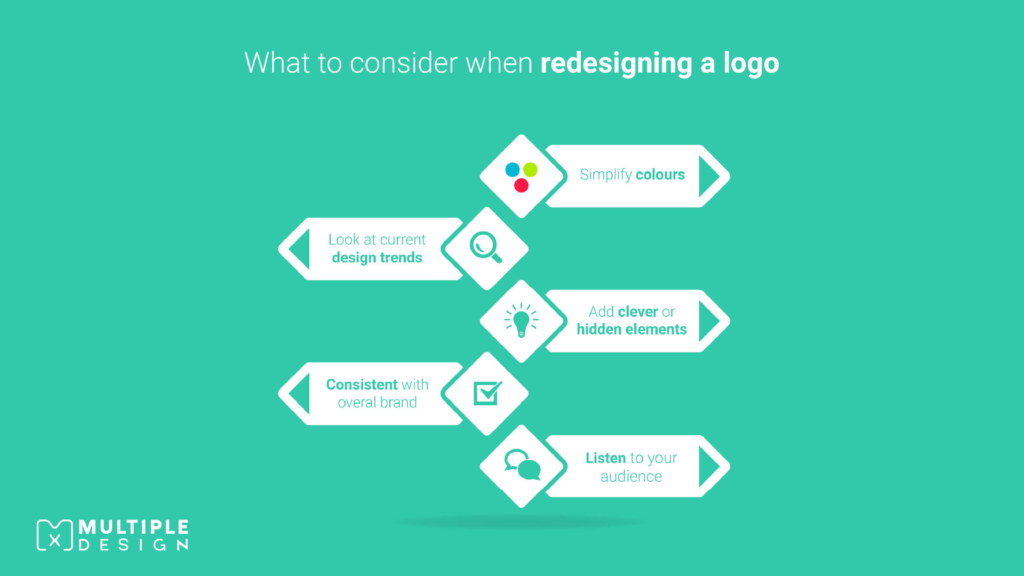
- Simplicity is Key: Too many logos look cluttered or busy. If your current logo has too much going on, streamline it! Start by cutting down the color palette to match your brand colors. The goal is to have a clean, simplified logo that’s easy for people to remember.
- Add a Touch of Wit: Sometimes, the best logos have a hidden gem. Clever design can bring in symbols or shapes that reinforce your message subtly. Playing with negative space or adding a small visual twist can add personality to your brand, making your logo fun to discover and memorable.
- Keep an Eye on Trends: Design trends do evolve - remember the gradients and textured logos of the early 2000s? Today’s trend is clean, flat, and minimalistic. If your logo is stuck in the past, consider bringing it into the present while keeping your brand identity intact.
Every detail you see in a logo - the shape, the font, the color—is part of a plan to make a memorable first impression. A graphic designer combines all these elements to create a logo that feels like you.
But Should You Rebrand?
Not every brand needs a makeover. For some companies, staying true to the original logo is a point of pride. Iconic brands like Stella Artois (which has kept its horn-themed logo since 1366!) and Twinings Tea (the same logo since 1887) show that if it isn’t broken, don’t fix it. Brands that lean on heritage may actually benefit from staying classic.
On the other hand, if you’re a growing business whose logo no longer tells the right story, a thoughtful rebrand can give you a big advantage.


Is It Worth the Cost?
Rebranding can be a bit of an investment, but it’s also one that pays off when done well. Expect a quality rebrand to take up about 20% of your marketing budget. Shortcuts might save you money up front, but they could end up costing more in the long run if they don’t resonate. Case in point: Everton Football Club spent a fortune redesigning their crest in 2013, only to backtrack after fan backlash. Now they’re back at the drawing board to try again - with input from fans this time!

The Takeaway? Do It Right.
Rebranding isn’t something to rush. Take the time to think through why you’re rebranding in the first place and what your new logo should convey. The right rebrand isn’t just a fresh look—it’s a long-term investment in your business’s future, helping you connect with your audience, boost recognition, and stand out from the competition.
About the Author
Ryan Marter works as a lead graphic designer for Multiple Graphic Design. He has years of experience in helping out small and start-up business develop their brand. Get in touch with him on info@multiplegraphicdesign.com


