Discover the secrets behind the world’s most famous logos. Part 2
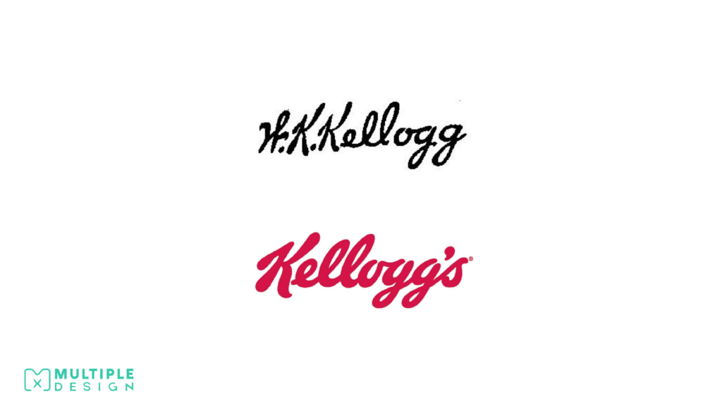
Kellogg's Logo is based William Kellogg's signature.
William Keith Kellogg, signed each Corn Flakes package personally, to show that it was a genuine Kellogg product. Eventually the Kellogg company decided to use this signature as their company logo, retouching it slightly, and colouring it in red.The first one is the & Adidas Three Stripes, which is used on all their sport wear, and is probably the most recognisable out of the three. The second one is called the & Adidas Originals, which is used on their premium lifestyle and fashion products. The third one is called the & Adidas Neo, not as well known as the others, but is used on their standard lifestyle products.
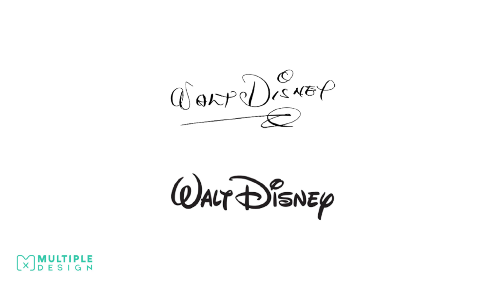
The famous Disney Logo is based on Walt Disney's writing style.
Probably the most famous logo based on a signature belongs to the Walt Disney Company, who uses a stylised version of Walt Disney’s signature. He stopped signing his name this way eventually, and grew to dislike it. Today, all Mickey Mouse characters at every Disney Park must sign their name using the same Disney signature font. Same swirl over the i, same swirl underneath the name.
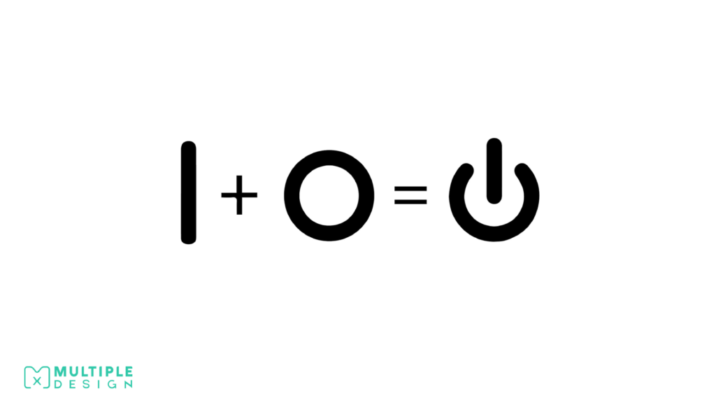
The “Power On/Off” symbol is a combination of a 1 and a 0.
It is actually binary, where 1 is on and 0 is off. Originally there used to be two buttons, which either displayed a 1 or a 0, but as technology developed the symbols merged into one. The serifs on the numbers were removed, simplifying the symbol to bypass language barriers.
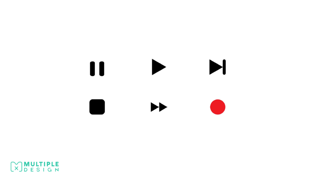
There is a reason why the symbols on a remote control look the way they do.
The pause icon is symbolised by two vertical lines, which represent the sides of frames on a reel. Pause means you are stopped between two frames. Stop is symbolised by a square to represent that you are currently on one frame.
The pause icon is symbolised by two vertical lines, which represent the sides of frames on a reel. Pause means you are stopped between two frames. Stop is symbolised by a square to represent that you are currently on one frame.
The scene skip icon represents moving forward to a frame and pausing. The record icon is symbolised by a red circle, which is a visual representation of the red “studio in use” light outside the door of recording studios.
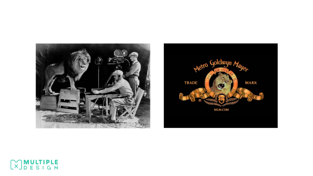
This how the MGM Logo was made.
In 1916, Metro Goldwyn Mayer (MGM), crafted their “Leo The Lion” logo using seven trained lions. The original logo was designed by Howard Dietz, who decided to use a lion as homage to his favourite football team, The Colombian Lions. The first lion was called Slats, and couldn’t roar on cue, so he just sat there looking around. After the silent film era had finished, the roar was recorded using another lion called Jackie.
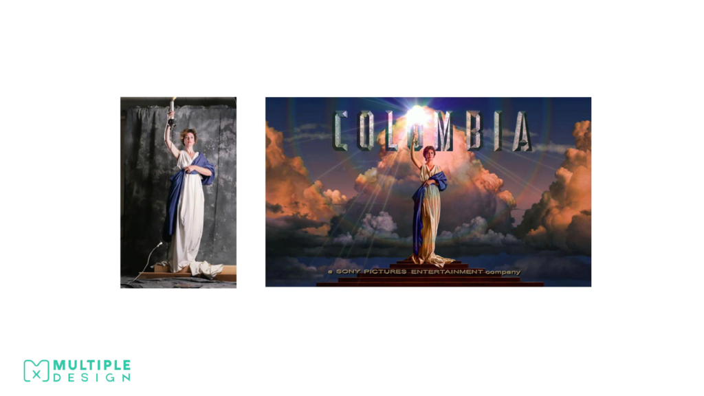
The Columbian Pictures Logo was based on a real woman.
The famous logo of Columbian Pictures was made by painter Michael Daes. He used a friend of his, Jenny Joseph, wrapped in a bed sheet to resemble a roman and standing with a corded desk lamp. She was then painted over to enhance her figure, and clouds were airbrushed behind her.
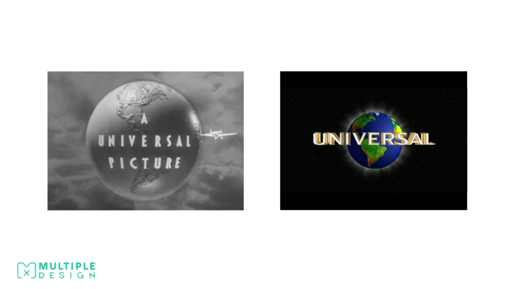
The Universal Pictures Logo was a real model.
Universal Pictures created their logo by rotating a model globe on a space background. The studio originally wanted to use Saturn and it’s rings for the logo, but decided in the end to use Earth. There used to be a model plane flying around the logo, before it was removed to enhance the lettering.
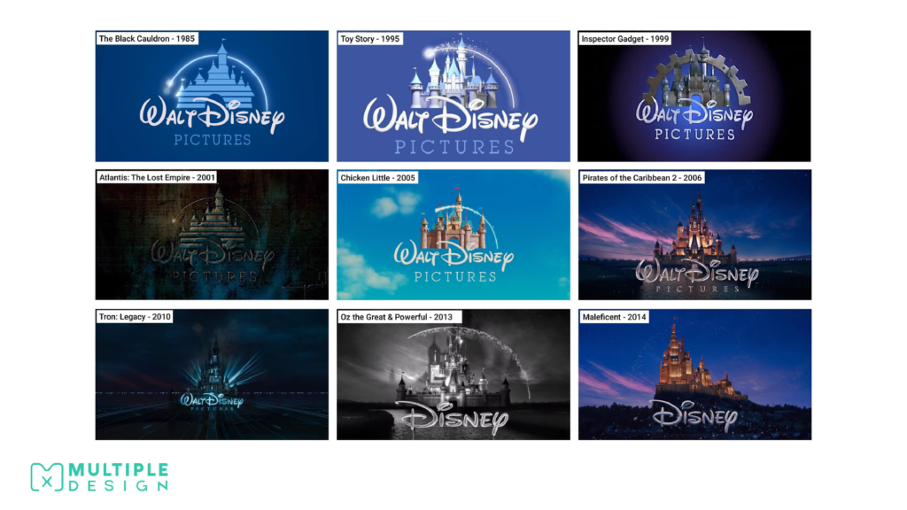
Disney alter their opening Logo to reflect the context of each film.
The Disney logo has become one of the most iconic opening credit logos of all time. Their logo depicts Cinderella’s castle, and uses an instrumental version of “When You Wish Upon A Star” as their theme song. The first film to use this logo was The Black Cauldron in 1985. The logo was left unchanged for ten years, until 1995’s Toy Story turned the logo into a computer animated castle to match the style of the film.
After positive fan reaction, Disney decided to alter their logo to match the context of each film. In 2006, the opening of Pirates of the Caribbean: Dead Mans Chest, was the first time their fully 3D Cinderella’s castles was used. Disney then started to add variants of this logo, eventually dropping “Walt” from their name in 2011. Each of their Princess stories features their characters castle in place of Cinderella’s castle.
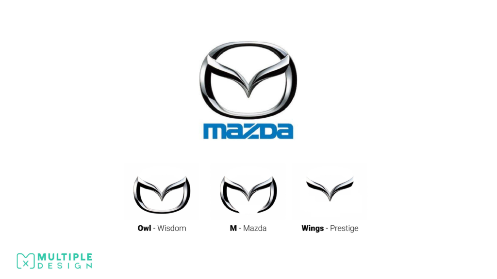
The Mazda Logo is not just a stylised M, but also includes a pair of wings and an owl.
The Mazda logo is full of symbolism. The name Mazda itself comes from the god of wisdom, Ahura Mazda. This is shown in the logo as an owl face, as the animal is commonly used to depict wisdom. The pair of soaring wings in the middle of the logo represents Mazda’s flight towards the future, and prestige.
The Logo for Continental Tyres cleverly features a tyre shape created by the C and the O.
Continental is a leading German automotive manufacturing company specialising in tyres and brake systems. The logo cleverly reinforces what they produce. The prancing horse is a visual representation of their corporate tagline “The Future in Motion”.

There is a pin hidden within the Pinterest Logo.
Pinterest is a portmanteau of the words “pin” and “interest,” since it allows users to pin things they’re interested. The concept of the site is to mimic the action of pinning up ideas and images into a bulletin board.

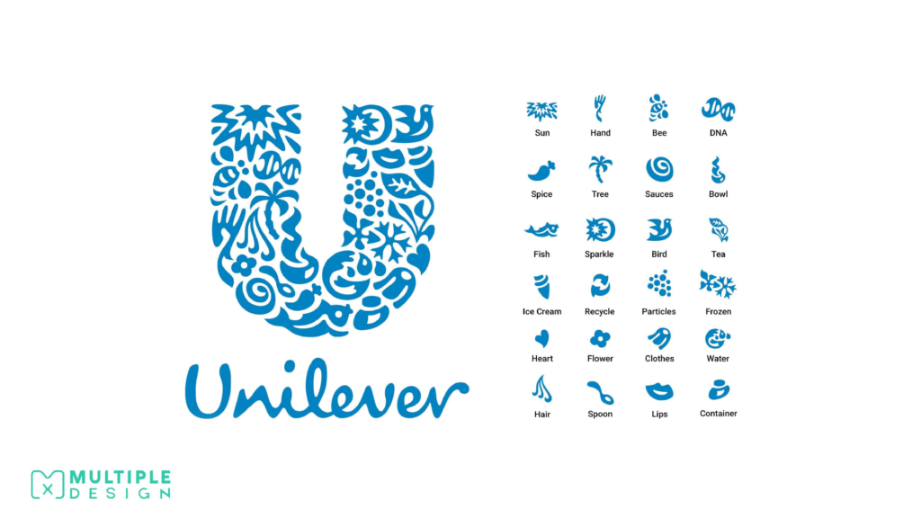
The Unilever Logo is composed of 24 different icons, each representing one of their products and services.
Unilever is a British-Dutch consumer goods company with a portfolio of well-known brands within nutrition, hygiene, and personal care. Their clever logo is a visual expression of their products and services. Some of the icons within the logo include an ice cream, tea, hair, a heart, and the recycling symbol.
The Golden Ratio appears in many of the world’s most recognisable Logos.
The Golden Ratio is a mathematical ratio that is based around perfect proportions that create aesthetically pleasing compositions. It is commonly found in nature, but has been applied to many areas of design for thousands of years. The Pyramids of Giza, the Eiffel Tower and Da Vinci’s painting of The Last Supper all abide by The Golden Ratio.
When applied to logo design, it can help be uses to create some harmonious designs. Google, Apple, Twitter, Pepsi, and BP all use The Golden Ratio.

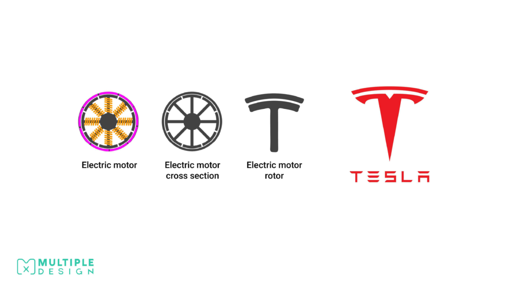
The Tesla T Logo is based on a cross section of an electric motor.
Tesla Motors specialises in electric automotives, owned by billionaire Elon Musk. At first glance, the Tesla logo just looks like a fancy T, but is actually a stylised cross section of an electric motor. The motor itself was first designed by the company’s namesake, Nikola Tesla, the famous physicist and inventor.