

When Benjamin Sila reached out to us on Twitter, we were thrilled to take on an exciting new challenge. He was in the process of launching Hepify, an events management app that makes it easy for users to buy tickets to a wide variety of gigs and events. Benjamin needed a designer to create a standout app icon that would grab attention and convey the fun, dynamic nature of his app.
Designing icons was something we’d been eager to dive into, so this project felt like the perfect opportunity. From the start, we wanted to create a design that was not only visually striking but also tied closely to Hepify’s core purpose. As we brainstormed ideas, we noticed something intriguing about the H in Hepify—it could easily be shaped to resemble a ticket! Inspired by this connection, we began exploring how to merge the letter and the ticket symbol into a single, cohesive design.
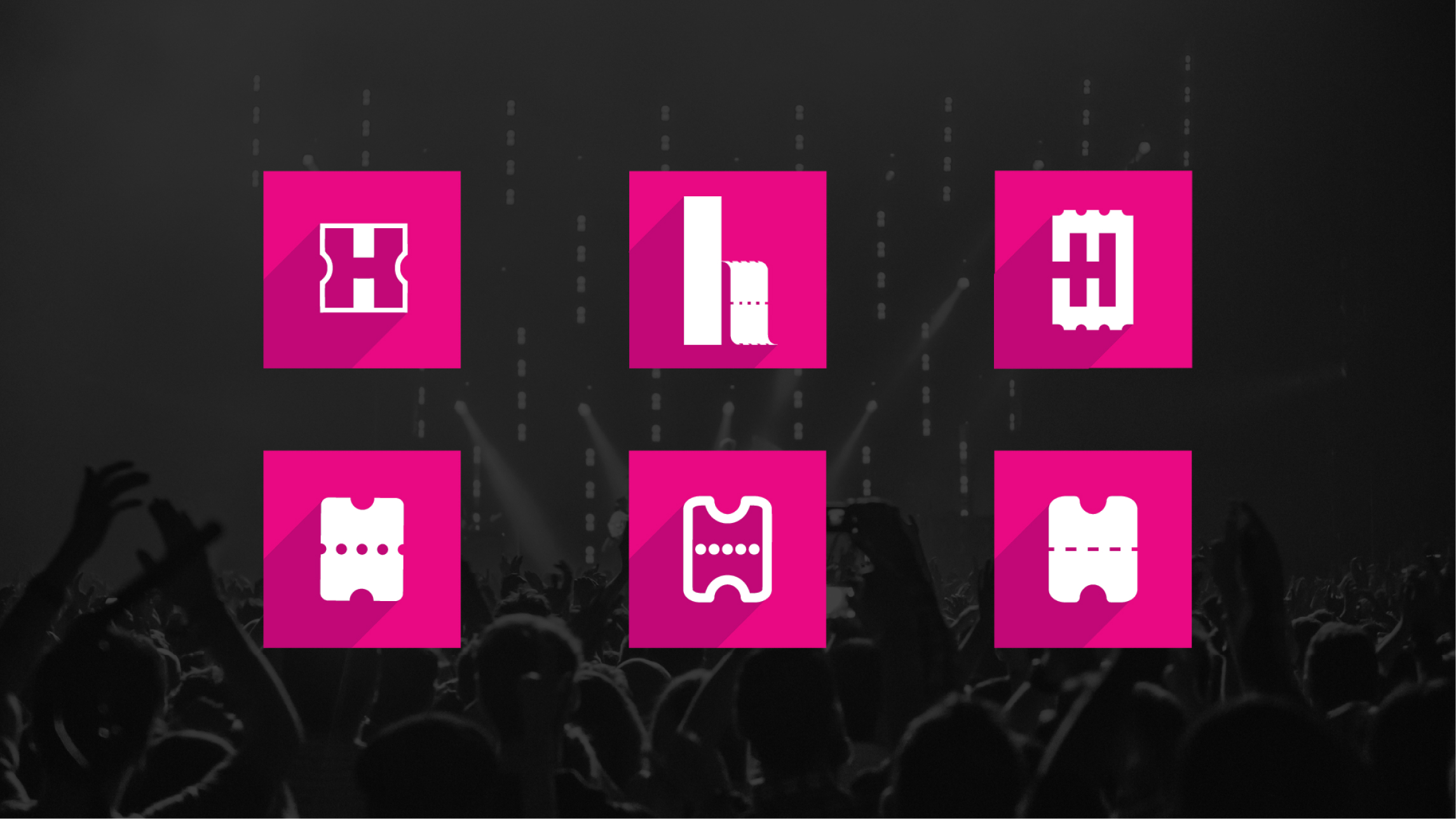
Benjamin envisioned a brightly coloured and playful icon, one that would stand out on a smartphone menu amidst a sea of other apps. With this in mind, we worked on creating a bold and cheerful palette that would make Hepify instantly recognisable. The final design featured a clean, modern ticket shape styled with vibrant colours that gave it a lively and approachable vibe, perfect for an app all about fun and entertainment.
We were thrilled with the results, and so was Benjamin! The first icon design hit the mark, and seeing it in use on Hepify was incredibly rewarding. It’s always exciting to work on a project where creativity meets functionality, and this one was a perfect blend of both.
Now available on Google Play, Hepify is making waves, with an Apple App Store release on the horizon.


