

Suzi Wong discovered us on LinkedIn, intrigued by one of our updates, and reached out to discuss creating a logo for her new Midlands-based architectural company, Grey Rose Architects.
Architecture is close to our hearts at Multiple – after all, we were founded by an ex-architecture student, so we couldn’t wait to dive into this project. Suzi had already commissioned a logo in the past but felt it didn’t quite capture the essence of her brand. This time, she was looking for something more distinctive, creative, and aligned with her vision. She envisioned a design rooted in geometry, complemented by a sleek grey and pink colour palette.
Our brainstorming sessions centered on combining Suzi’s love for geometric patterns with the elegance of her chosen colours. We explored several ideas, from intricate geometric roses that reflected her company’s name to clean, structured forms that demonstrated professionalism. Suzi loved the concept of using a geometric rose, but as we refined the designs, another idea took center stage, a cubic design.
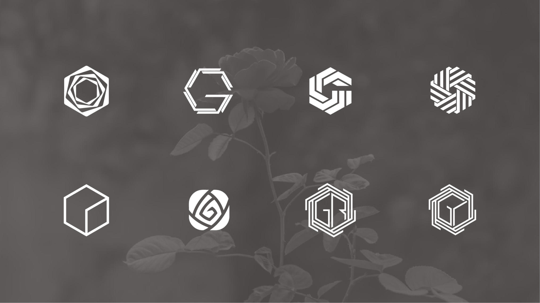
This new direction was inspired by the initials of her company, G, R, and A. We carefully crafted a logo where the letters intertwined within a bold, three-dimensional cube. The result was a design that was striking, modern, and carried a subtle nod to the structural precision of architecture itself.
To take the design to the next level, Suzi suggested adding a metallic rose gold effect. This detail was the perfect finishing touch, infusing the logo with a hint of luxury while staying true to the company’s contemporary aesthetic. The rose gold against the grey and pink tones created a timeless yet fresh look, one that Suzi instantly loved.
Working with Suzi was a fantastic experience. Seeing the final logo come together, a blend of geometry, elegance, and architectural roots, was deeply satisfying for both of us.
If you’re in the Midlands and dreaming of architectural projects brought to life with care and creativity, be sure to check out Grey Rose Architects.


