
In 2021, more than ever it is important to keep your brand fresh and adaptive. Last year was a real struggle for many businesses. They had to overcome political strife, racial injustice, and a global pandemic. Businesses must adapt with the world in order to overcome challenges in the marketplace.
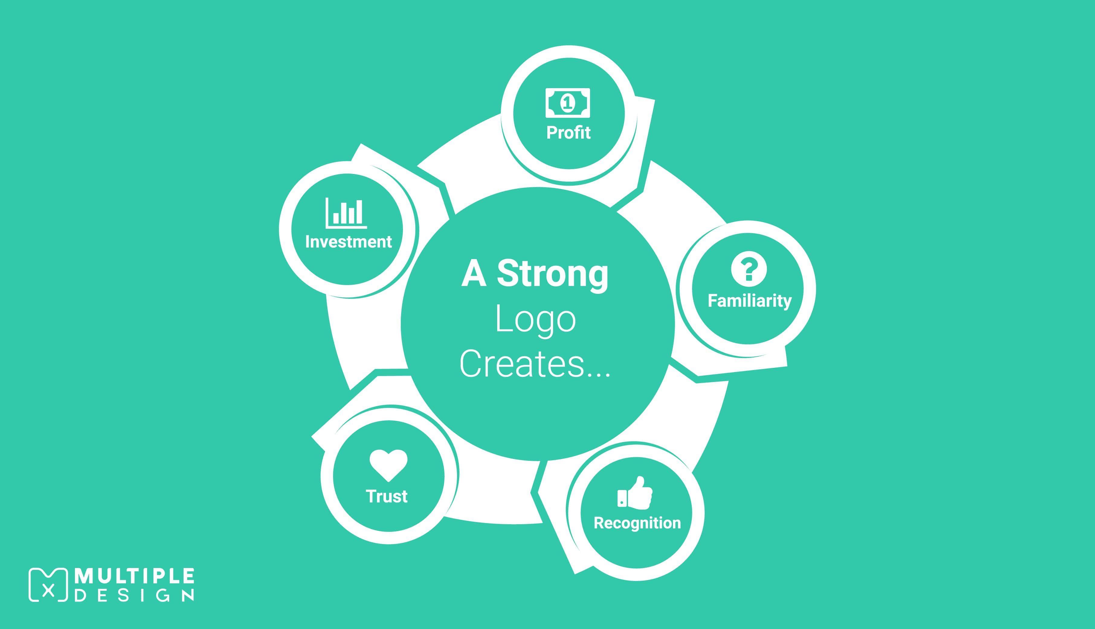
A logo is one of the most important visual elements a brand can use to communicate its objectives. It is therefore important for brands to consider a logo rebrand at some point to highlight the key strengths and to reflect core business values.
If you are thinking of undergoing your own rebrand and need inspiration, I have rounded up the biggest logo changes of the year, and will be updating this page as they are released.
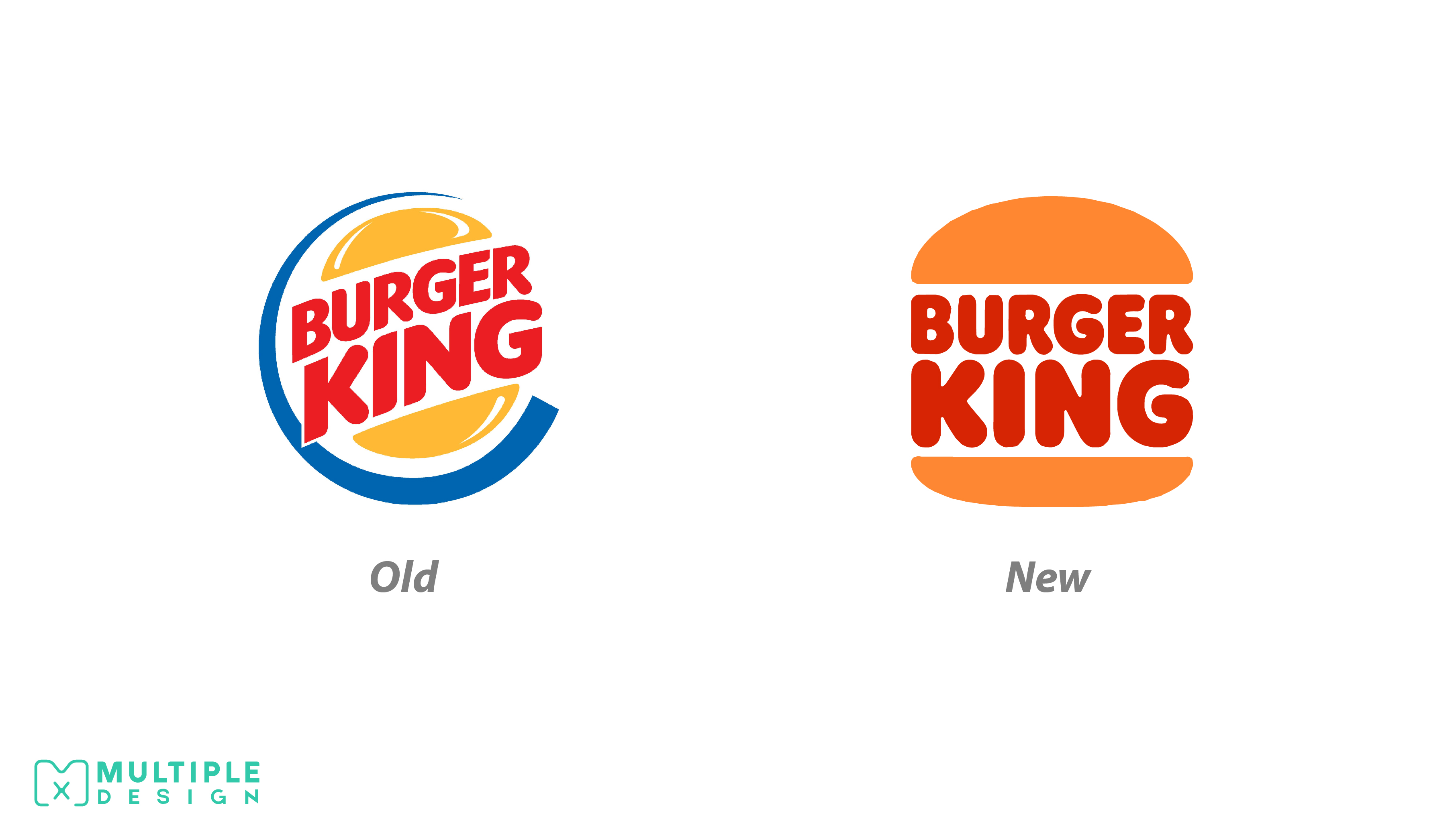
Burger King
The new design is simple and fun. The lettering is much more rounded and somewhat retro in style.
The new logo calls heavily on Burger King's past. It greatly resembles a design they used during the 1970s and 80s. The brand believes this was when Burger King was at its strongest and now aims to reposition themselves with this era of success. The removal of the blue swish is meant to symbolise the removal of preservatives and artificial flavourings from their food. The colours in the logo are inspired by the food, with the browns and yellows representing flame grilling.
At first I didn’t like the design but after looking back on their previous logo, I think it is a good step forward. Their original logo does look dated in comparison. The new design also works much better on digital platforms.
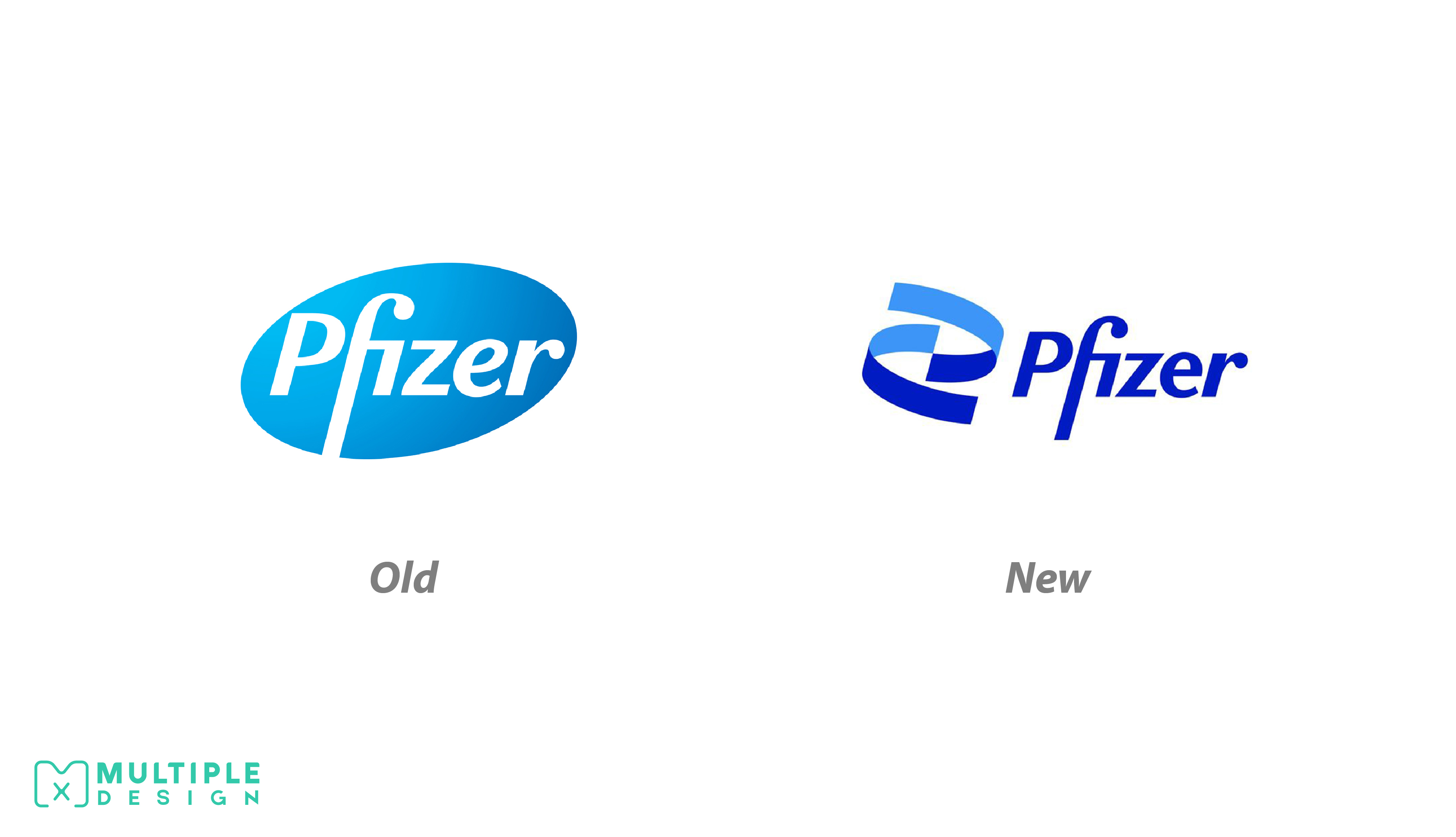
Pfizer
After recently creating the Covid vaccine, the company has revealed their new logo, which aims to shift the brand from “commerce to science”.
The new design is inspired by DNA’s double helix structure, and replaces the pill shaped logo they had before. They have described it as “unlocking the pill to reveal Pfizer’s DNA: the power of science”. With the logo comes a new colour scheme and typeface. The colours have been toned down from eight to two, in industry standard blue.
I really like the design. It is current, and a lot more interesting to look at. By removing the gradient, the logo is a lot more usable on digital platforms. The rebrand has come at a good time for the company, as their reputation has improved after their vaccine breakthrough.
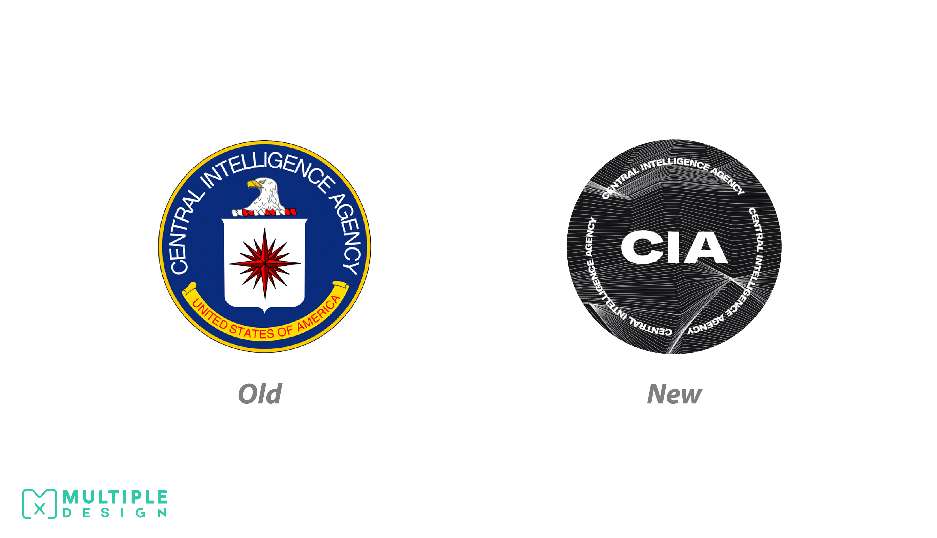
CIA
The rebrand comes at a time when the CIA are looking to encourage diverse applicants “from people of all backgrounds and walks of life”. The rest of their brand is clean, bold and modern, unlike their new logo which is anything but simplistic. The new design incorporates waveform curves in black and white. A bold sans-serif font now includes the agencies initials. The only thing it retains from the original is its circular shape.
The new design has been met with criticism and mockery. In true CIA fashion, the identity of the designer remains classified.
Personally I do not like the new design. It looks like something you would see in a dystopian, sci-fi movie or video game, not as an official emblem of a government agency. The lines on the background make the lettering too hard to read. It will suffer when scaled down, so it is not at all suited for digital platforms.
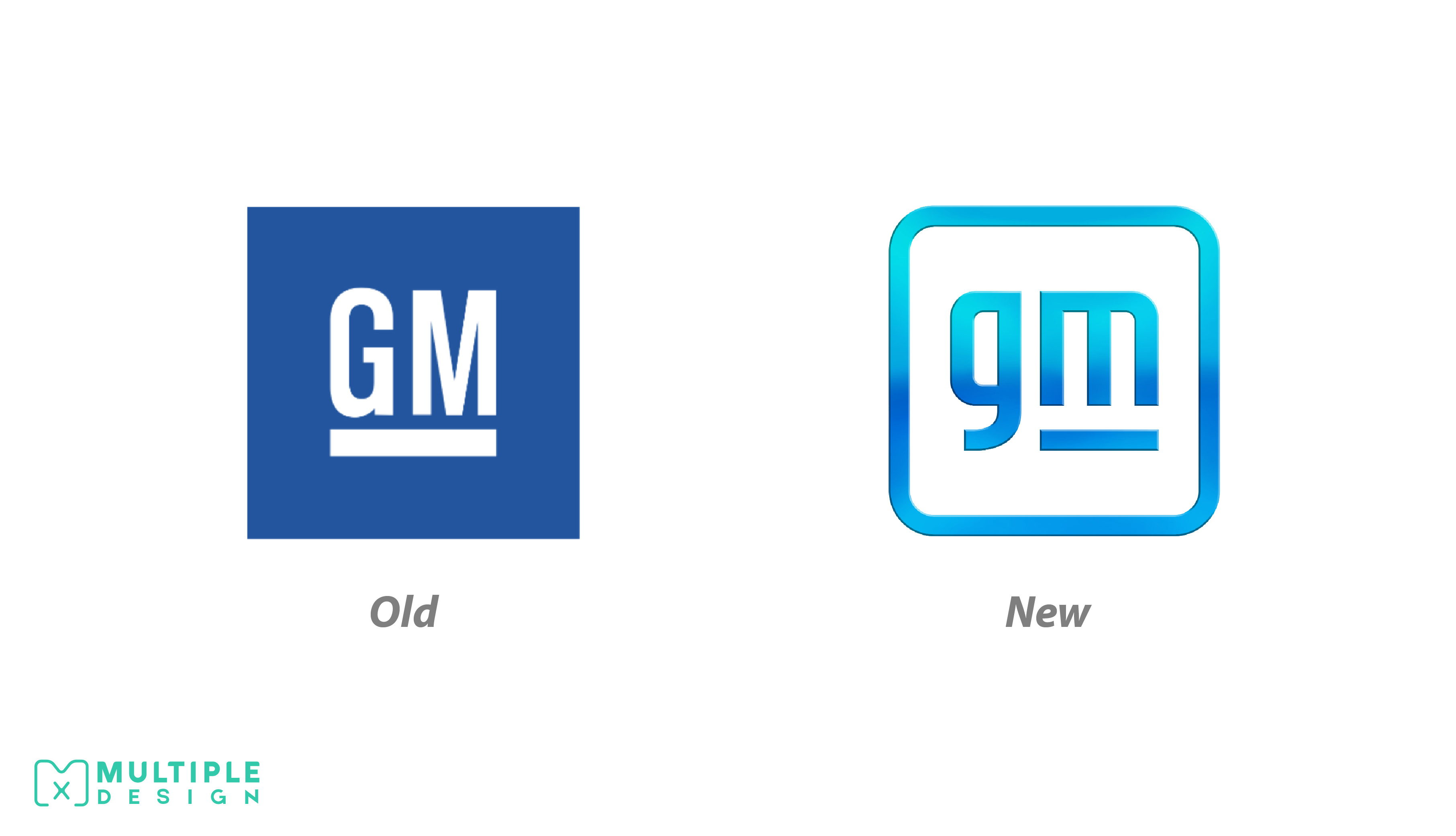
General Motors
General Motors is the parent company to brands including Chevrolet, Buick and Cadillac. Their new logo is meant to reflex the company’s electric vehicle campaign, which aims to reduce emission and create an all-electric future.
Along with the logo comes their new tagline “The clean skies of a zero-emissions future”. The design aims to showcase this message, employing a sky blue gradient. The company’s initials are displayed in a new lowercase font. The line under the m is retained from their previous design. It has been stated that this is meant to represent a battery range, where the negative space under the m is a reference to the shape of a plug.
I personally am not a fan of this logo. It looks very generic and uninteresting. The gradient looks a little outdated, and will struggle on digital platforms. The font for the lettering needs to be reworked into something more unique to the brand.
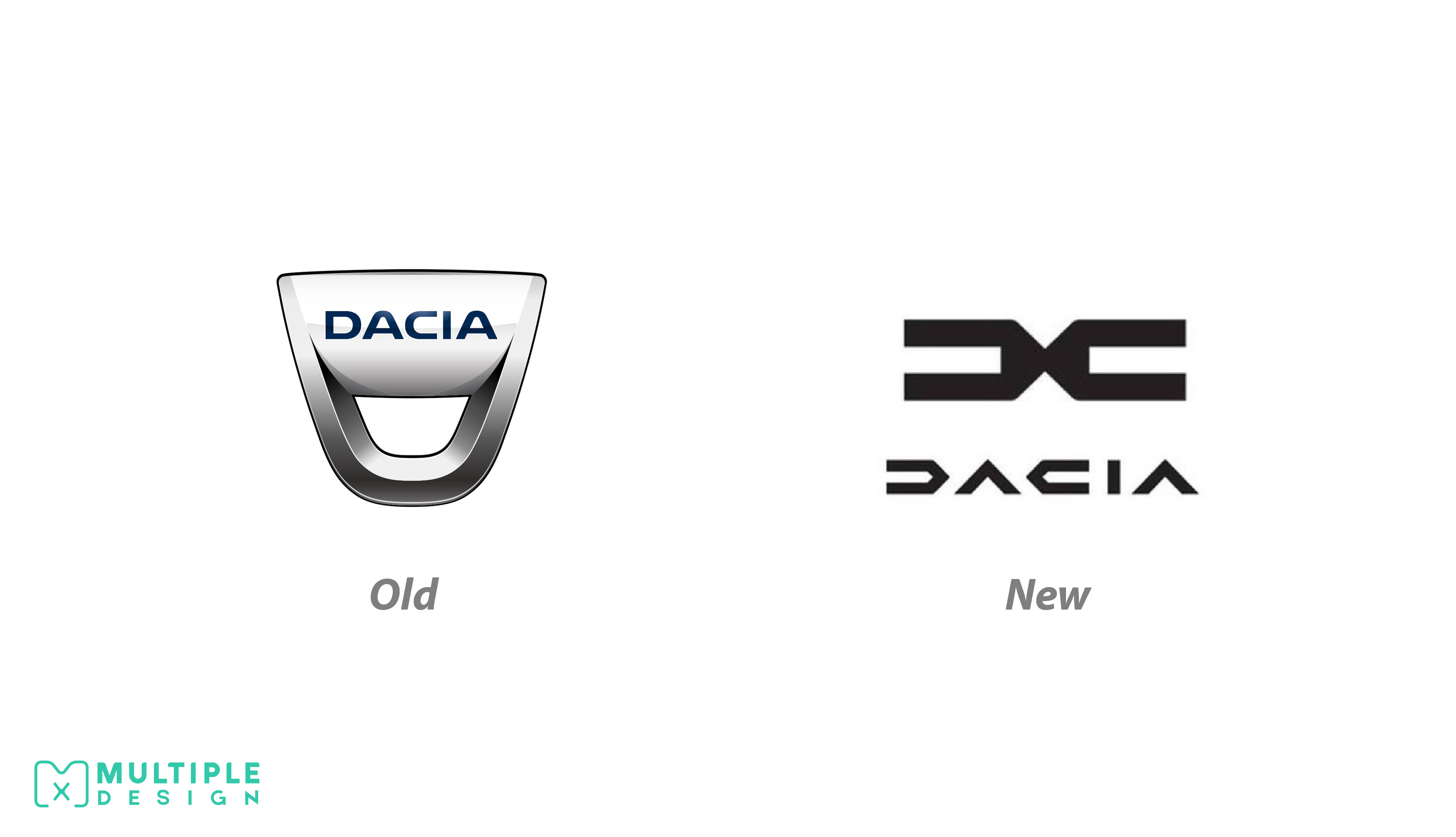
Dacia
Dacia is a Romanian car manufacture owed by Renault. As part of the company’s new development plan, known as the “Renaultlution”, they have showcased their new SUV displaying their new logo.
The new design showcases an angular symbol, meant to represent two D’s. New lettering sits below this, which takes on a futuristic styling.
Dacia seem to have gone the same way as other ca manufacture by ditching gradients and bevels, and opting for a flat, stylish design. I love this new logo. I especially love the lettering. It seems to fit in with their overall brand nicely.
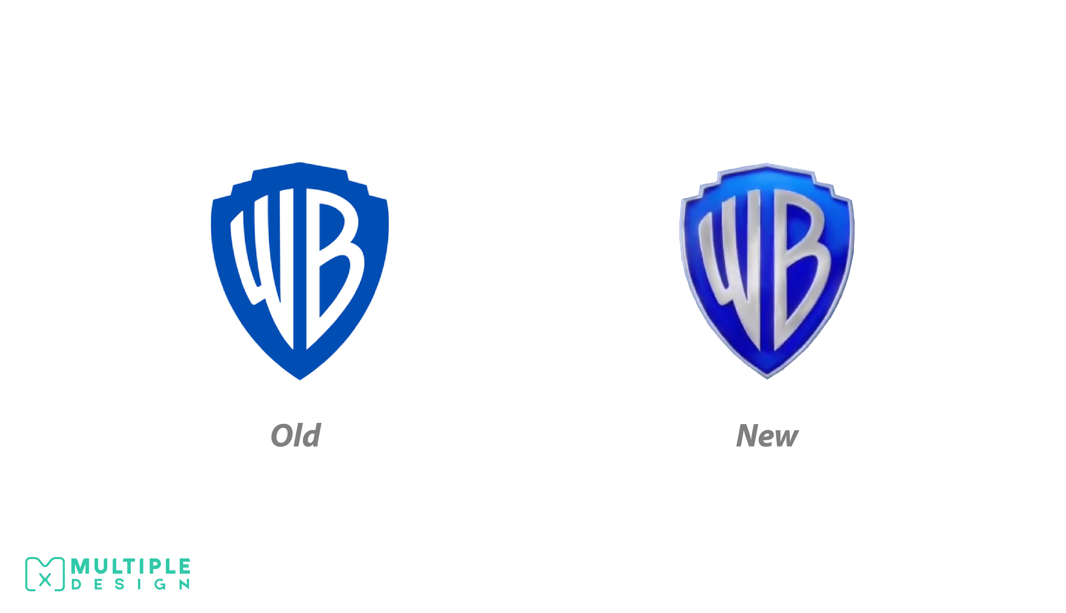
Warner Brothers
In 2019 Warner Brothers revealed their new flat logo to celebrate their centenary. The iconic gold shield was removed, and the initials were changed to white. The new design did not go down very well fans.
Over 2 years later, the updated design finally appeared onscreen attached to the film Locked Down, although slightly different. A touch of 3D had been added to the design, with the edge of the shield and the initials new rendered in metallic silver. It has been speculated that Warner Brothers listened to their fans, striking a medium between the two designs.
I like it. This is what I wanted to happen back in 2019. I felt the design stripped away too much, so it’s nice to see it retain some of its iconic features. If I was to nitpick, I would have preferred it remain gold rather than silver.
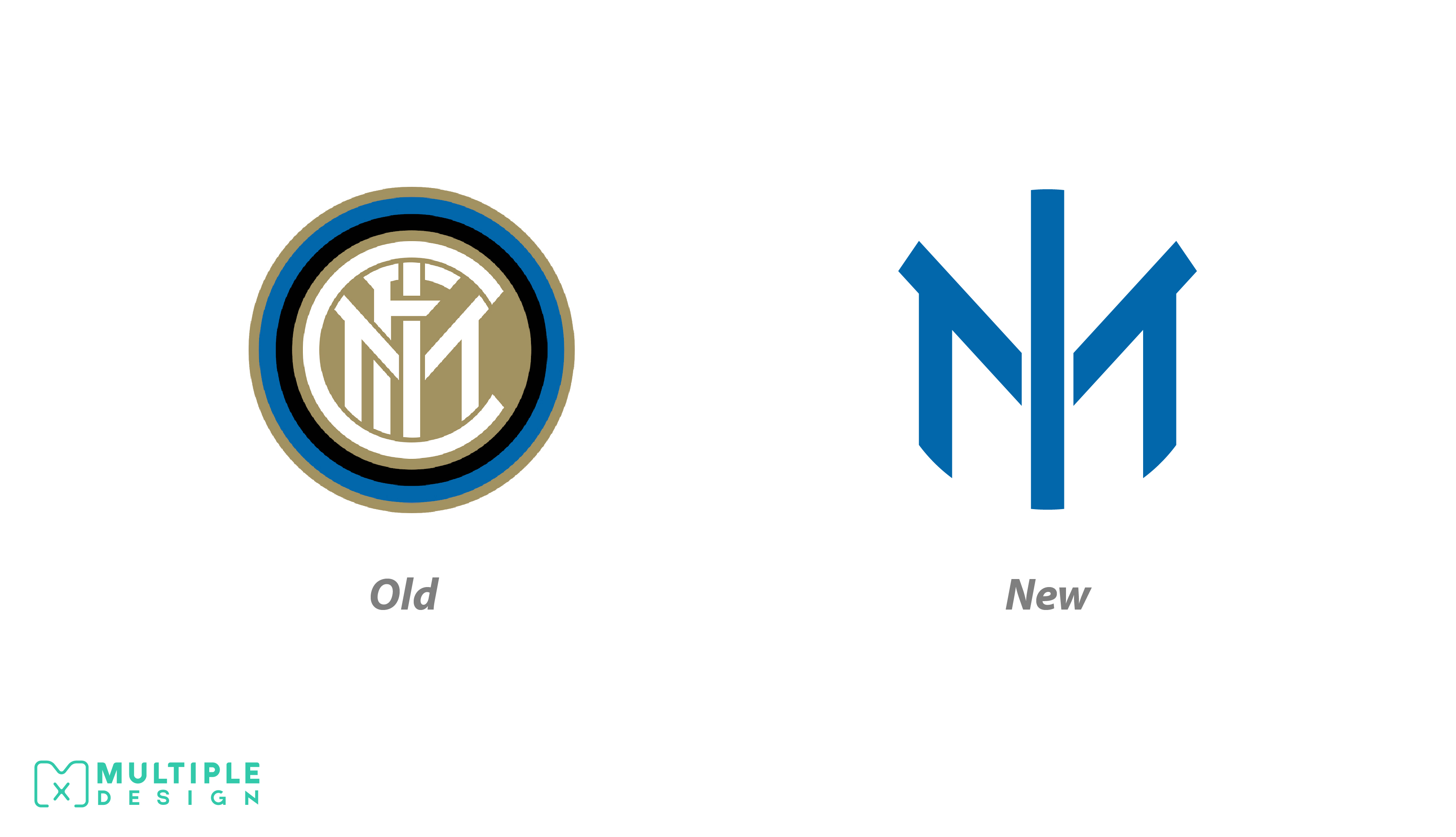
Inter Milan
Inter Milan, formally known as Football Club Internazionale Milano, will reportedly change both their crest and name to celebrate their 113th anniversary. They will be known as Inter Milano in an effort to modernise the club and establish a closer connection to the capitol. It is also believed the name change is a deliberate effort to establish dominance over David Beckham’s Inter Miami.
The new logo is a stripped down version of their 2014 rebrand. It has dropped the monogram, and now simply displays a I and a M. The club aimed to emulate their long time rival Juventus FC with a minimalist style.
I am not sure how I feel about the design. It’s a good logo, but it seems too simplistic, and a bit empty. Perhaps if the blue, gold and black monogram was retained, it would help tie the design together.
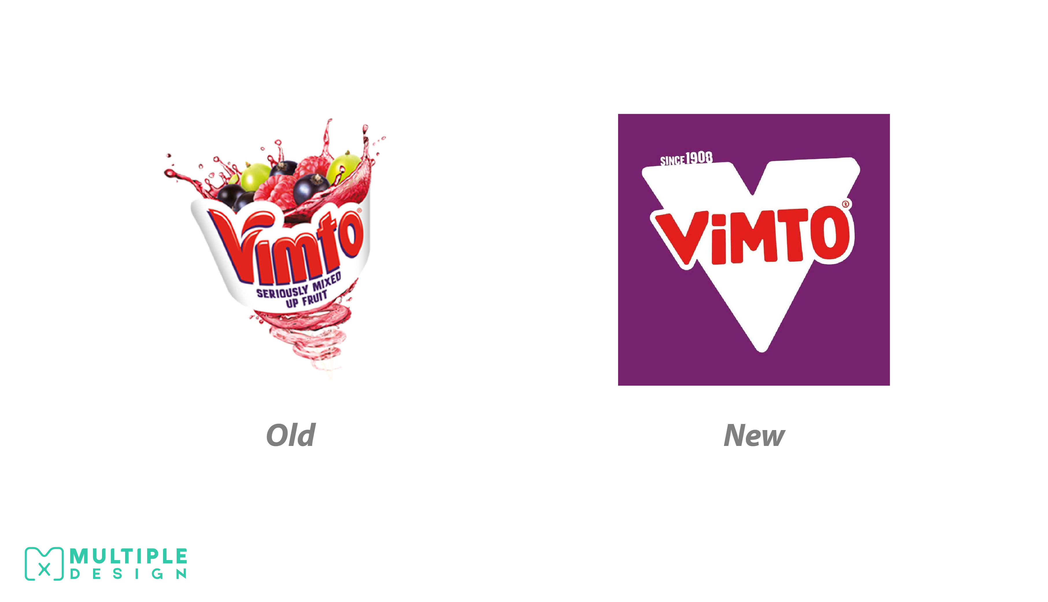
Vimto
The new look is currently being rolled out across its entire portfolio range. The design takes a clean and stripped down approach. They have retained their red, white and purple palette, but now only features a bold V, and the text “since 1908” – a homage to Vimto’s 113 year heritage. The logos styling is playful and reflects the personality of the brand. The layout highlights the brand more, allowing the product to stand out on the shelf to consumers.
Vimto, like the rest of the soft drinks industry at large has benefited from the pandemic. Children have spent more time at home, and parents see squash as a healthy product to give to their children.
I personally like the new design and think it is a step in the right direction for the brand. The previous version was just too busy and outdated.
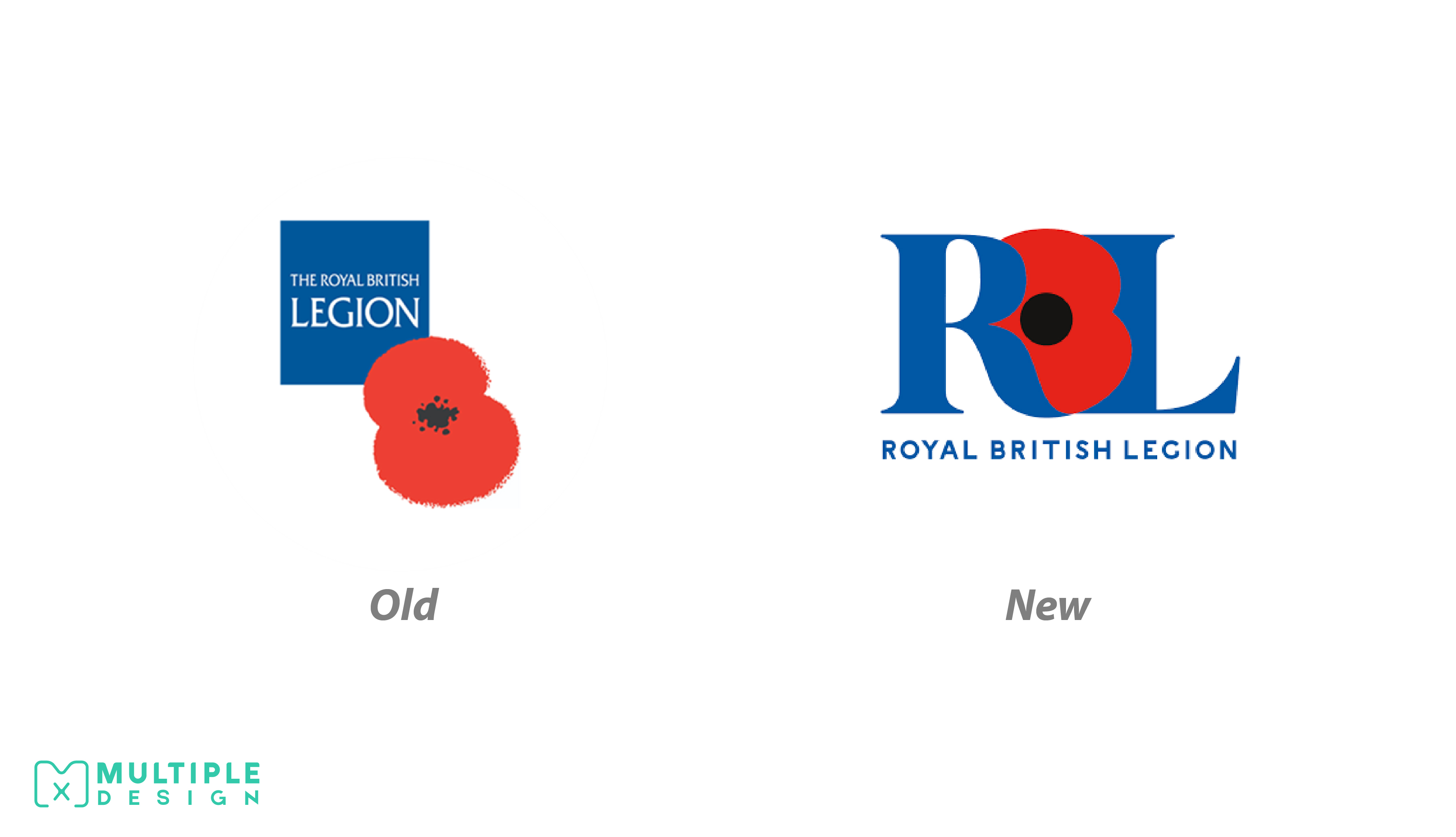
The Royal British Legion
The Royal British Legion is a British charity which provides financial and emotional support to members and veterans of the British armed forces. After nearly 30 years the brand has updated their logo. The new design retains the brands colour palette, and includes the brands initials. In place of a B is a poppy which has been rotated to resemble the shape.
The new design has sparked controversy amongst the general public, mainly due to the alleged cost of the rebrand which is almost £100,000. Many believe the cost was a gross misuse of funds and could have been spent on the 6000 ex-armed forces which are currently homeless.
I like the idea they were trying to convey, but it needs a bit more polish. Using the poppy to represent the B in the initials is a good idea, but it needs a bit more refining to resemble the shape of the letter. It isn’t immediately obvious that it is meant to resemble a B. I’m not sure the design matches the price tag.
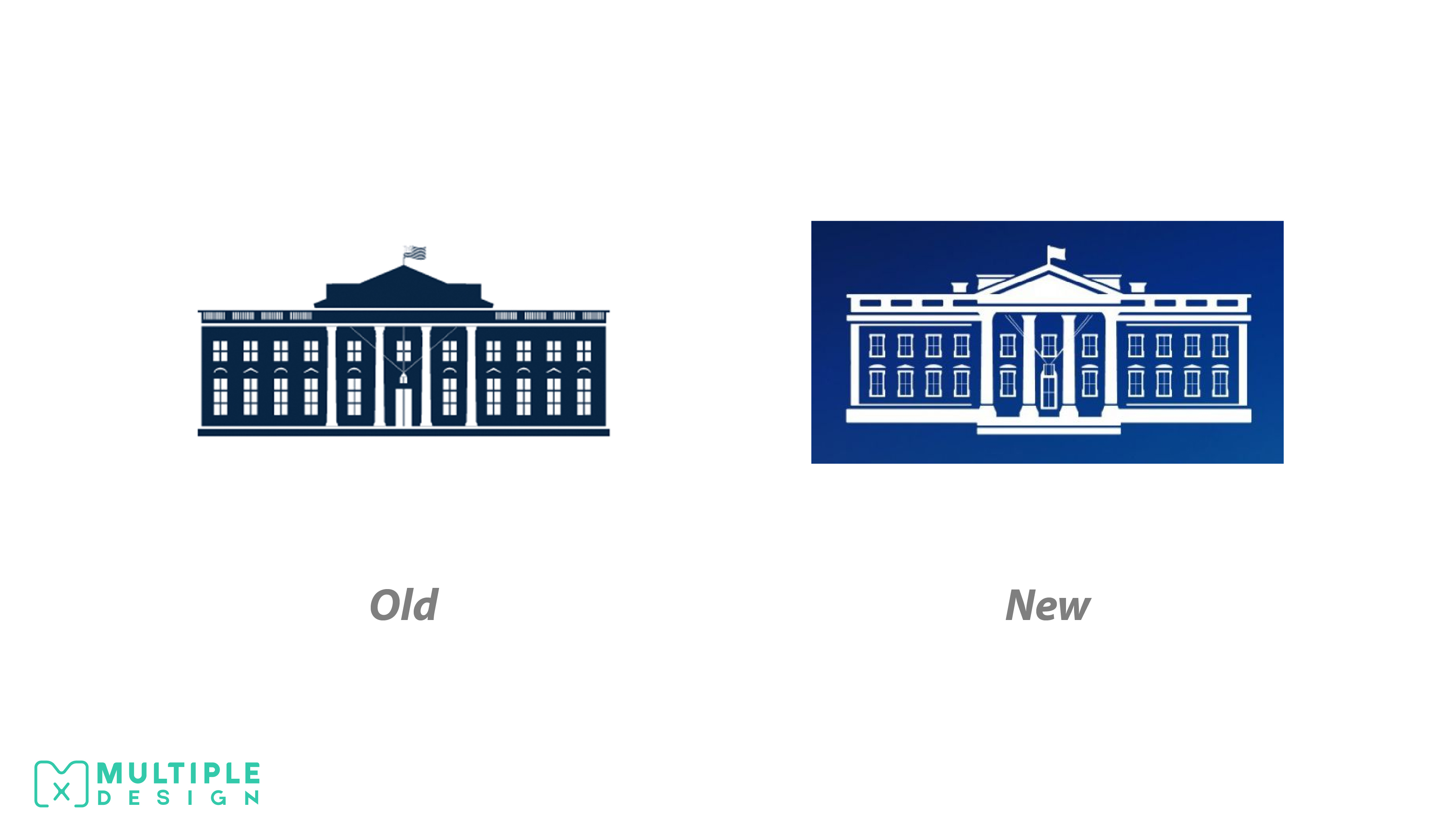
The White House
With a new President comes a new image. Biden’s administration have overhauled the entire White House website, and have introduced a new logo.
The colours of the previous design have been inverted. Like the namesake, the White House now appears white. Subtle architectural details have been added to the windows and pillars. The new design is meant to represent the goals of the new administration, by looking forward while maintaining roots in something traditional. Another version of the logo reintroduces the lettering which was removed by the Obama administration.
I like the design. I liked the previous one too. I prefer the little details on this version, and overall it does feel like a stronger design. The boldness of the edges works well with the subtle details on the windows. I like that the flag is now a solid as it looked a little lost on the previous design.
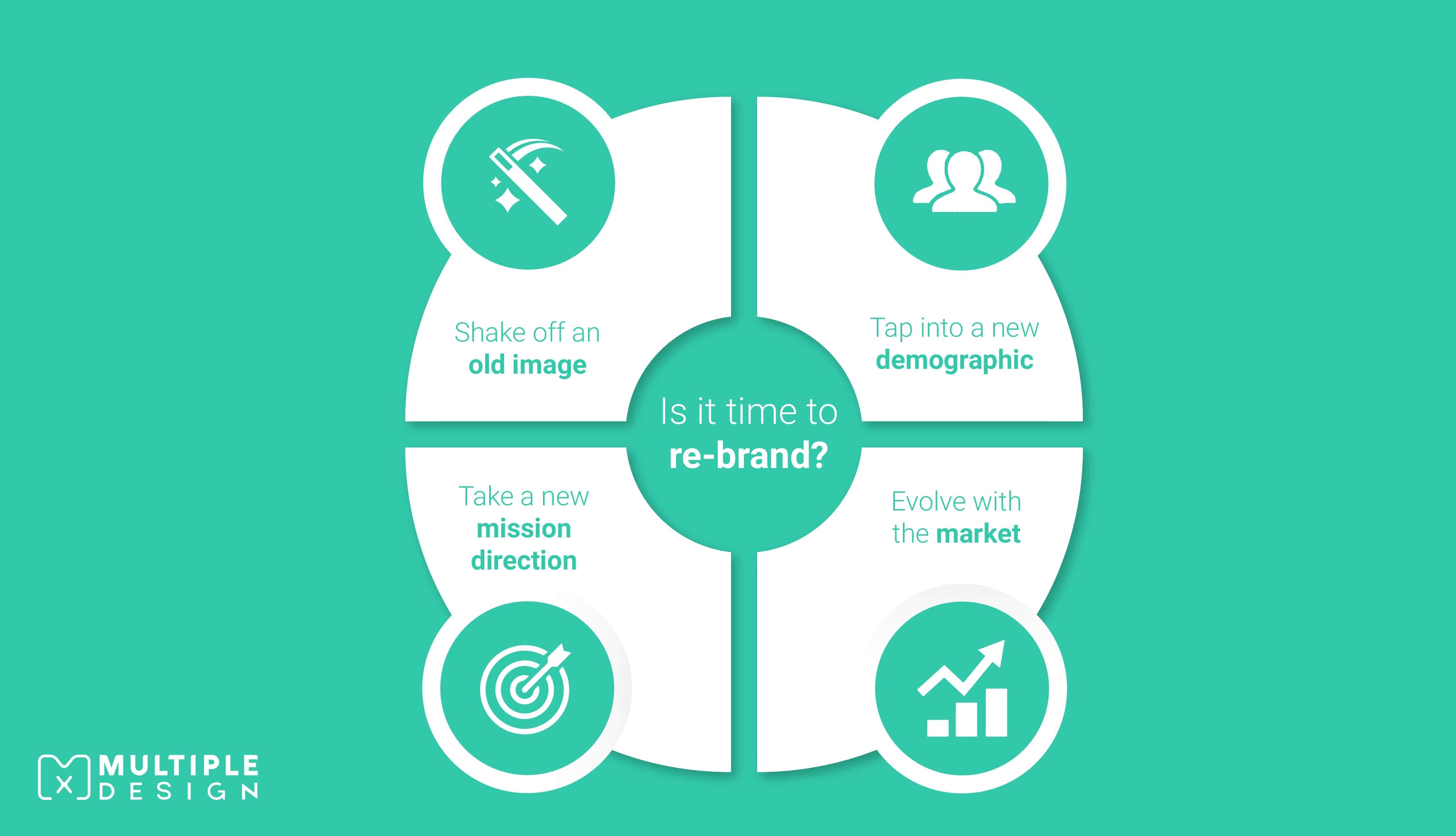
I am sure you have your own ideas on how a solid re-brand can help your business stand out from the crowd.
So get it right. Don’t rush it, and think about why you are re-branding in the first place. If you look at your logo and it just doesn’t represent your business anymore, then you might want to think about making some changes.
A strong re-brand is a step in the right direction in creating a stronger brand.
SEE ALSO: The Biggest Logo Rebrands Of 2020 >>
- About the Author
Ryan Marter works as a graphic designer for Multiple Graphic Design. He has years of experience in helping out established and start-up business develop their brand. Get in touch with him on info@multiplegraphicdesign.com


Leave a Comment