
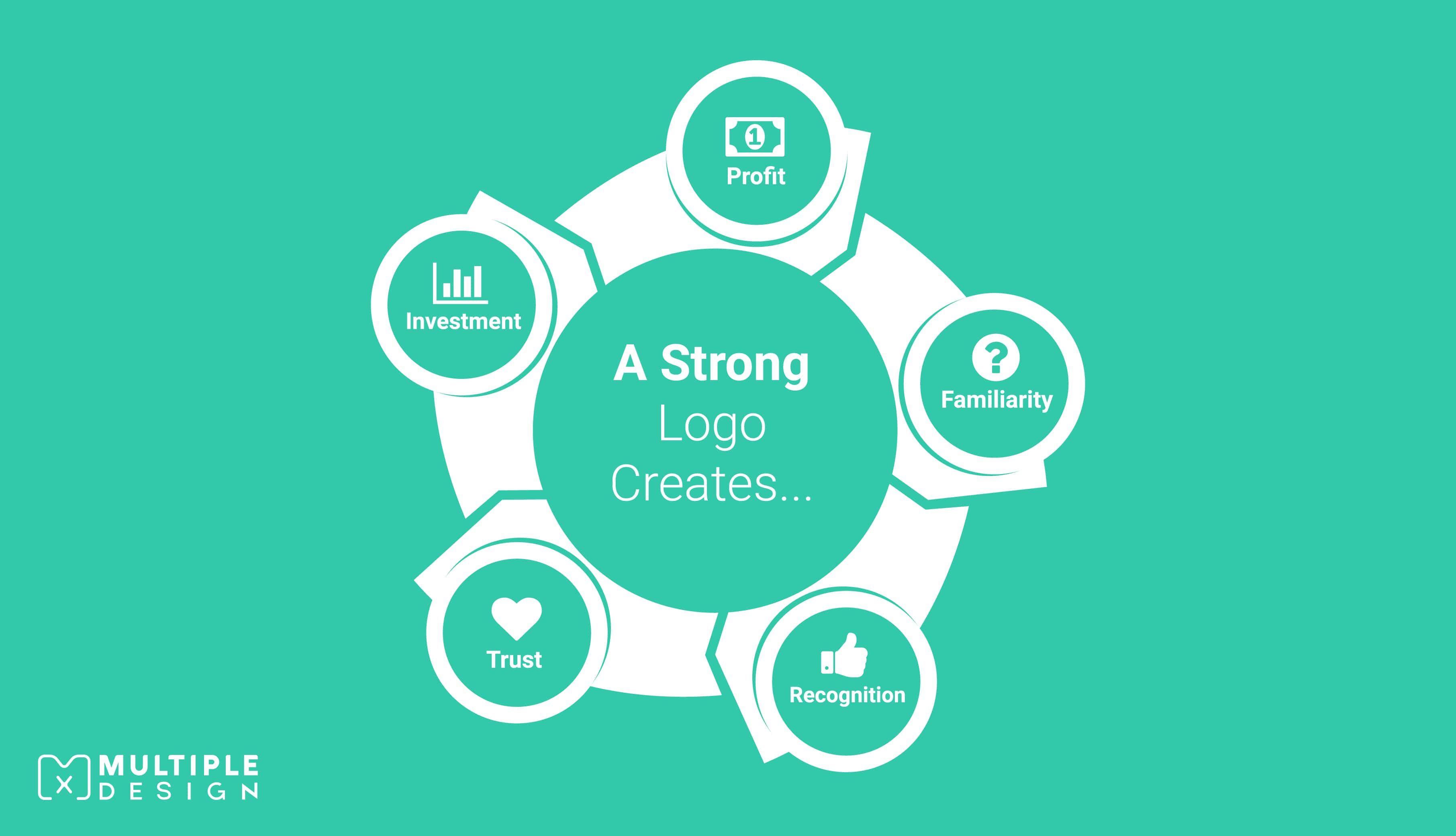
Logos are the most important branding element that a business possesses. It represents the brand and communicates it's objectives while staying up to date with new design trends. It is therefore important for brands to consider a logo rebrand at some point to highlight the key strengths and to reflect core business values.
A well-designed logo can help entrepreneurs to launch their business at stratosphere level, while a poorly designed logo can lead to failure.
To keep you inspired with fresh ideas for your own rebrand, I’ve rounded up the biggest rebrands of the year, and will be updating this page as they are released.
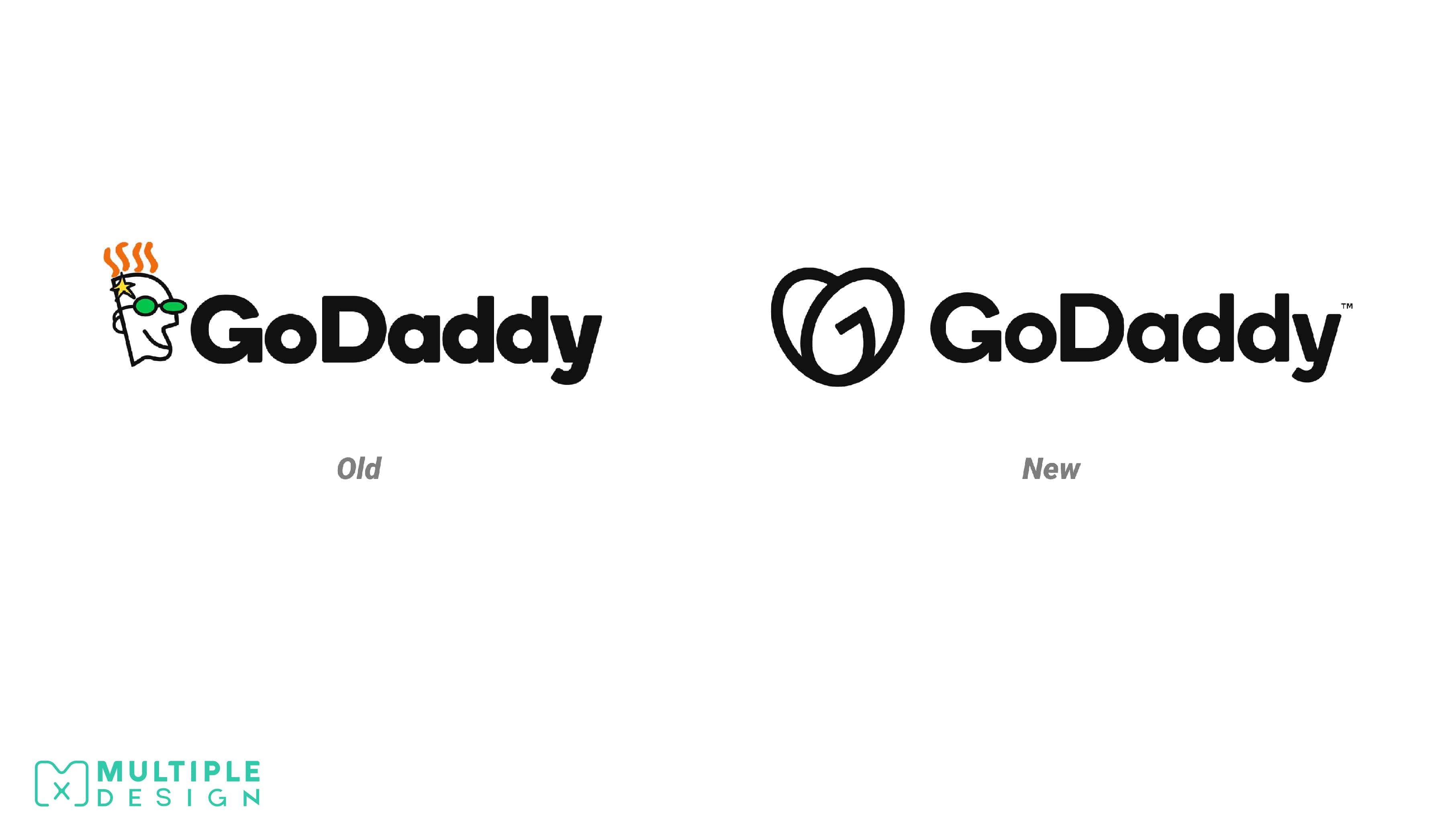
GoDaddy
The new logo consists of a "G" and a "D" shaped into a heart. The company has dubbed it the "GO" logo.
Their old logo was incredibly dated. I think it was a good choice to update it, but I think the initials in the heart need to be a little more refined. The icon will work really well in the mobile and app environments but it's got no separation through line weight or spacing to make it clearer. The font is much more legible though, definitely an update that has been a long time coming.
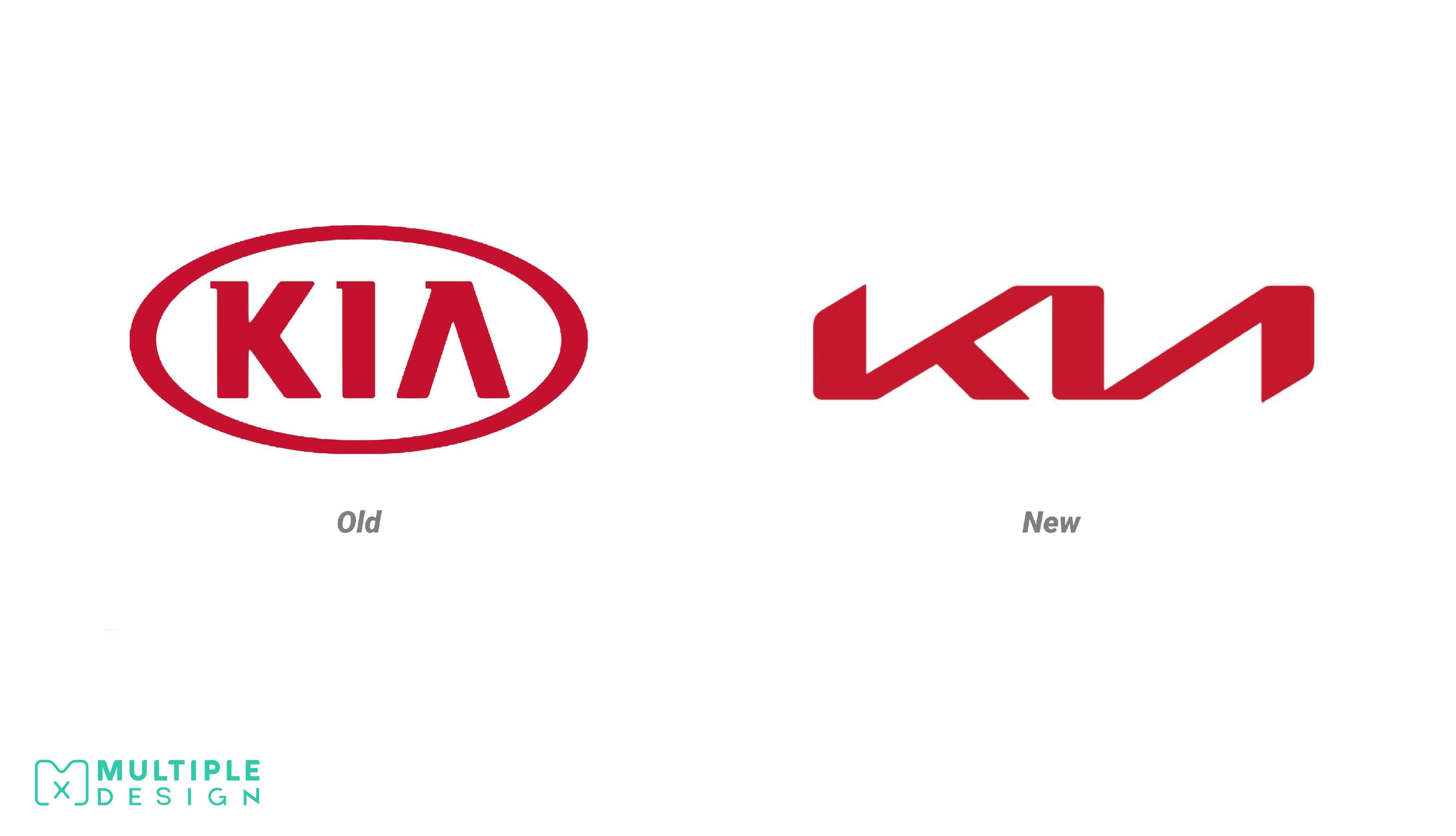
Kia
The logo is much more angular and stark. The bounding oval has been abandoned while the company colours have been retained. The design will debut later in the year alongside their range of hybrid and electric models.
I personally love the new design direction. I think the futuristic styling will work nicely with their new range of electric models. My only concern is the readability of the lettering from a distance.
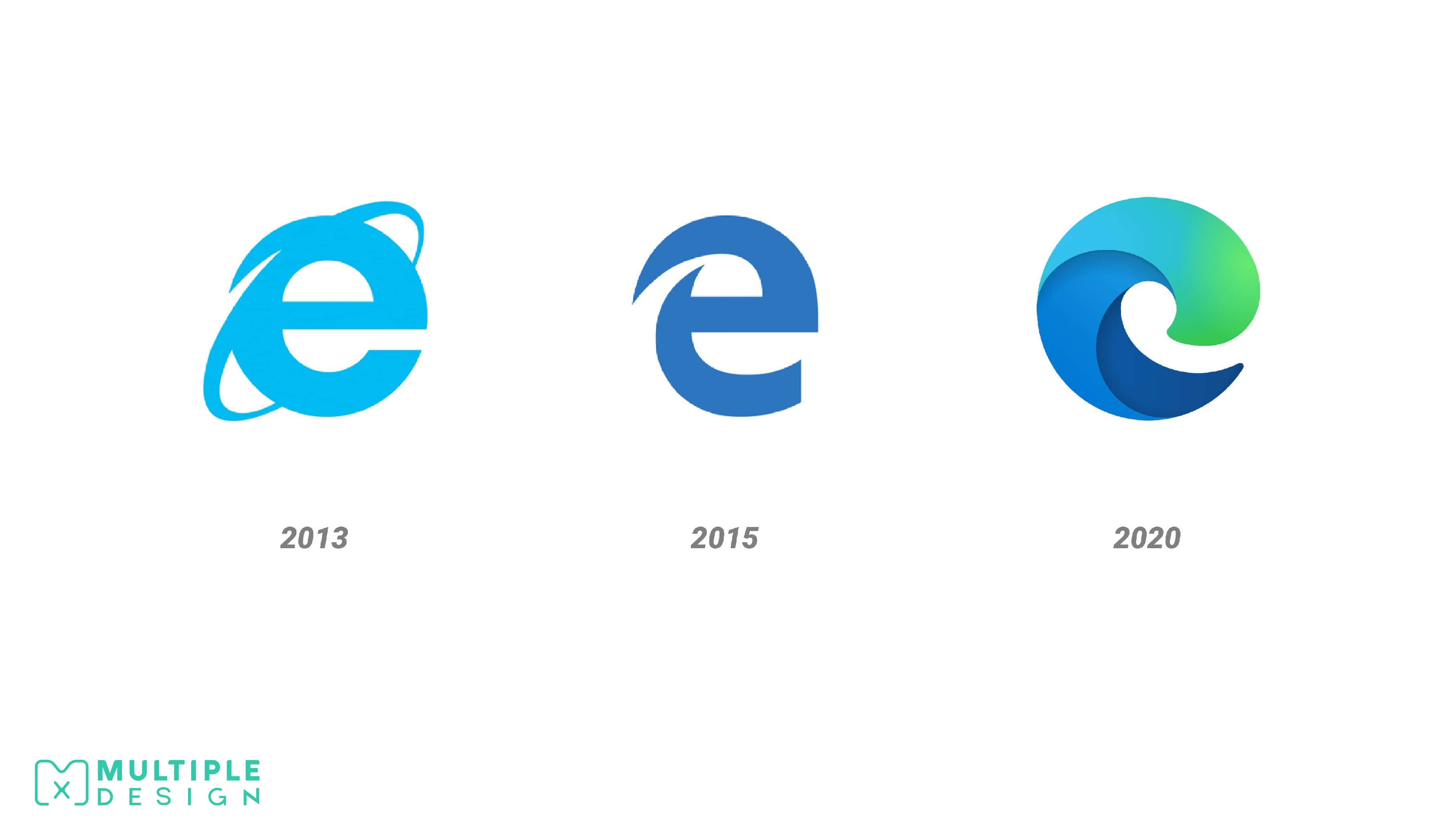
Microsoft Edge
Microsoft is currently in the midst of a year-long redesign of their signature apps in a attempt to re-enter the market, now dominated by Google Chrome. Edge, previously known as Internet Explorer, is their web browsing app and is powered by Chromium. The logo is much more playful and abstract. Like the rest of the new Microsoft app logos, it includes a colourful gradient in hues of blue and green.
Personally I am not a fan of the design. It looks too generic to me, and very similar to the logo for Mozilla Firefox. When you rely on a gradient in your logo, it creates a challenge on how you showcase this in flat or monochrome colours. The 2015 Edge logo also looked odd to me, but I understood that they needed a new identity with the name change. I loved the original Internet Explorer logo, and was hoping they would have took more influence from that design.
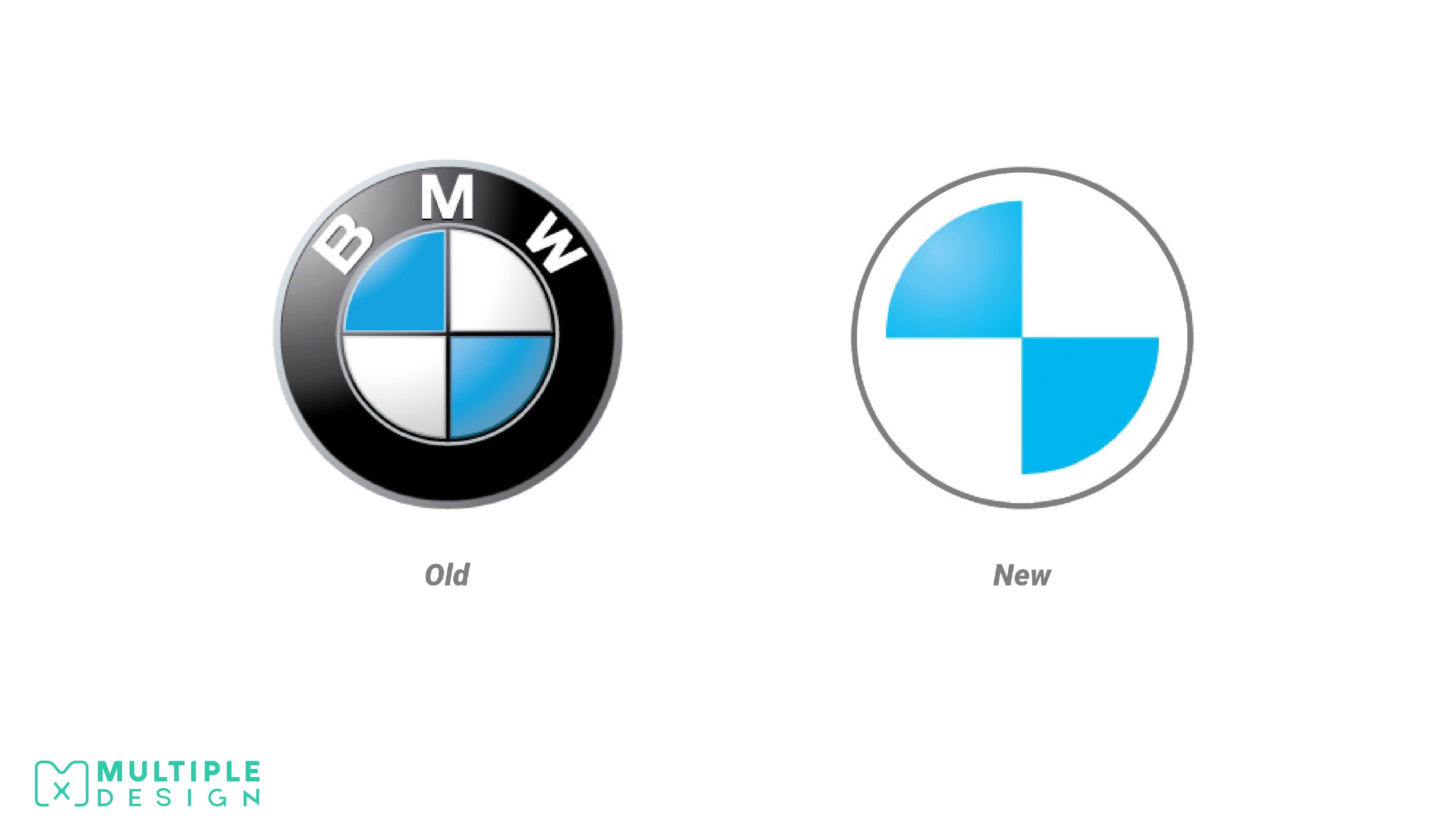
BMW
The BMW logo, which dates all the way back to the company's beginnings more than a century ago, is getting a redesign. The white and blue represents the spinning of a propeller on a blue sky to represent their beginnings as aeroplane manufactures, as well as the colours of the Bavarian state. The new design retains these elements but removes the lettering and black border. The logo is transparent, giving it a different appearance depending on the colour of the vehicle it's on.
Although its a simple change, I like it. The company no longer needs their name on the logo, as their brand has become that strong.
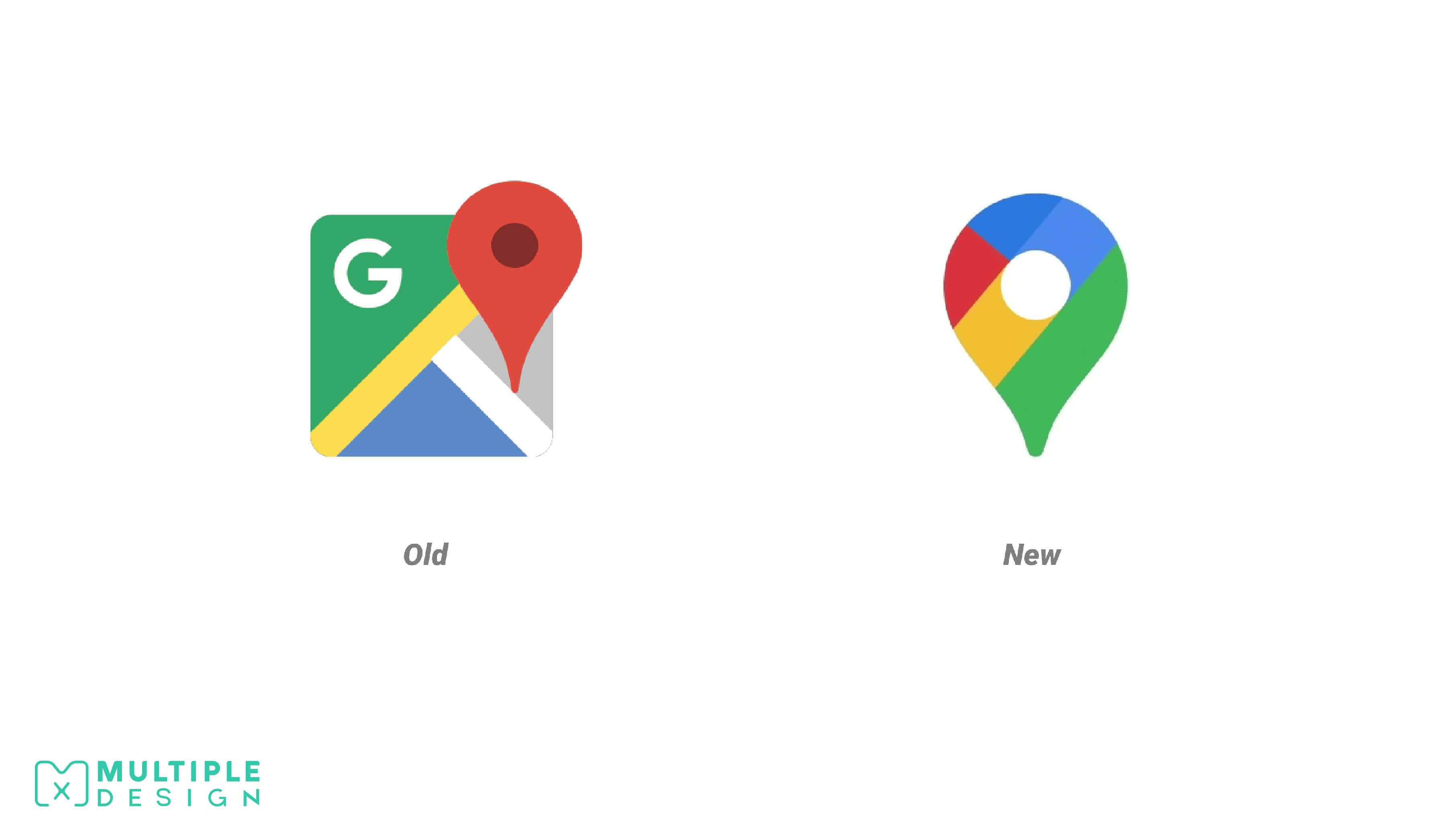
Google Maps
To celebrate its 15-year anniversary, Google Maps had a refresh with a new app design and a new logo. Instead of featuring a road, the Google logo and a dropped pin, the new logo is now a single multi-coloured pin.
I like the new design. Their previous logo looked too busy, so I appreciate the cleaner look. I am also happy that the "G" has been removed.
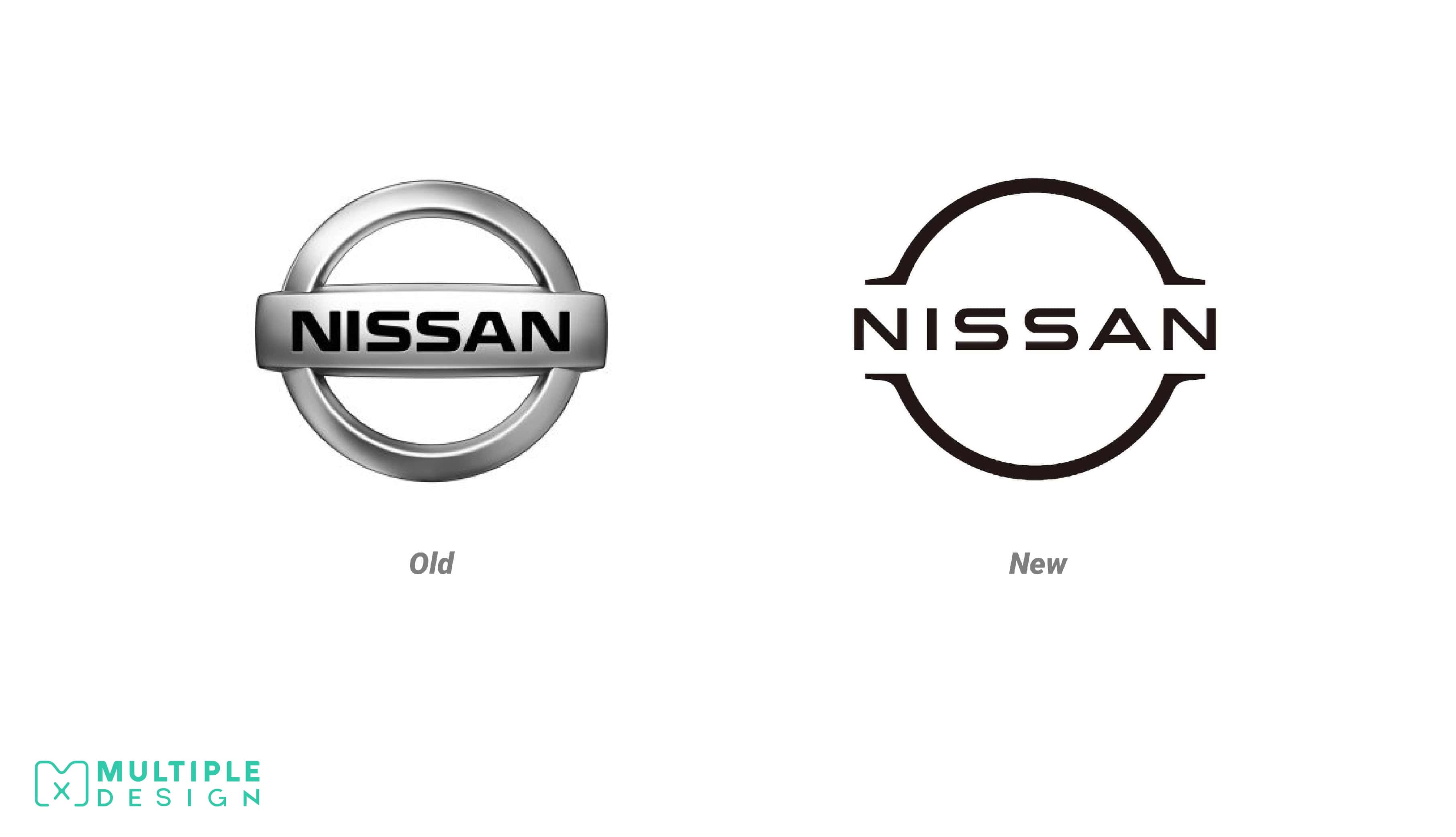
Nissan
Nissan has recently filed a trademark for a new logo. The new design is more minimalistic, ditching the existing simulated chrome finish and three-dimensional appearance. The lettering has been slightly tweaked, and is now thinner and spaced out.
I like the change. It recalls efforts made by BMW and other automakers to modernise their image using simpler, cleaner forms.
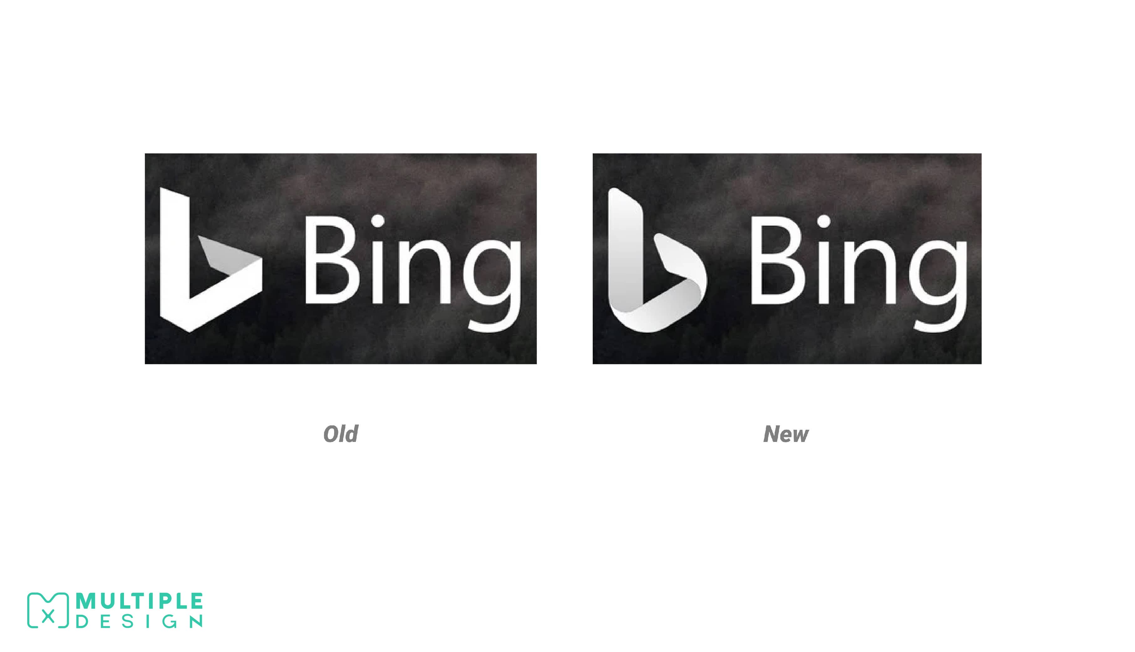
Microsoft Bing
The most apparent change with the new logo is that it's much curvier than the older one. There's a nice hint of shading and depth to it as well, but it otherwise sticks very close to Bing's signature lowercase "b" branding. The new design will start appearing on web searches over the next few weeks.
I like it. It sits nicely with Microsoft's fluent design vision that's circulating to all of their icons and logos these days.
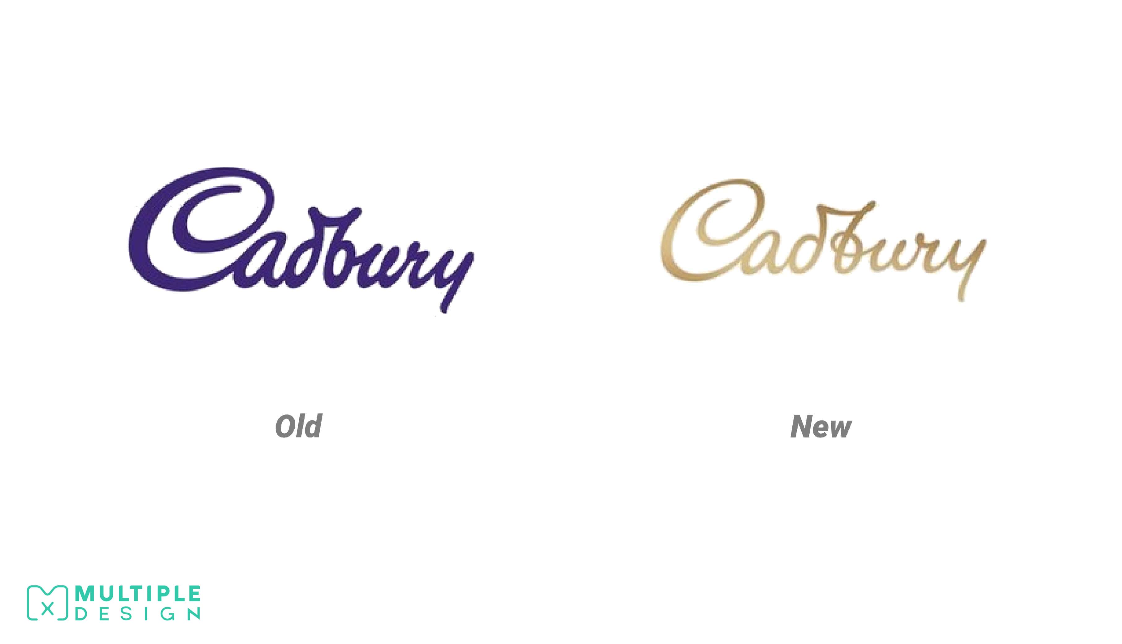
Cadbury
The company has changed its logo for the first time in 50 years, with a design that nods back to Cadbury's original 1921 signature. Cadbury Australia is set to roll the new look out to coincide with the launch of a new chocolate bar, Marble. The typography has been redesigned to make it look more natural, authentic and high quality.
I really like it. It's very subtle, but it looks a lot more refined, with the added loop in the "b" helping it flow more seamlessly. I'm hoping they do use the purple in the future. It looks like the gold variant is for their Marble bar.
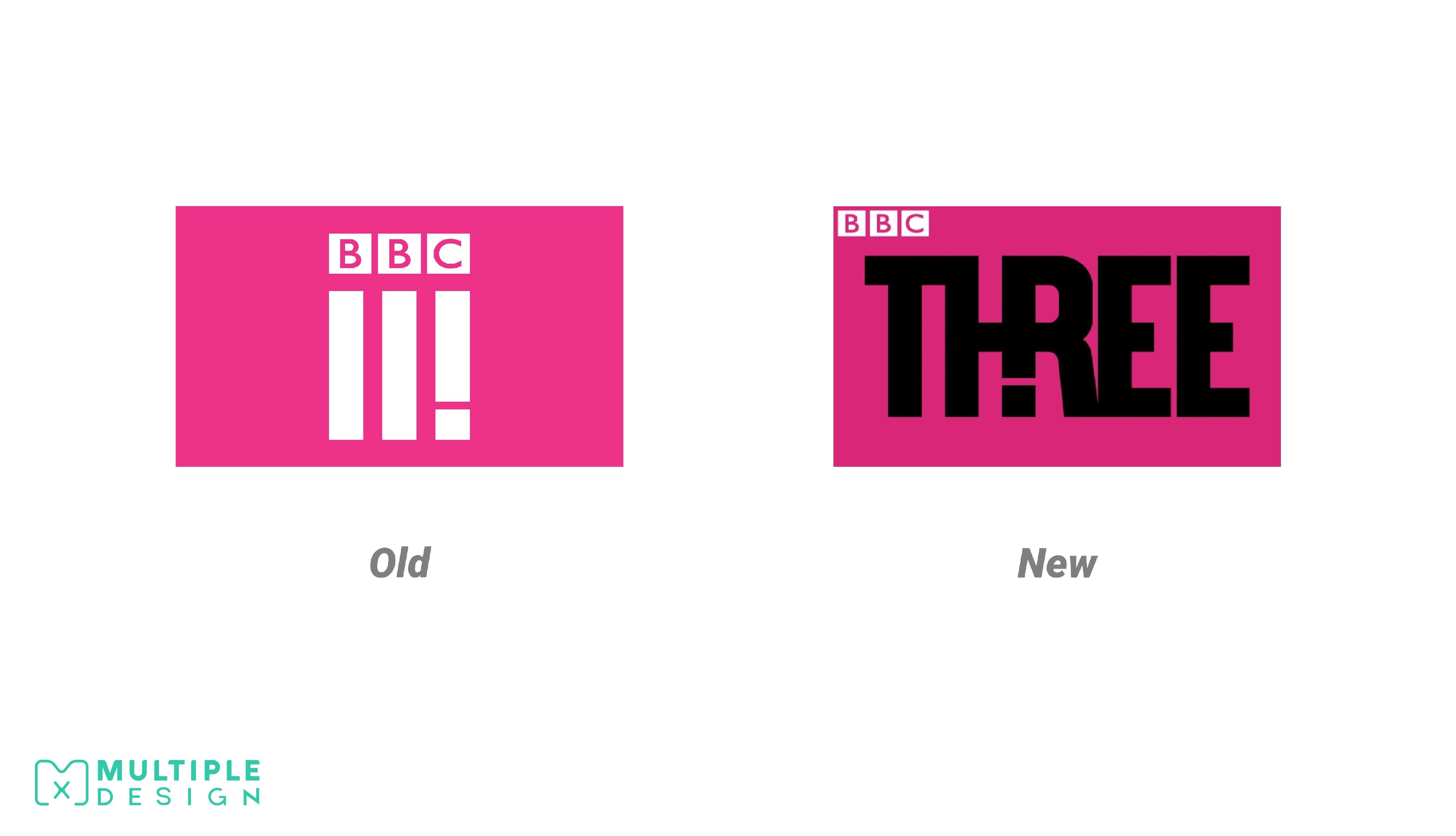
BBC Three
Their previous logo received mixed reviews when it was revealed in 2016. It's goal was to work as both a logo and a app icon, after the channel was disbanded in favour of a online streaming platform. The current logo now places more emphasis on lettering rather than roman numerals, cleverly hiding the exclamation mark in the "H".
Personally I'm not sure about the design. I was never a fan of the previous logo either. It's not immediately obvious that it is meant to be a exclamation mark in the "H" and feels a little incomplete. I am also a bit confused on what the significance of an exclamation mark is for the brand.
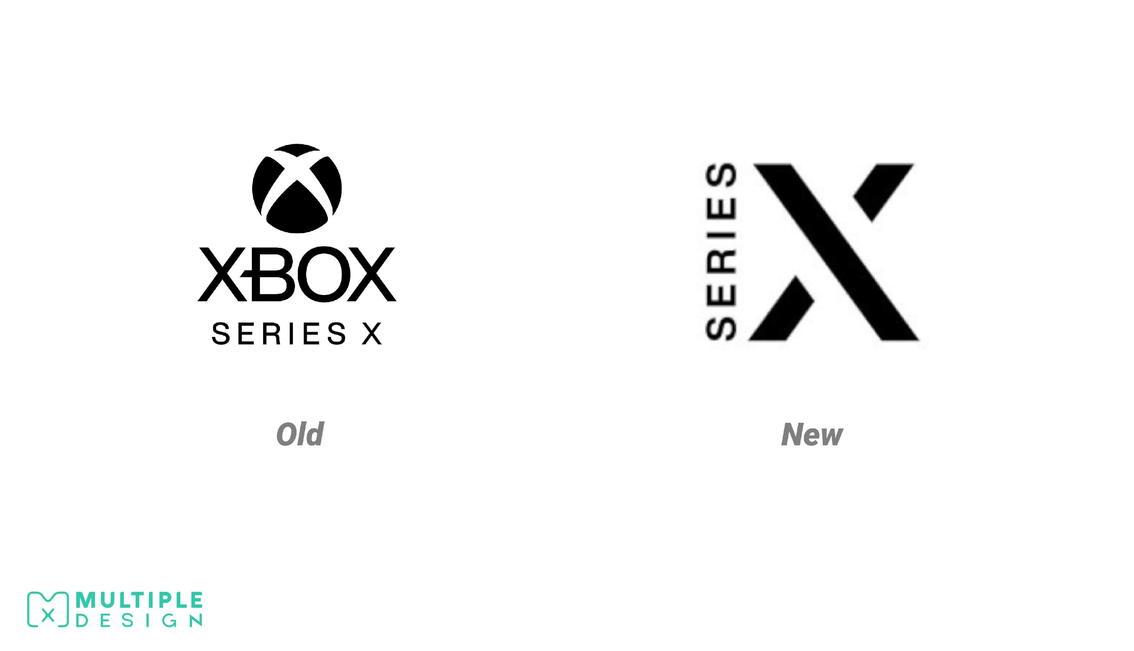
Xbox Series X
Microsoft has officially filed a trademark for the logo of its upcoming Xbox Series X console. The new design features the word “Series” vertically across a stylised "X". The style is much more minimalistic and does not include any of the green colours seen in previous iterations.
I'm not really a fan of this design. It looks too generic. I'm hoping its just a trademark and nothing more.
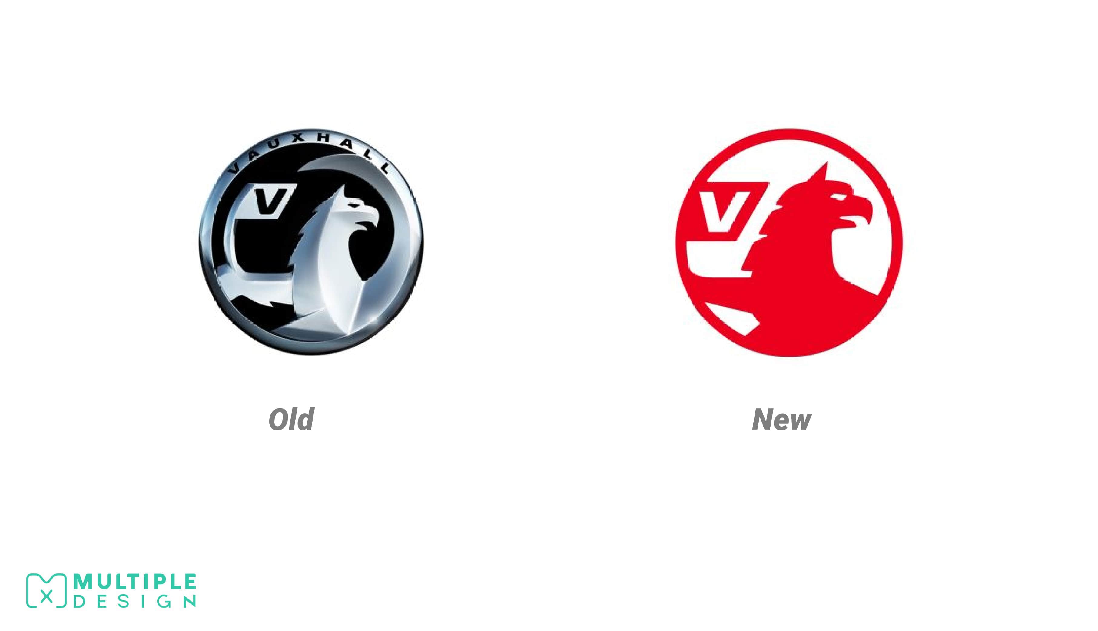
Vauxhall
British car manufacturer Vauxhall has unveiled their new logo, in the first update to their brand since 2008. The new design now appears on Vauxhall's website and social media pages. It is likely to appear on newer car models in the next few months. Vauxhall has seemed to follow suit this year with the rest of the other car companies including BMW, Nissan and Kia who have removed their 3D effects in favour of a flat design.
Although slightly unexciting, I like the flat design. However, it seems to be missing some of the features of the original, including the flag pole and the griffins wing.
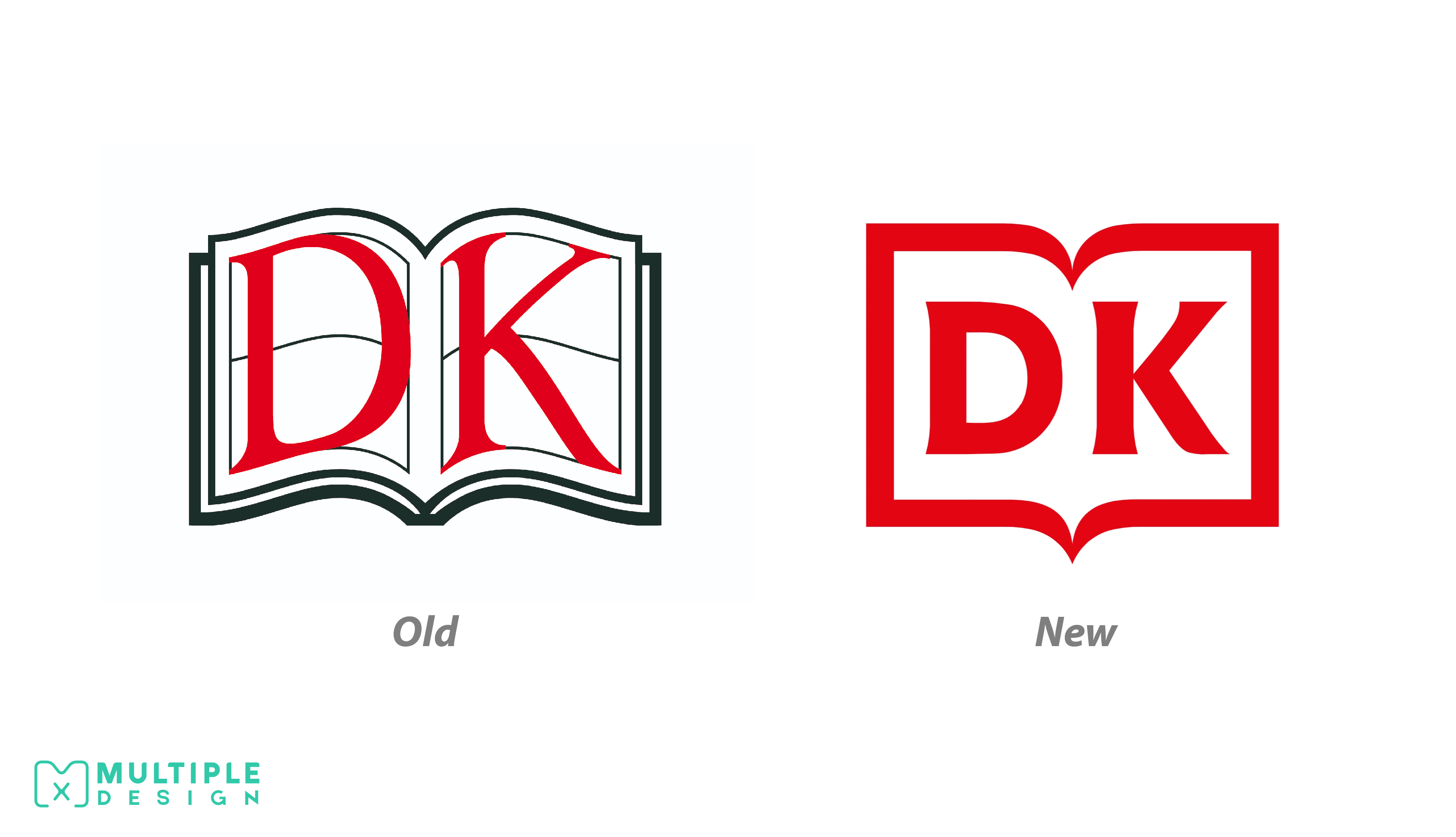
DK
Dorling Kindersley, better known as DK, has refreshed their logo with a clean design. Their older design suffered from overdesign, whereas it was cluttered, over detailed, and in this day and age - not suitable to digital platforms.
I am also pleased they kept their serif lettering, which is something that ties in nicely to a publishing company. The use of one colour is makes it suitable for use on web and mobile.
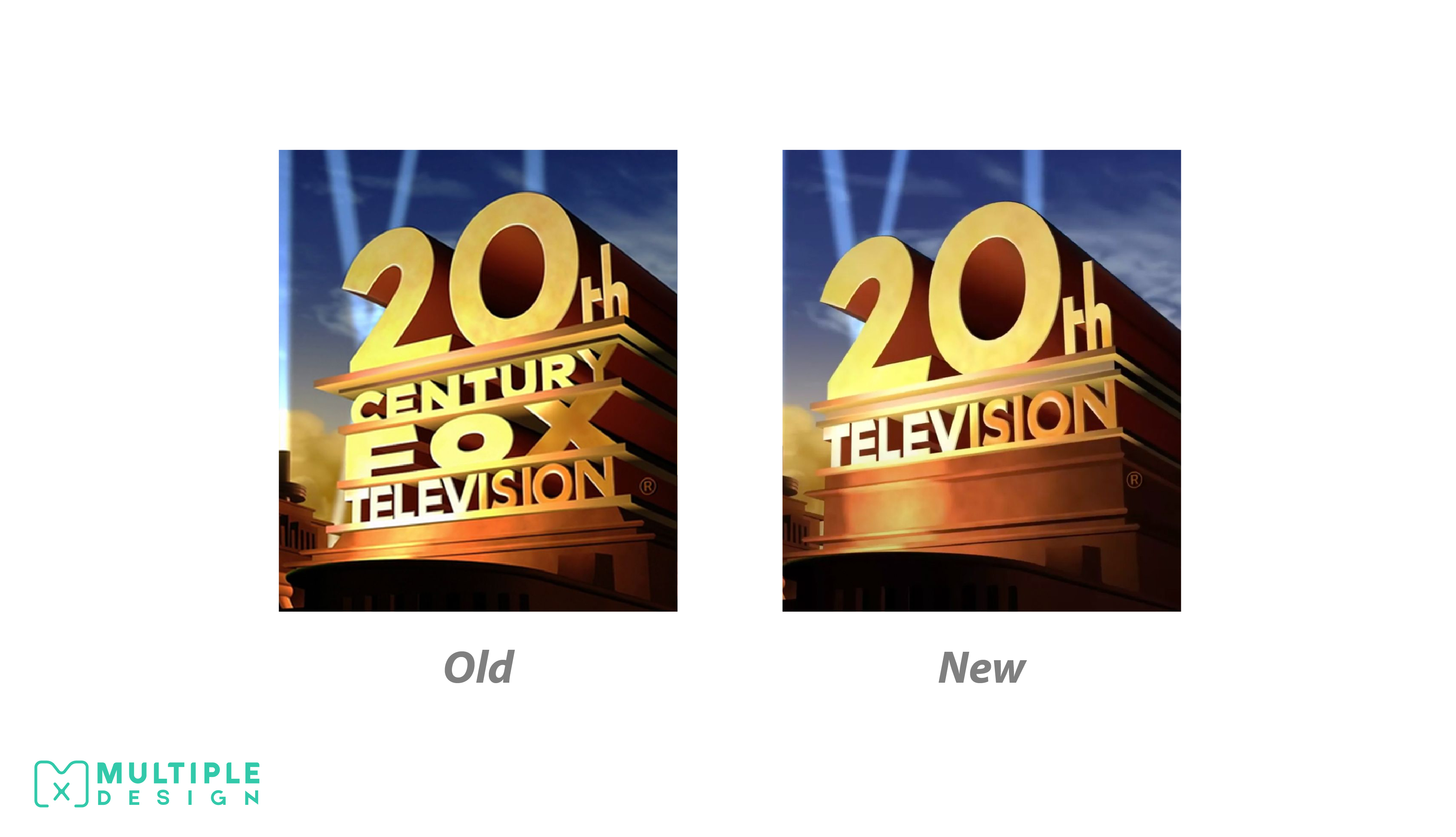
20th Television
In March 2019 Disney purchased 21st Century Fox, and all their subsidiaries, including 20th Century Fox Television. Disney was quick to shorten the brands name to 20th Television with the logo following suit.
The previous design felt overstuffed, with “Fox” appearing stretched. It also presented an issue when scaled down, with the lettering hard to read. The logo still maintains the iconic fan fair and searchlights.
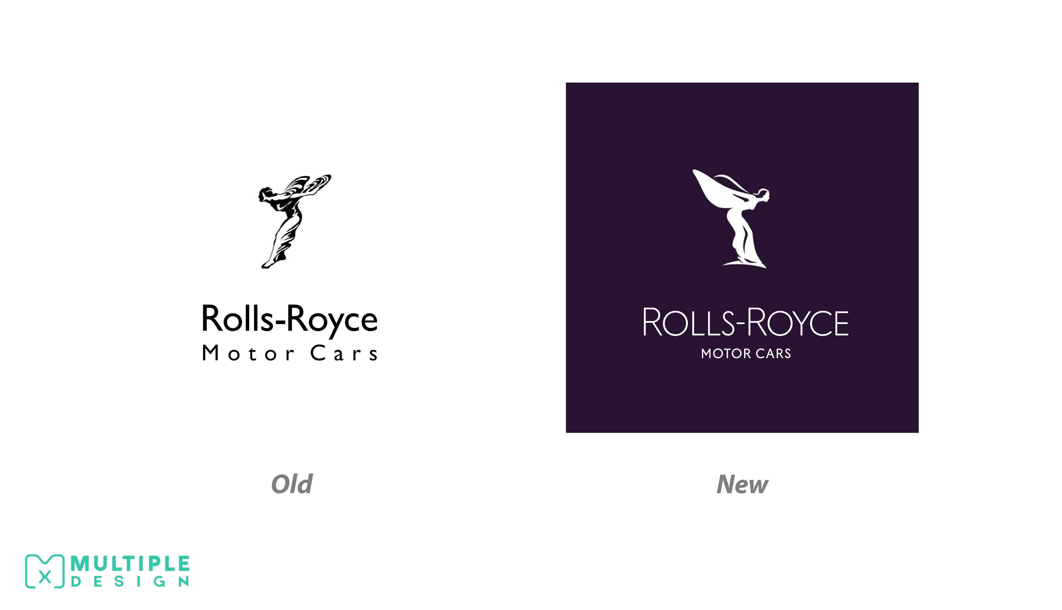
Rolls Royce
Rolls Royce has subtly overhauled its iconic Spirit of Ecstasy emblem, reducing the amount of detail, and rounding off the edges so it works better on digital platforms. The figure has also been angled slightly, so it appears to be moving forward, rather than backwards.
A new typeface was also unveiled for the company, which is thinner, capitalised and current. The company have also opted for a dark purple colour scheme unlike the black and white of the previous decades. Their other emblem, the double R monogram has been retained. Although subtle, I like the change.
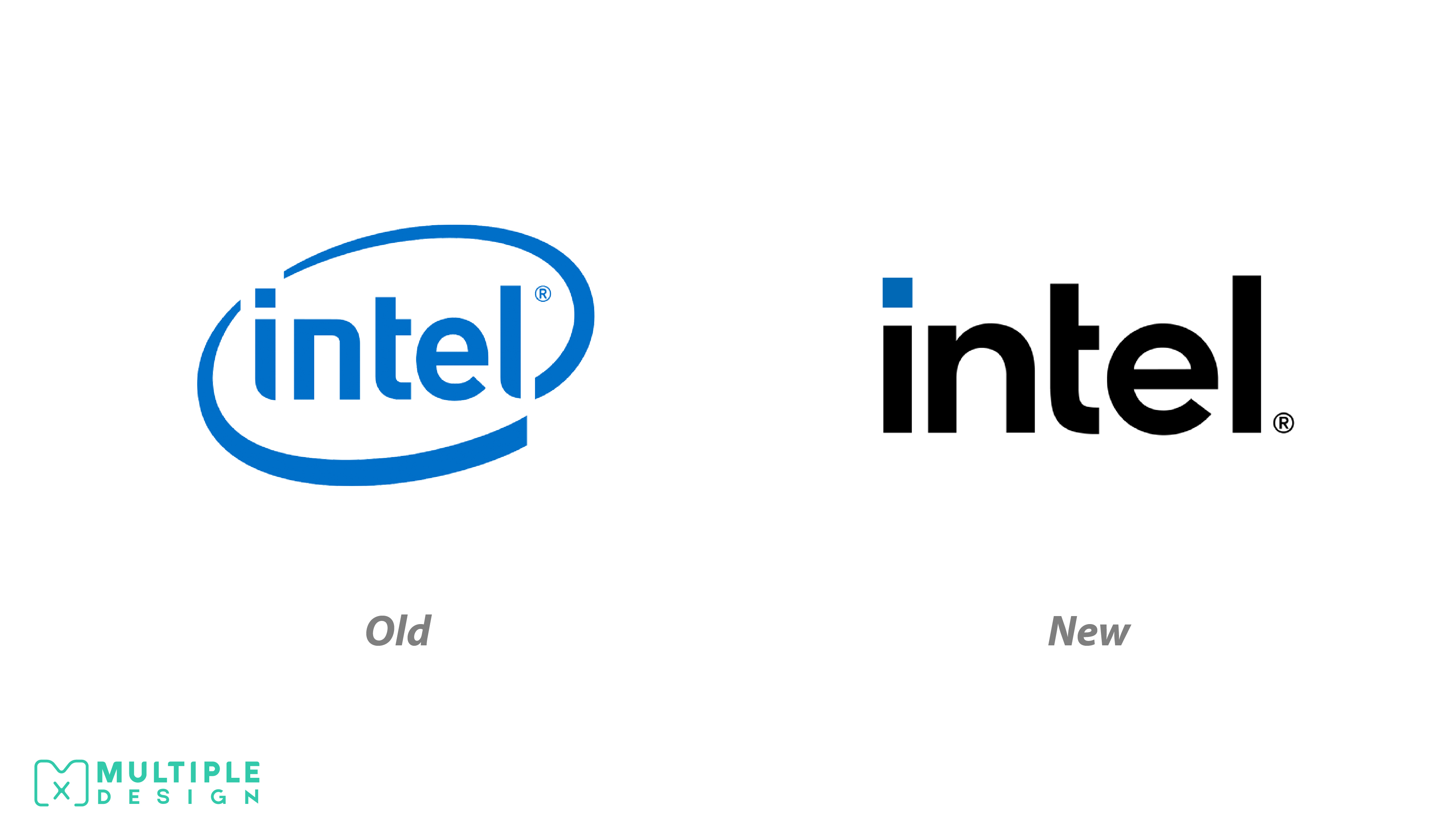
Intel
Intel has rebranded for the fourth time in 51 years. After several years of evolution for the company, ranging from processors to software, their branding remained largely unchanged. The new design is not a drastic change, the biggest being the removal of the ellipse. The lettering is different but is familiar to the brand. Blue remains their dominant colour for the brand.
I like the new lettering a lot, however the design seems like its missing something extra. It could be developed a little further.
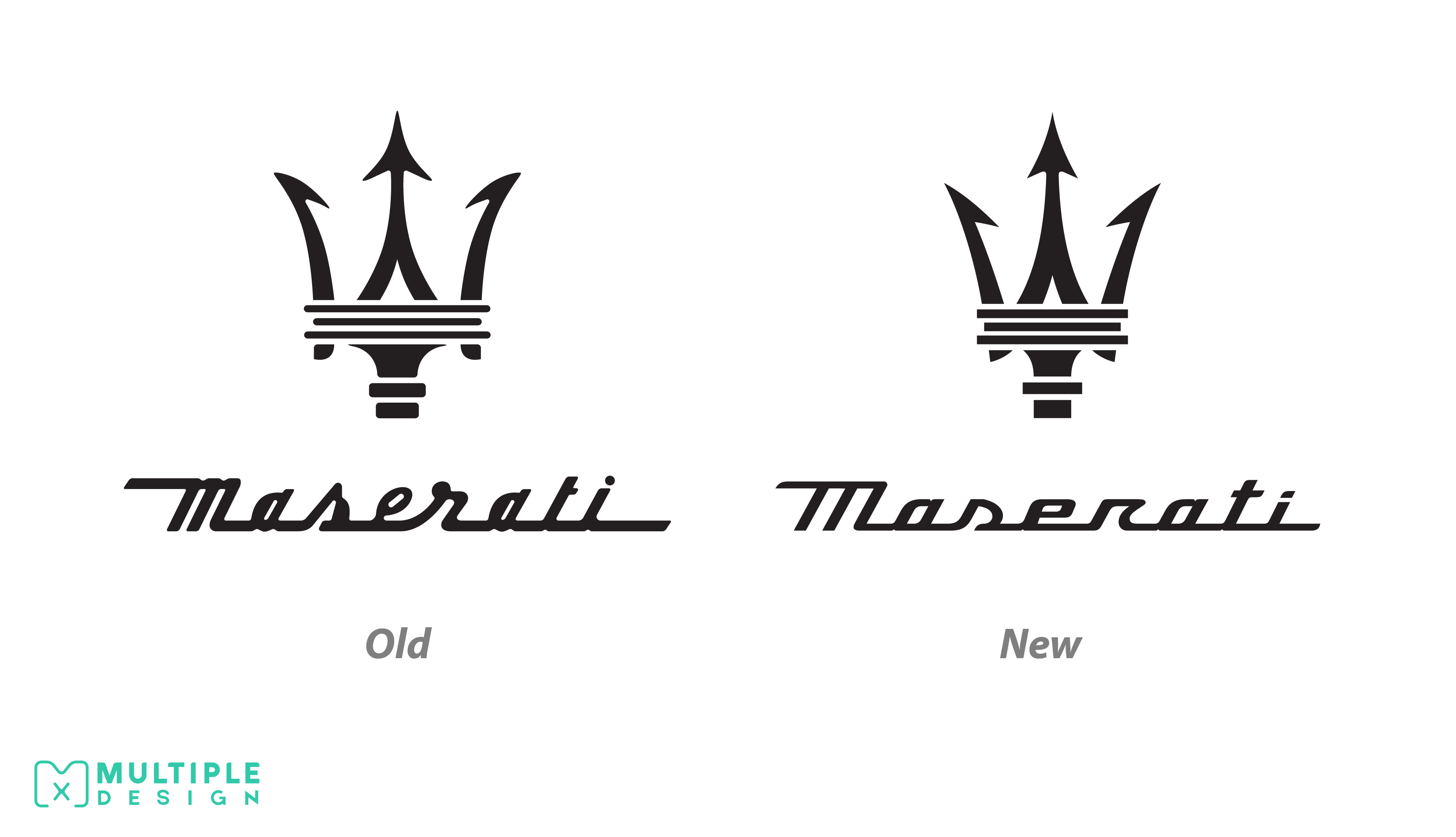
Maserati
The updated logo debuted on the new Maserati MC20, a turbocharged super sports car. At first glance, the changes to the trident are easy to miss. Although subtle, it is now narrower, sharper, and straight edged at the bottom. There is also a new wordmark, with the text becoming sharper and more streamlined. The company have opted to display the logo on their models in a satin chrome finish, replacing the glossy one they used previously.
I like the changes to the logo as it helps keep it neat and fresh. I am a fan of the new lettering as it enhances the readability, while also looking classy and polished.
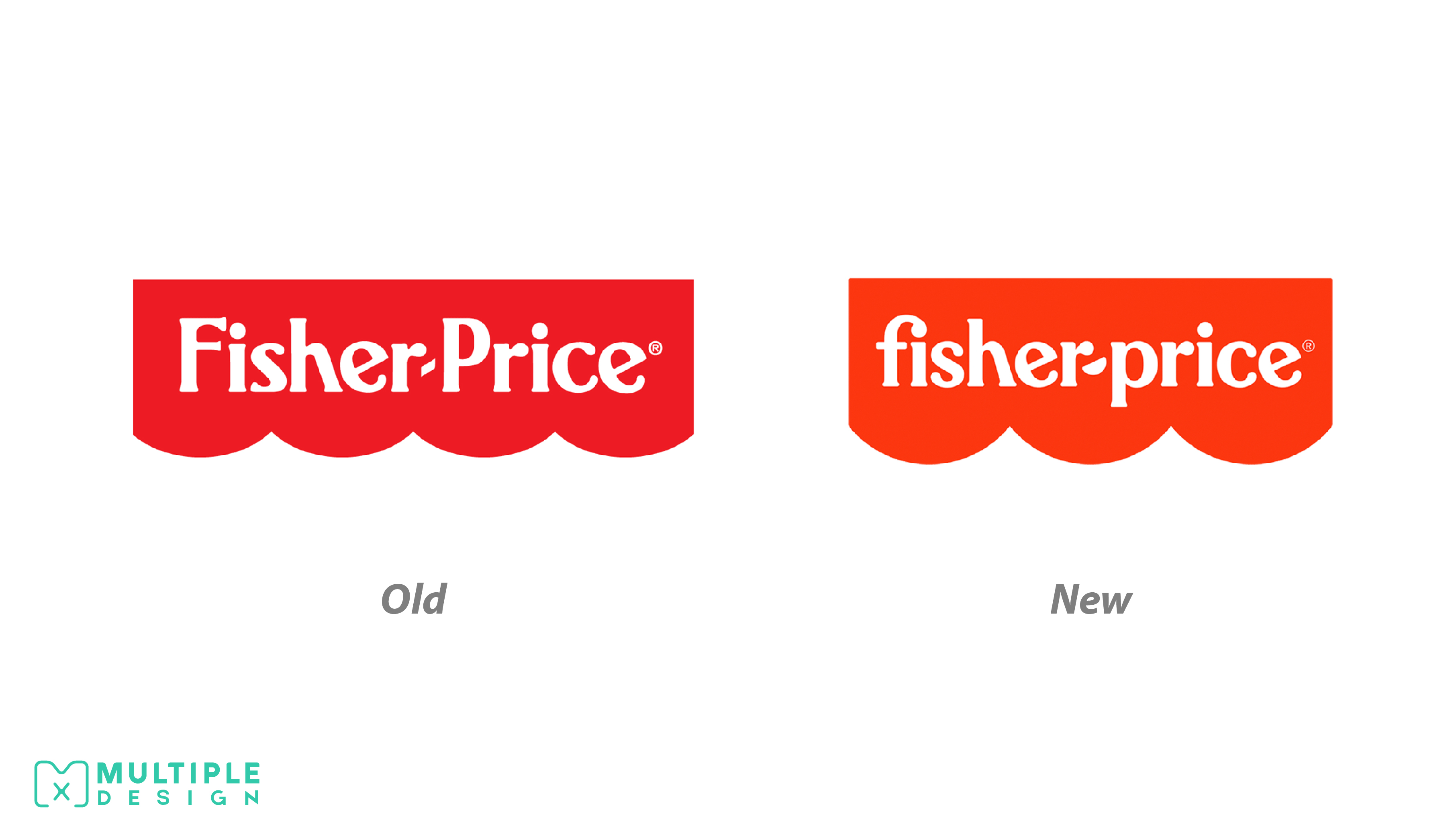
Fisher-Price
The new design has some small but important changes. The lettering has been updated but retains a childlike vibe like the original. The semi circles on the background have been reduced to three rather than four.
I like the new logo. The lettering looks more playful and kid friendly. I especially love how the “f” and the “i” are joined nicely. I would have preferred if they updated the “h”, as it looks a bit awkward.
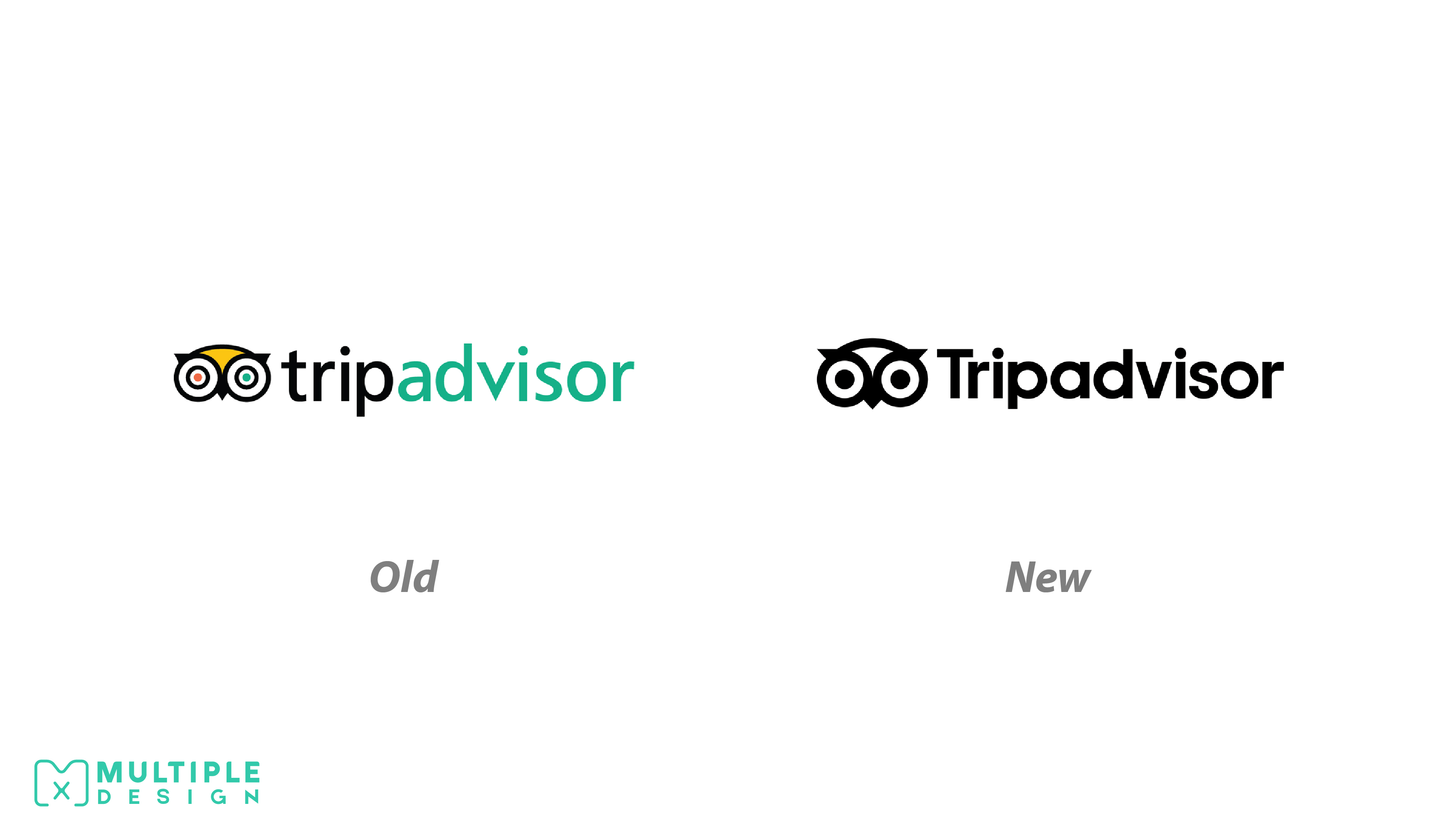
Tripadvisor
Tripadvisor unveiled its new logo at the start of the year, and has now began rolling it out. The most obvious change to the design is the simplification of the logo mascot; Ollie the Owl. The colours have been removed, and now rendered only in black. The outline has been made much thicker and the geometry has been refined. These changes were made to help the logo work across multiple mediums. A custom typeface has also been designed, taking influence from the original typeface.
I personally think it’s a great change. I never liked the old logo as it looked dated even when it was released in 2000. The simplification of its colour palette is a strong decision.
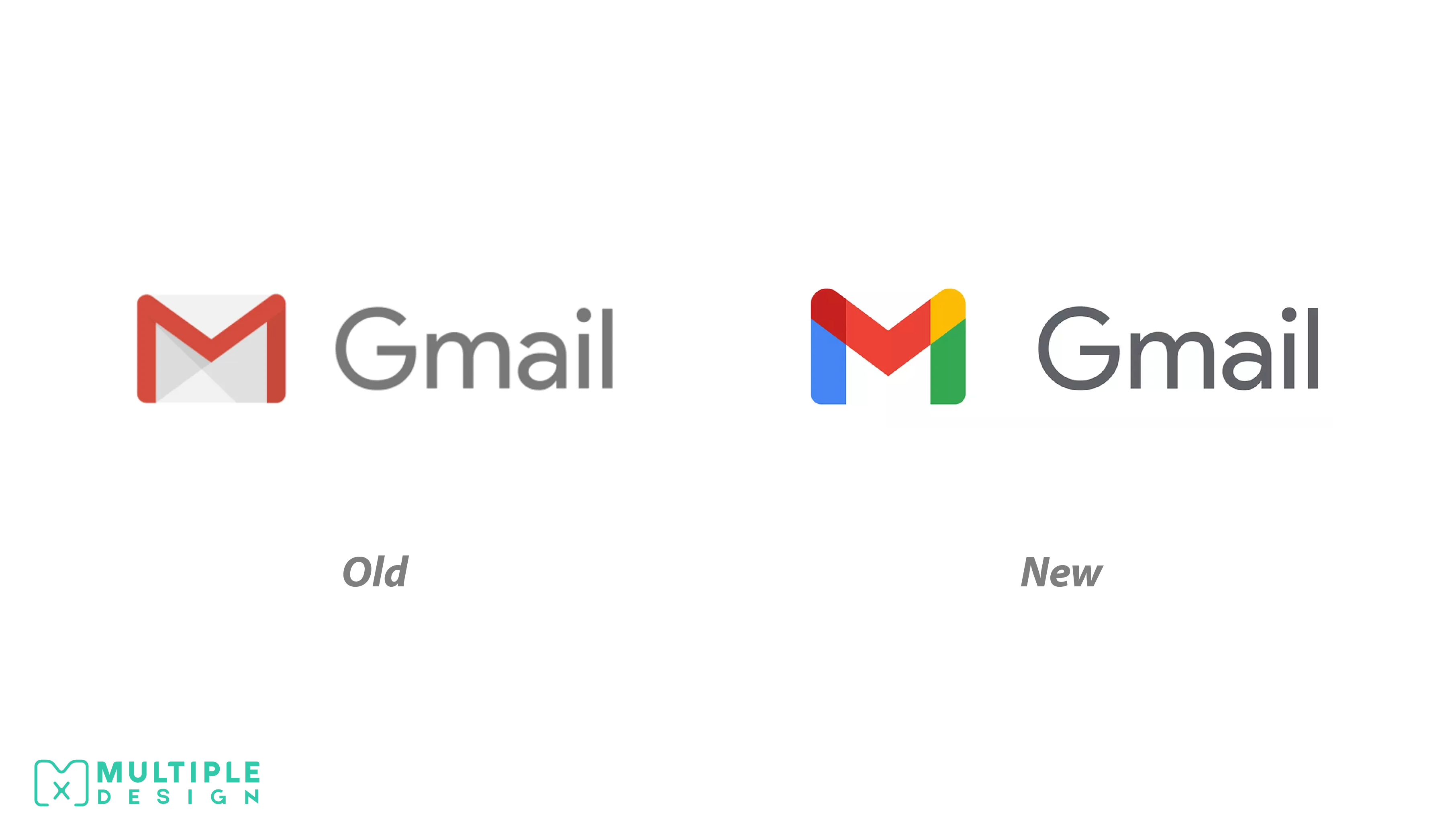
Gmail
Gmail has replaced its iconic “M” envelope logo with a design that fits in with the rest of Google’s products. The “M” is now made out of Google’s brand colours; blue, red, yellow and green. The brand colours are critical to Google’s brand, and allows each product to sit nicely alongside each other. This decision has also been criticised, with users complaining that the new logos simply look too similar.
I like the design. It is clean and contemporary and matches the rebrands undertaking for Google Maps, Google Photos, Google Chrome and the many other Google products. I think cohesion is important for a brand.
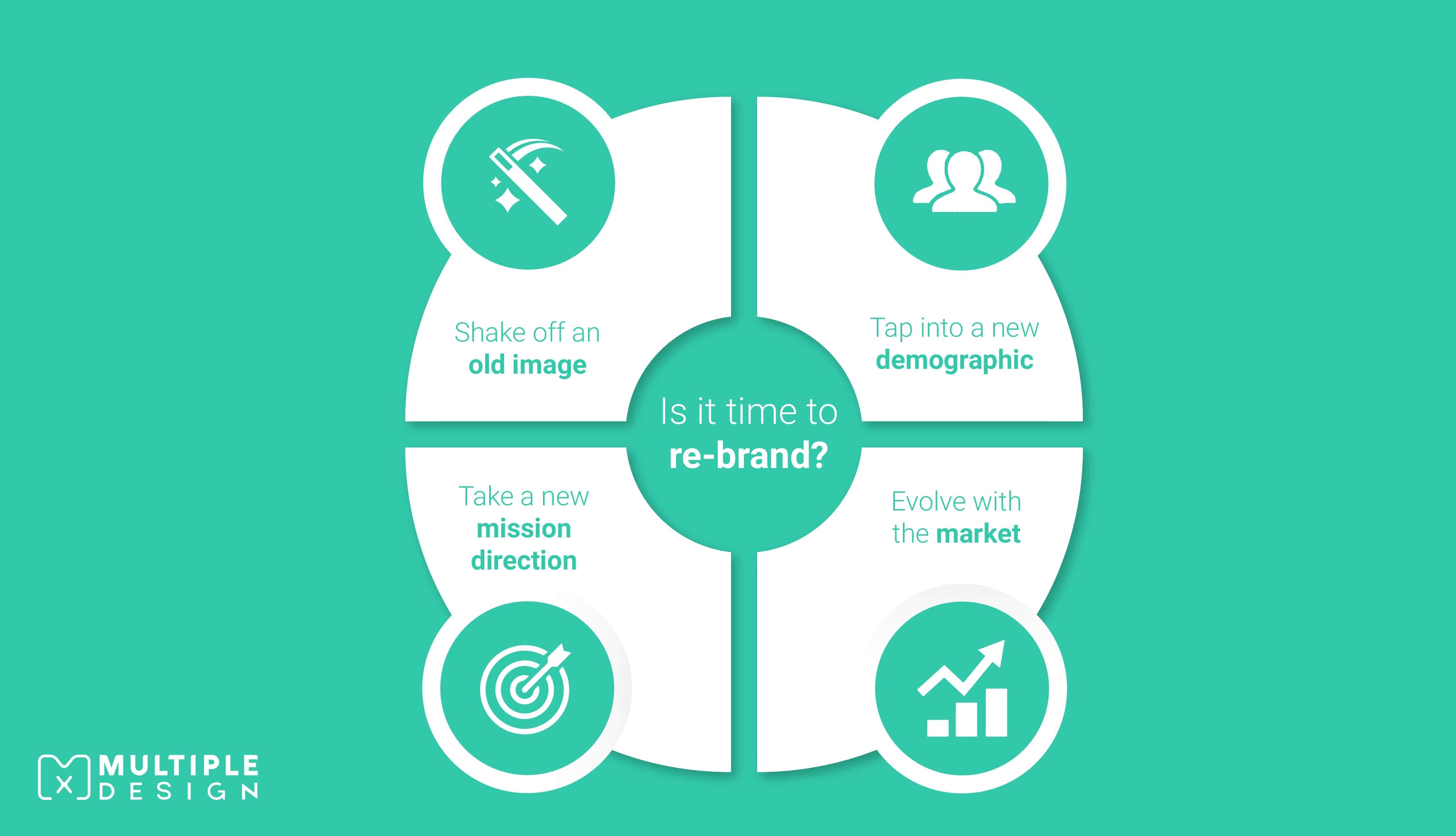
I am sure you have your own ideas on how a solid re-brand can help your business stand out from the crowd.
So get it right. Don’t rush it, and think about why you are re-branding in the first place. If you look at your logo and it just doesn’t represent your business anymore, then you might want to think about making some changes.
A strong re-brand is a step in the right direction in creating a stronger brand.
SEE ALSO: Stand out from the competition: The right way to re-brand your Logo >>
- About the Author
Ryan Marter works as a graphic designer for Multiple Graphic Design. He has years of experience in helping out established and start-up business develop their brand. Get in touch with him on info@multiplegraphicdesign.com


Leave a Comment