
You see these logos every day, but many of them have a hidden double meaning. Have you ever wondered why a logo looks the way it does. Not only do they help identify their product and service, but many make use of space to ingeniously convey secret symbols and lettering.
After years of working as a designer, I still love coming across a clever design, and reading about their development, and it turns out, you do too! So I have taken the time to compile this list of the ultimate logo design facts, and will be updating it weekly!
So get ready to have your mind blown!
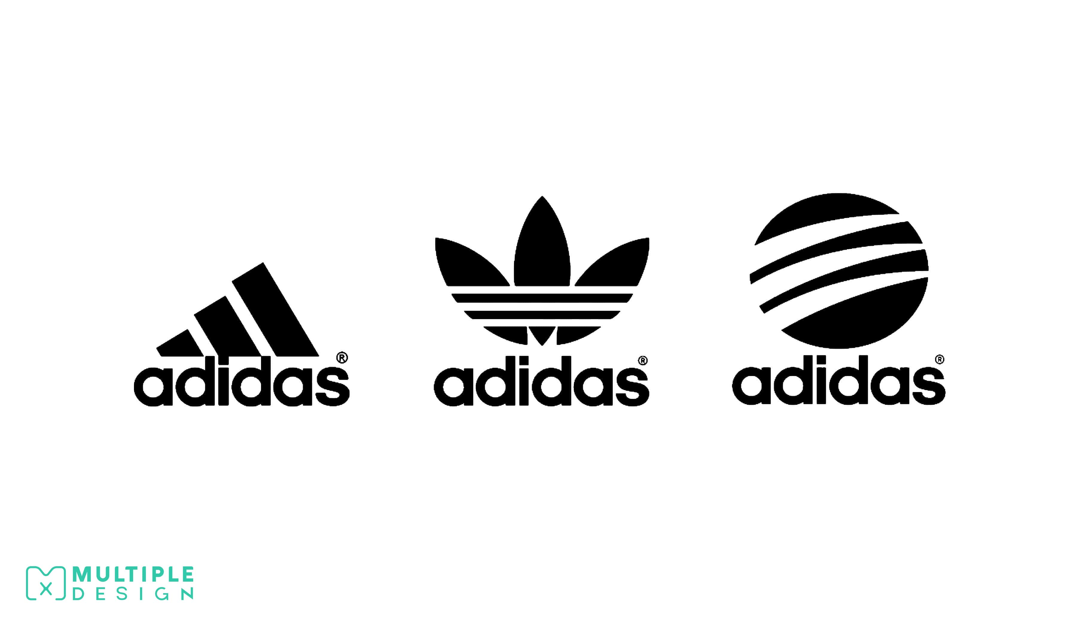
Adidas has three Logos
The first one is the Adidas Three Stripes, which is used on all their sport wear, and is probably the most recognisable out of the three. The second one is called the Adidas Originals, which is used on their premium lifestyle and fashion products. The third one is called the Adidas Neo, not as well known as the others, but is used on their standard lifestyle products.
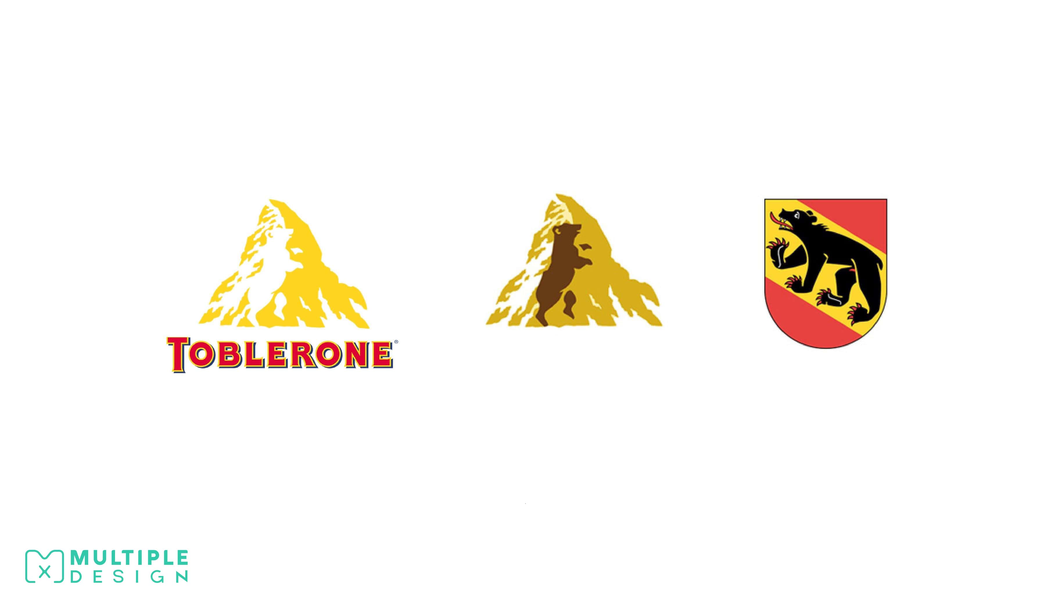
There is a bear hidden in the Toblerone Logo
The Toblerone chocolate makers are based in Bern, Switzerland. Bern is known as the “City of Bears” and has a bear on their coat of arms. The area is also home to the Matterhorn Mountain. This is a great example of incorporating a company’s roots and origins into their logo.
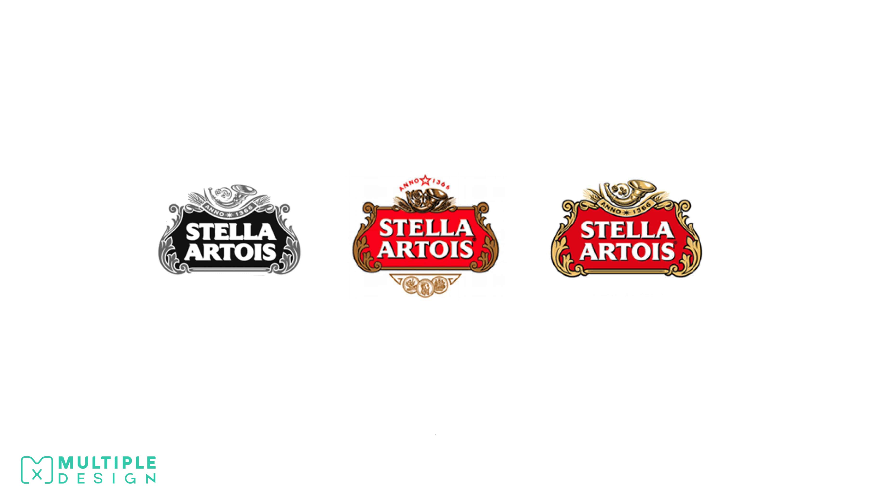
Stella Artois has been using the same Logo since 1366? This makes it the world’s oldest Logo!
The origins of Stella Artois can be traced back to 1366, when it was known as Brouwerij Artois. The company was renamed Stella Artois in 1708, and despite numerous shifts in management over the centuries, the logo has remained.
The design of their logo reflects the beer's origin from the city of Den Hoorn, Belgium. Den Horn is also Dutch for "The Horn". The now-defunct brewery lives on as the horn is proudly displayed on the top of the logo. The fancy frame around the name is representative of the style of the Flemish architecture found within the city.
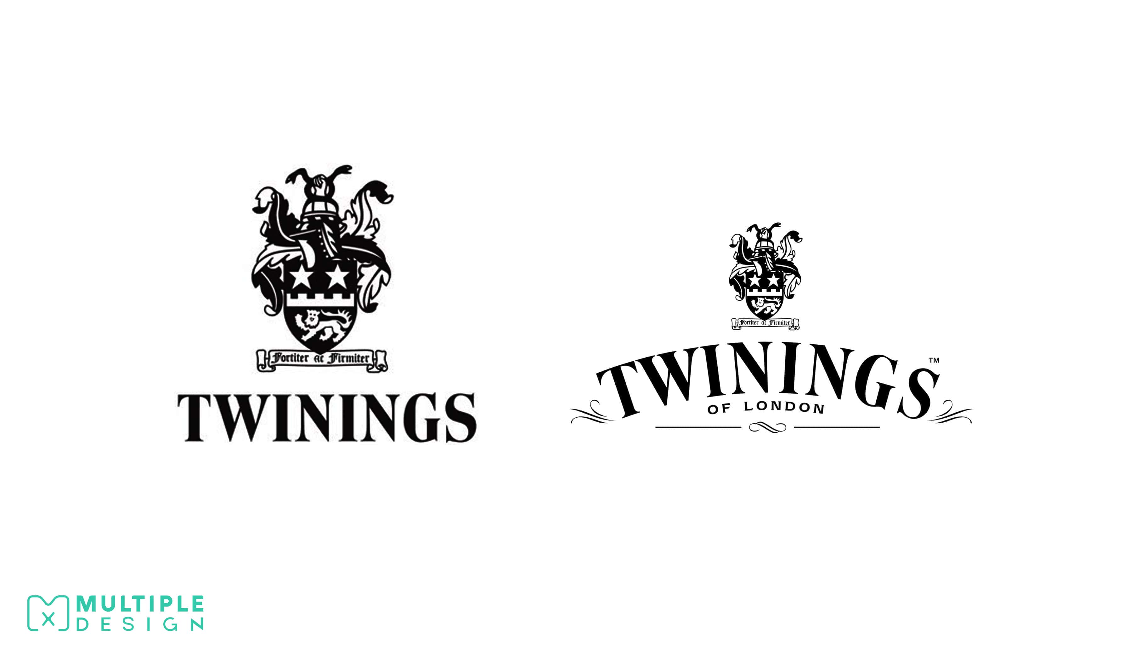
Twinings Tea holds the record for the world's second oldest Logo still in use.
Twinings Tea has been using the same lion crest logo for over 230 years. Even more remarkable is the fact that the company is still family run, passing down 10 generations, and occupying the same location in London’s strand since its founding.
Twinings is now recognised globally and currently distributes its tea to more than 100 countries worldwide.
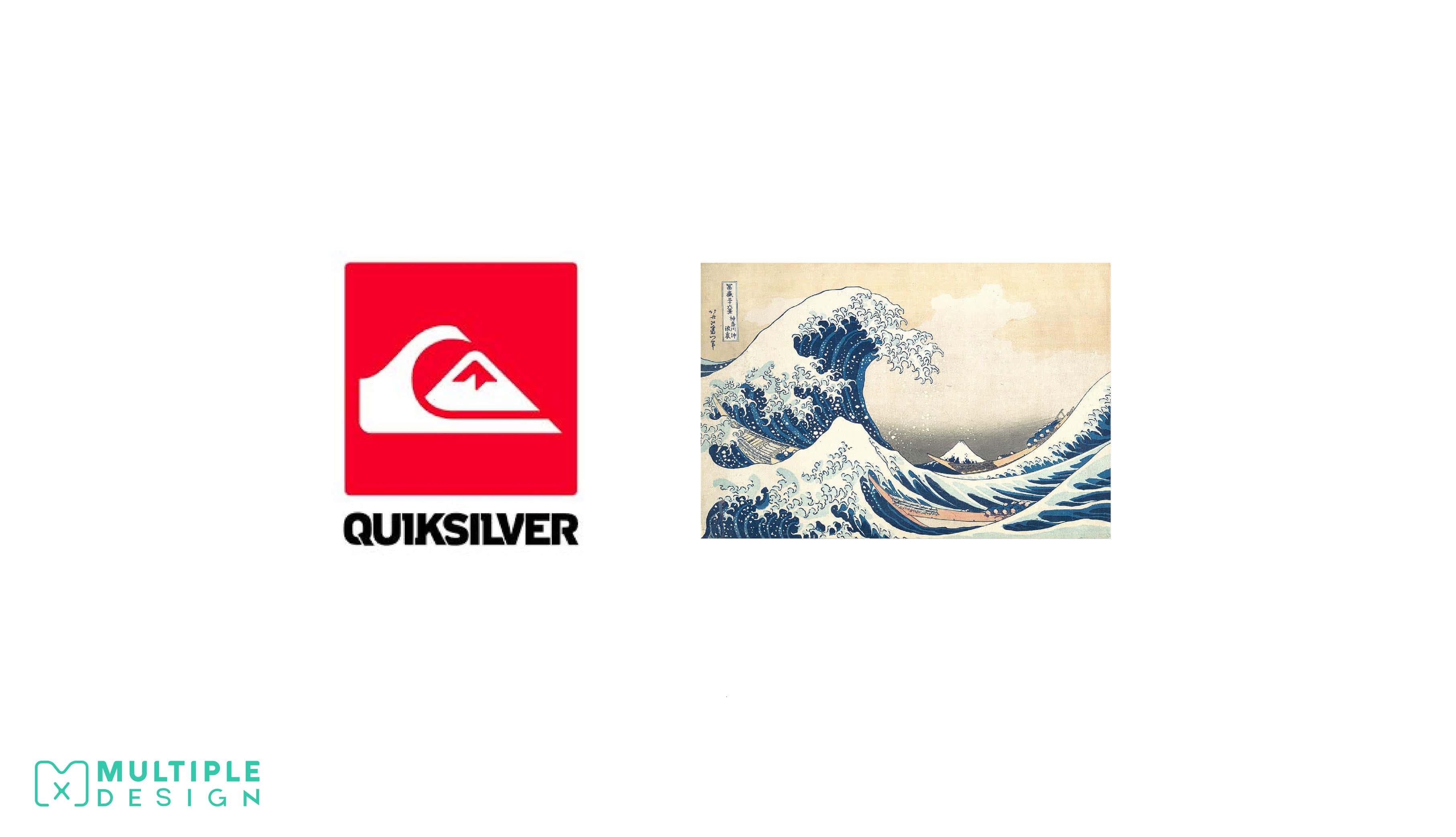
The QuikSilver Logo is a stylised version of the famous “Great Wave” woodblock print
The Australian clothing company QuikSilver specialises in surfwear, and wanted to showcase this in their logo, deciding to depict the world’s most famous wave. The logo consists of a large wave with a mountain on a red background, a direct reference to Hokusai's famous woodcut “The Great Wave off Kanagawa”
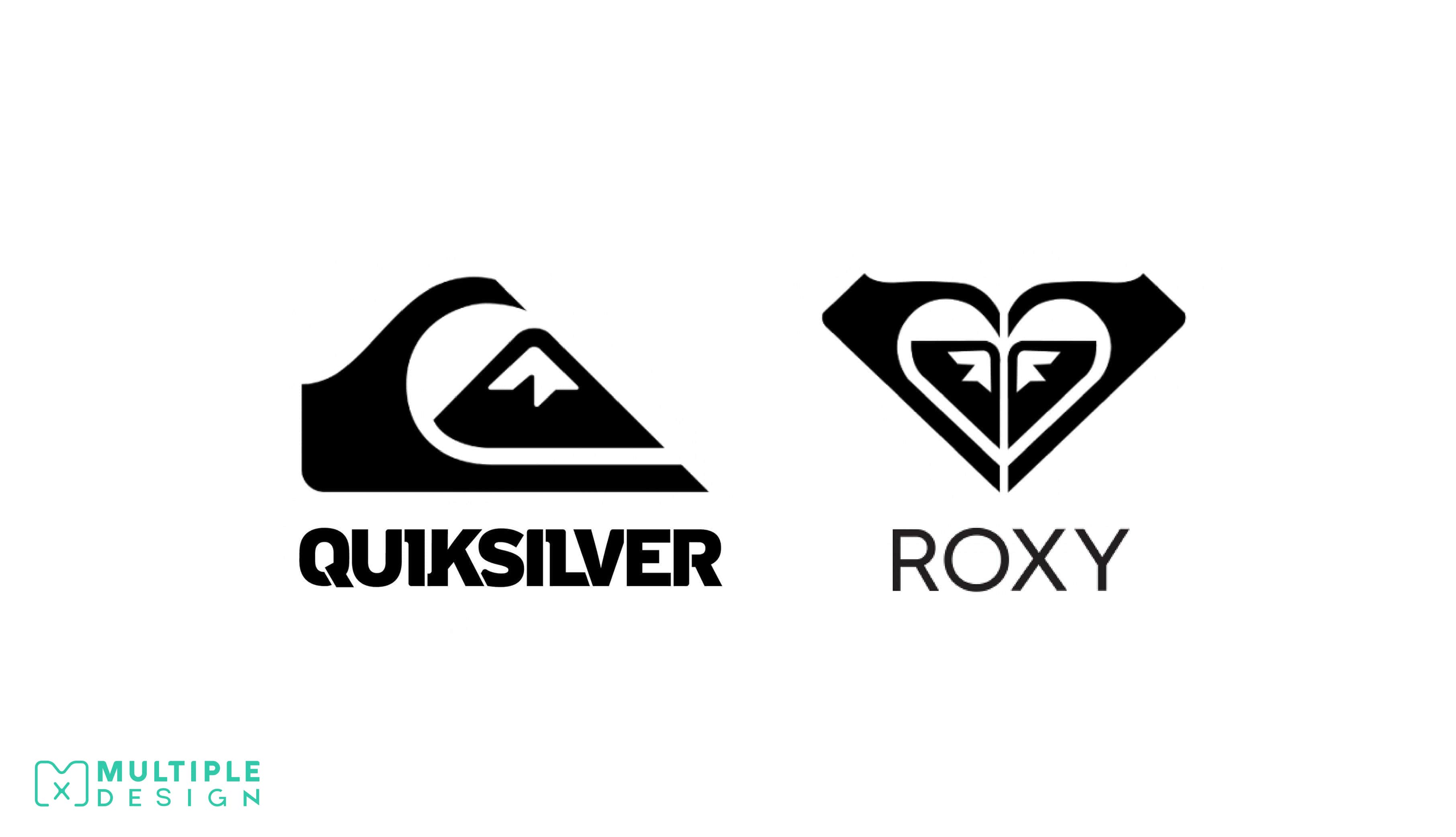
The Roxy Logo consists of two Quiksilver Logos rotated to form a heart?
Quiksilver is an Australian clothing company, and currently the world’s largest manufacturers of surfwear and boardsport related equipment. Roxy, which was established in 1990, is an offshoot brand of Quiksilver, who sell clothing and accessories geared towards women. It's logo was created by combining two Quiksilver logos, turning them on their sides and forming a heart.
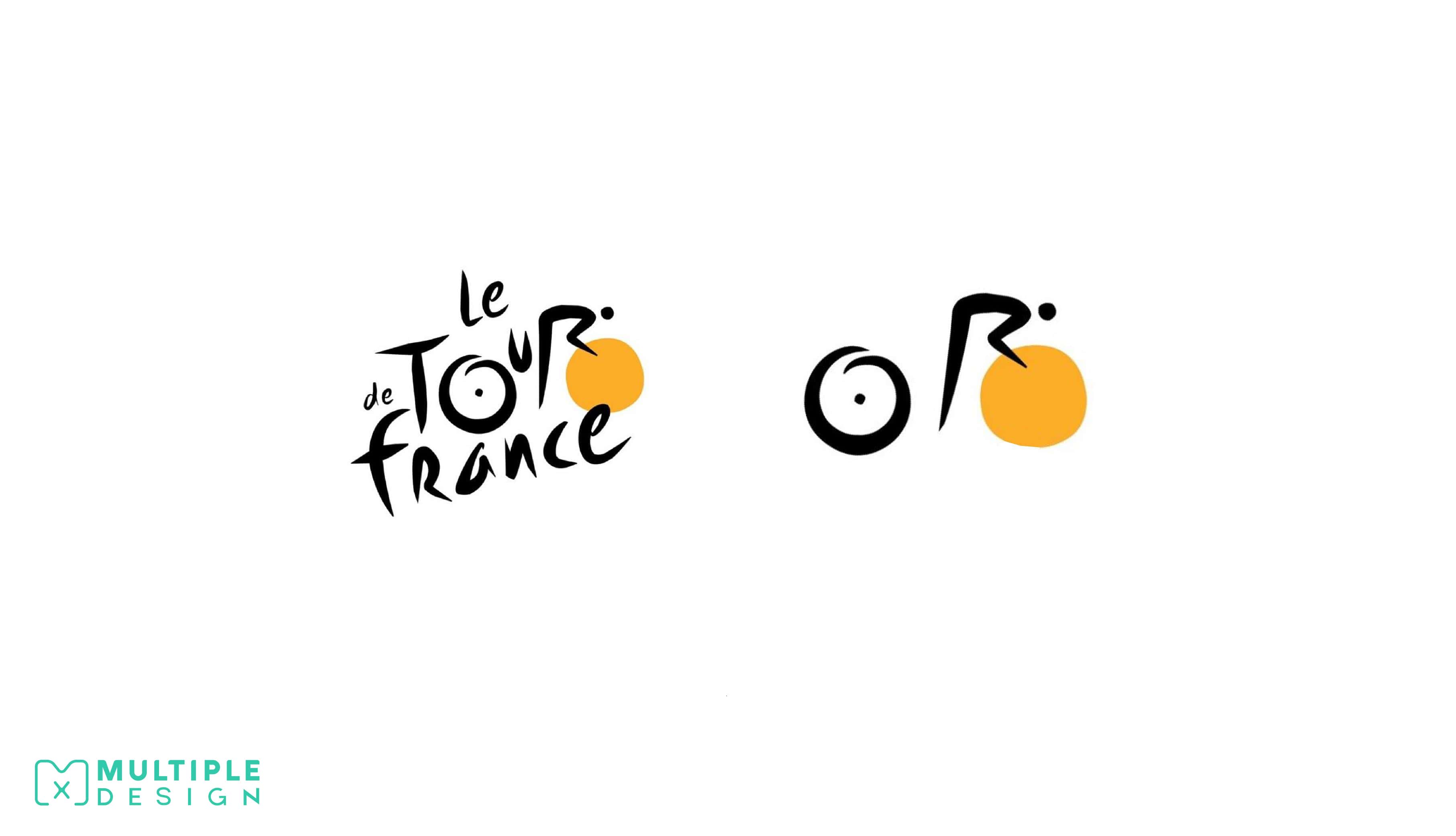
There is a cyclist hidden in the Tour de France Logo
At first glimpse, the Tour de France logo looks like it is made out of handwritten text, but on closer inspection, the logo contains a hidden cyclist, shaped by the letter R riding a bike, which wheel is made out of the O.
There is also a second subliminal message in hidden within the logo – a yellow circle which is intended to represent that the races only take place during the summer.
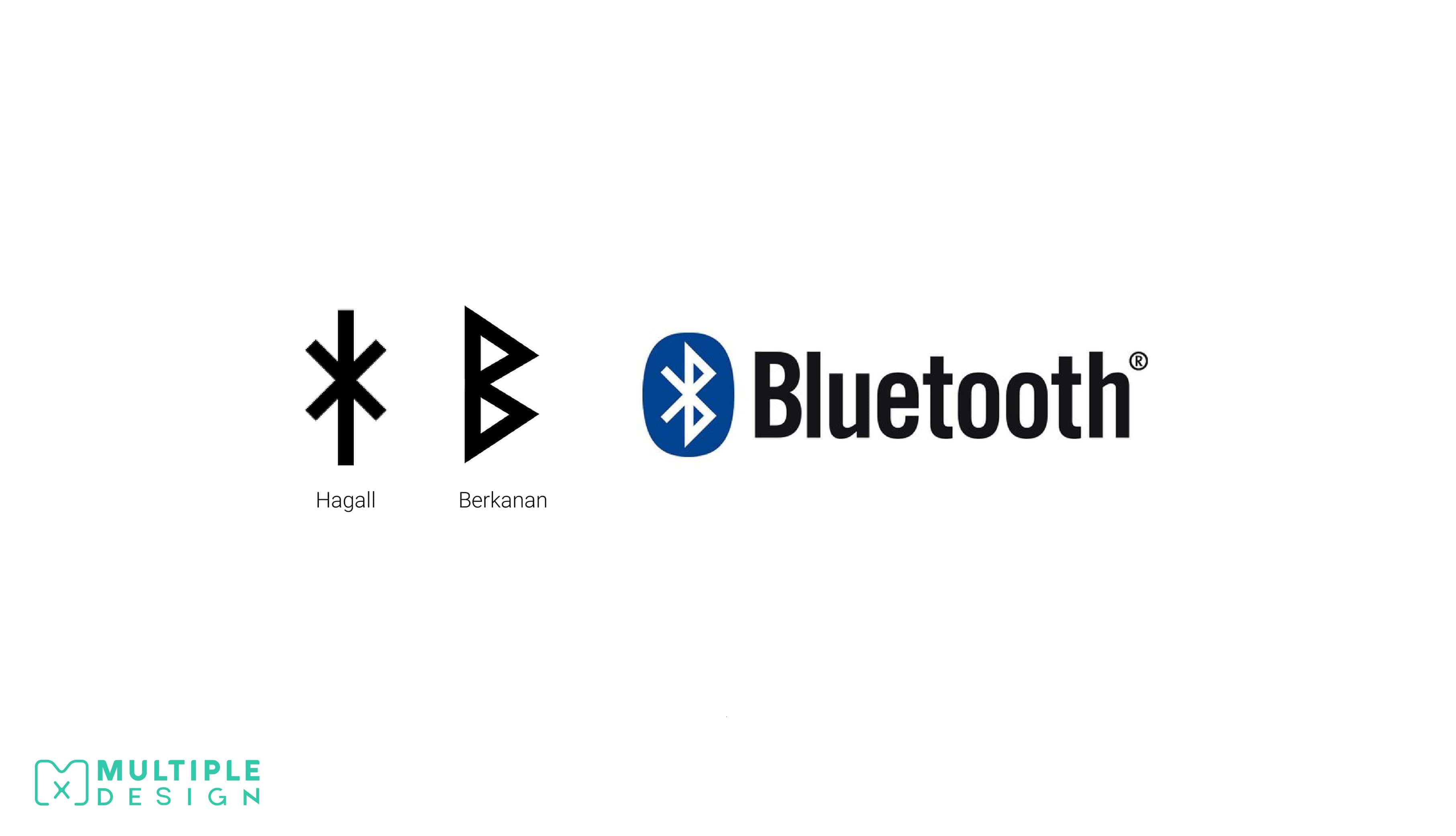
The Bluetooth Logo is made up of two old Scandinavian letters for H and B
Bluetooth was created by Swedish company Ericsson in 1994, and is named after the Scandinavian king, Herald Bluetooth of Denmark. The logo is a combination of two old Scandinavian letters of H (Hagall) and B (Berkanan) which resembles the initials of the king’s name. These were then merged to form the logo.
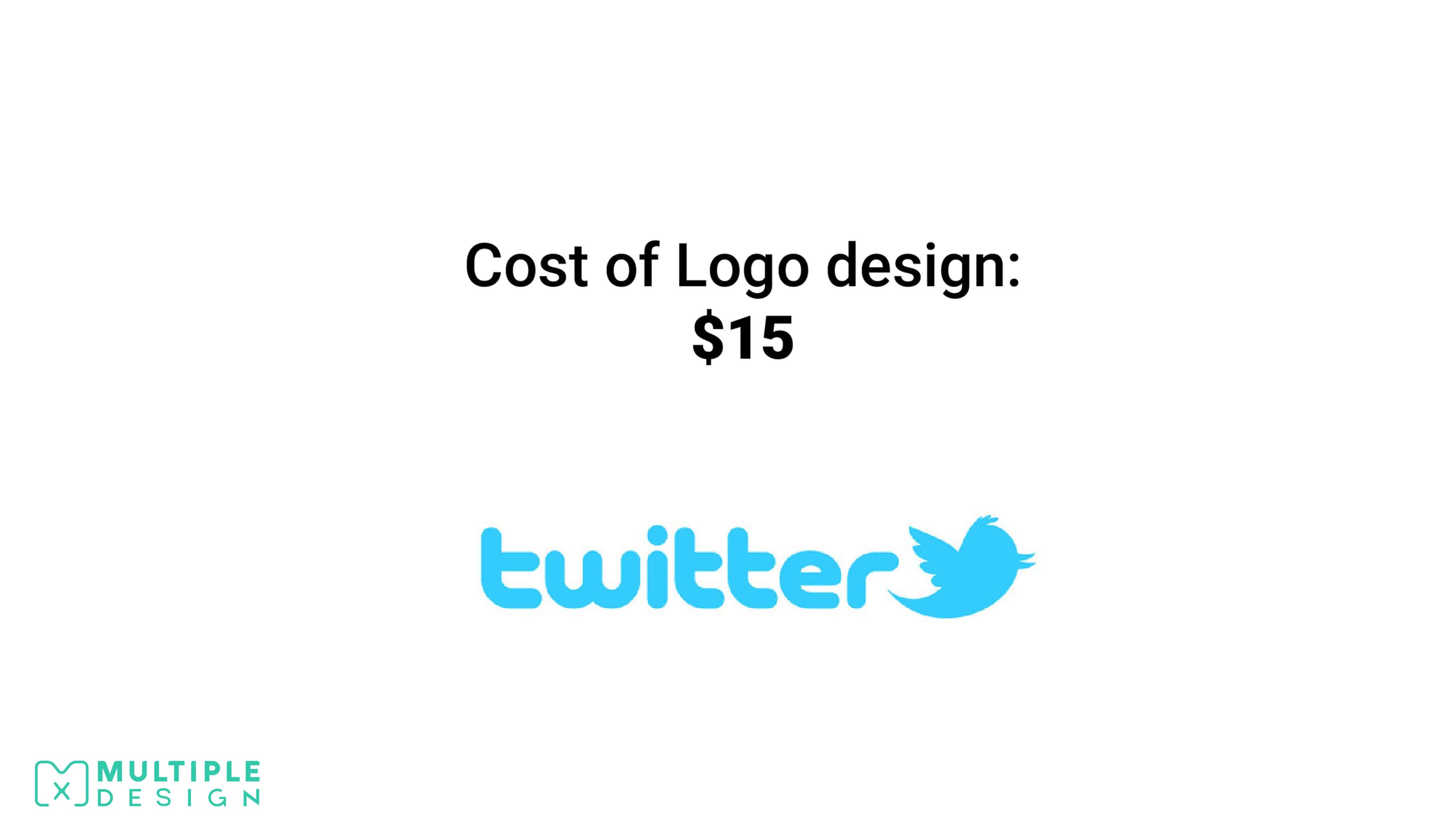
Twitter’s original Logo only cost them $15
They bought the logo of iStock from a logo designer called Simon Oxley, who only received $6 after iStock took its cut! Although the Twitter logo has recently undergone a makeover, it is still based on the iconic blue bird. Fun fact, the bird even has a name – Larry Bird.
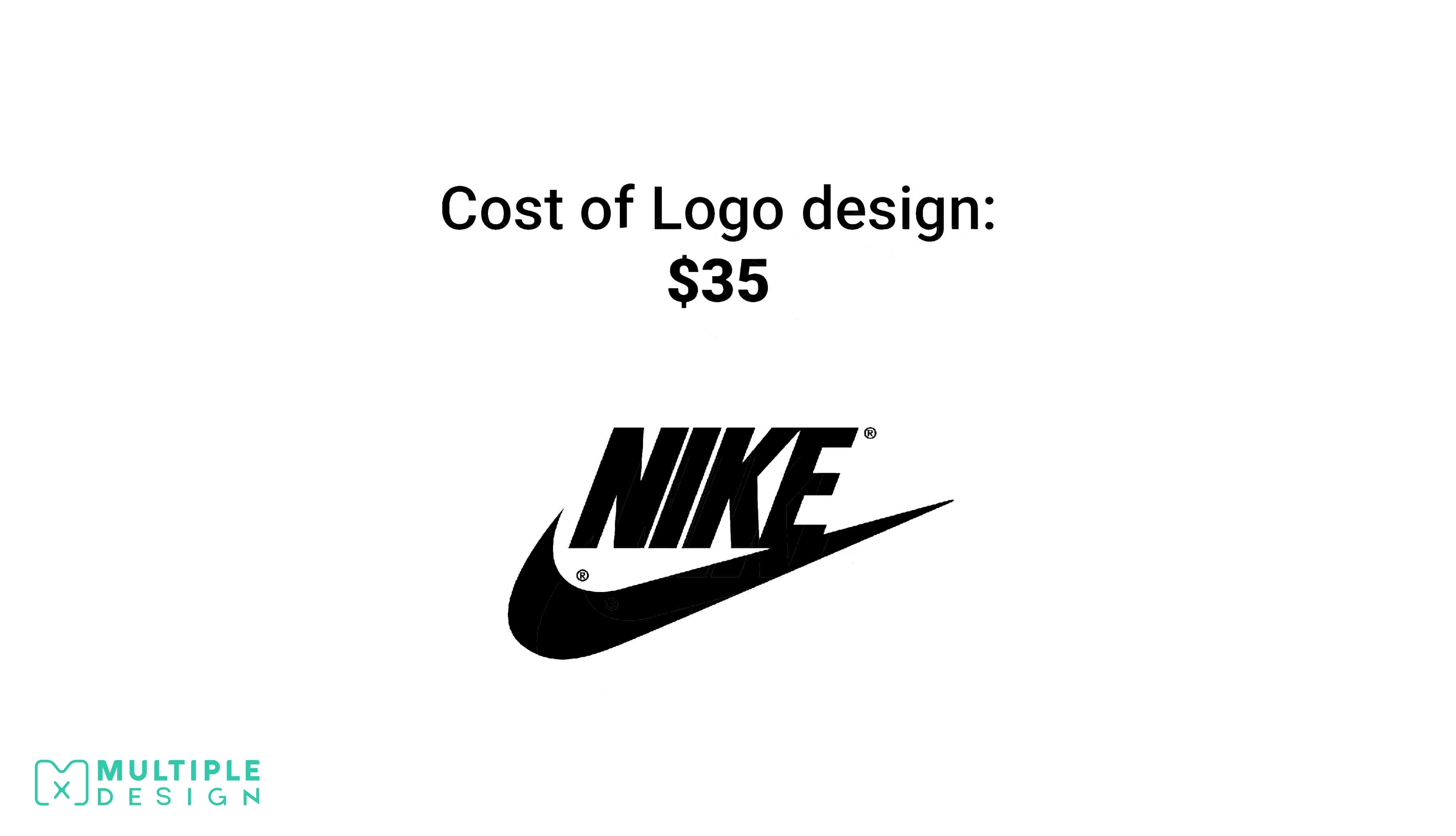
Nike only spent $35 on their famous Swoosh Logo
Nike has one of the world’s most recognisable logos, but it only cost them $35! Co-founder Phil Knight, commissioned Carolyn Davidson, a graphic design student who was studying at his university in Portland. He wasn’t happy with the design at the time, but decided to use it anyway. Years later, Nike rewarded Carolyn with a ring embedded with diamonds in the shape of the Nike logo for her creative efforts!
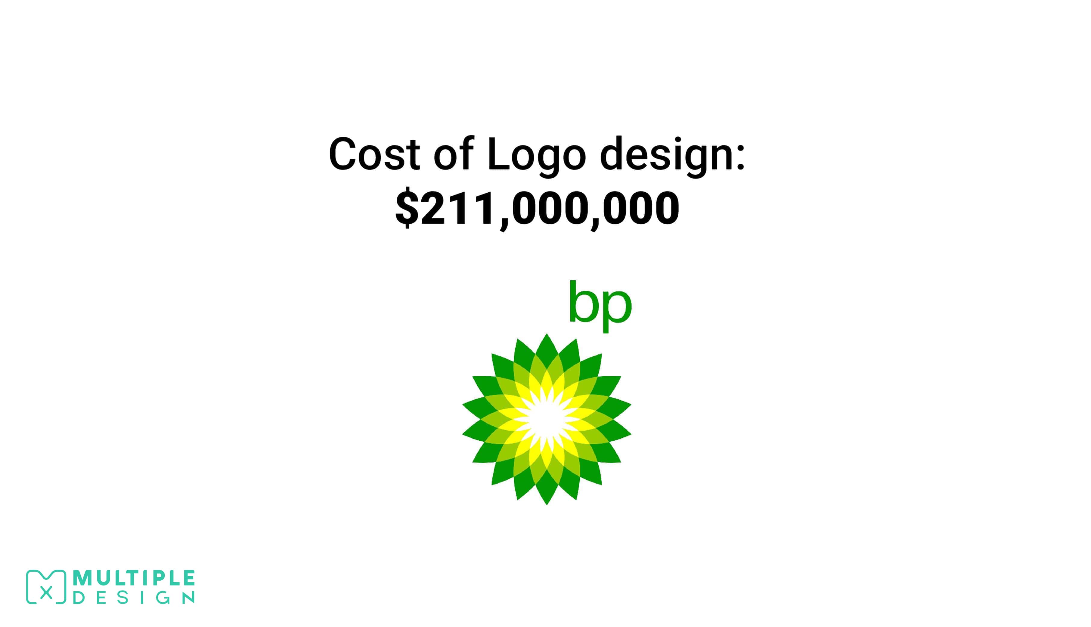
On the other end of the scale is BP, who spent over $211,000,000 on the re-design of their Logo.
BP had been using their previous shield inspired logo for over 70 years, and in 2010 decided to replace it with their “Helios” logo. The only element that was kept from the previous logo was the green and yellow colour scheme, to symbolise their strategy of green growth.
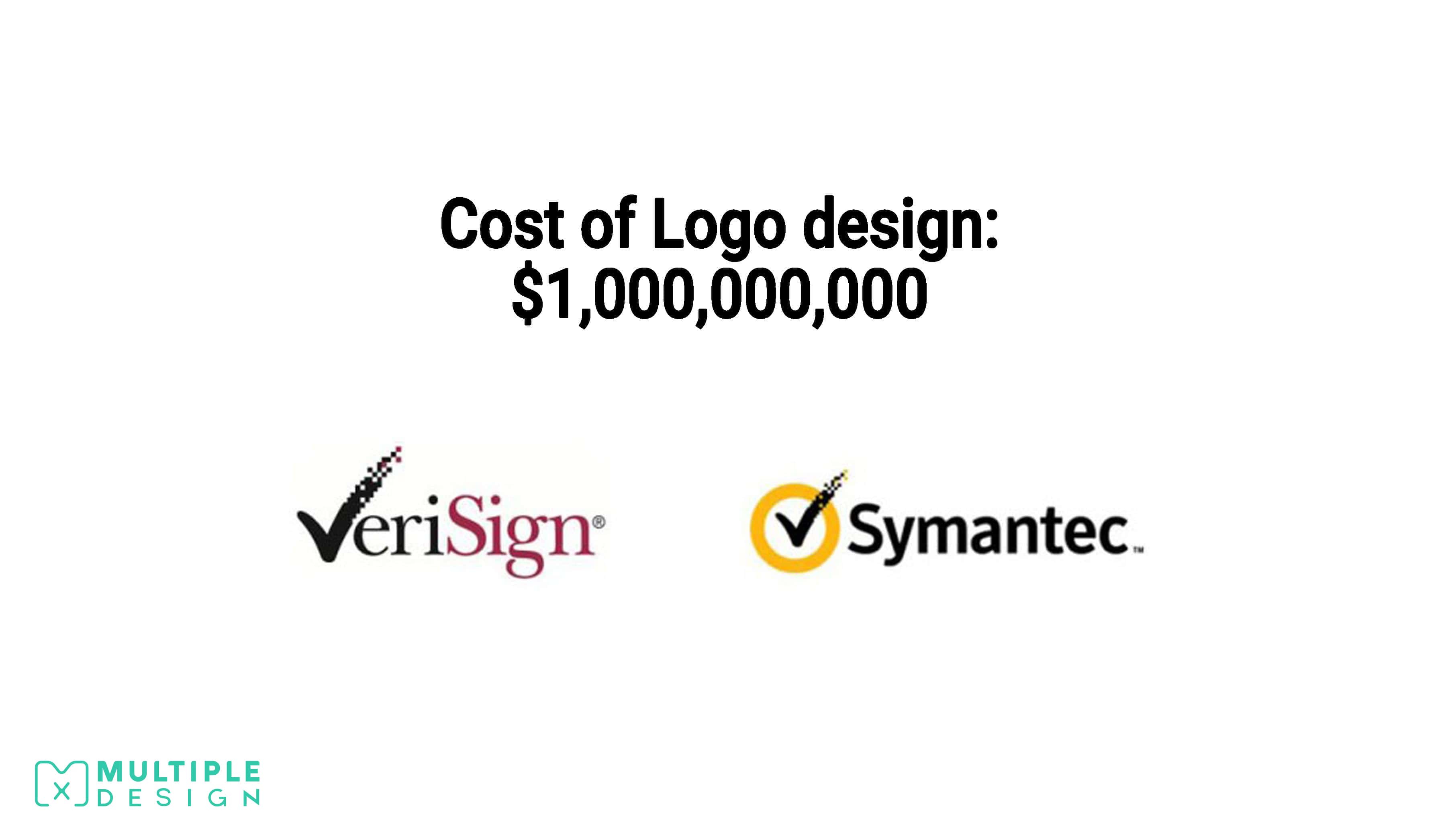
The world’s most expensive Logo belongs to Symantec
Symantec is an American software company, and global leader in cyber security. Symantec spent over a billion dollars on its logo redesign and re-brand campaign. The cost was mainly down to establishing a foothold after buying out their competitor VeriSign. They wanted the Symantec tick to be as recognisable as Nikes tick. Many have come to realise that the re-brand failed to spotlight the company, as the firm is now struggling to reposition itself in the market
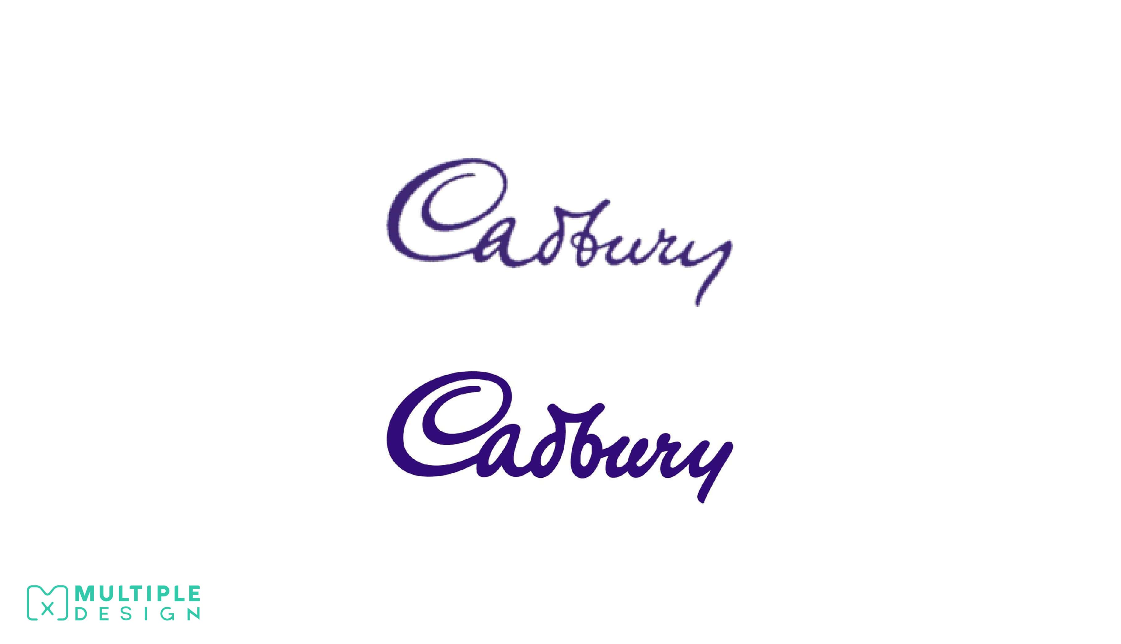
The Cadbury’s Logo is based on the signature of William Cadbury
The Cadbury script logo, based on the signature of William Cadbury, appeared first on their transport fleet in 1921. It was quite fussy to start with and has been simplified over the years. It wasn’t until 1952 that it was used across all their major chocolate brands.
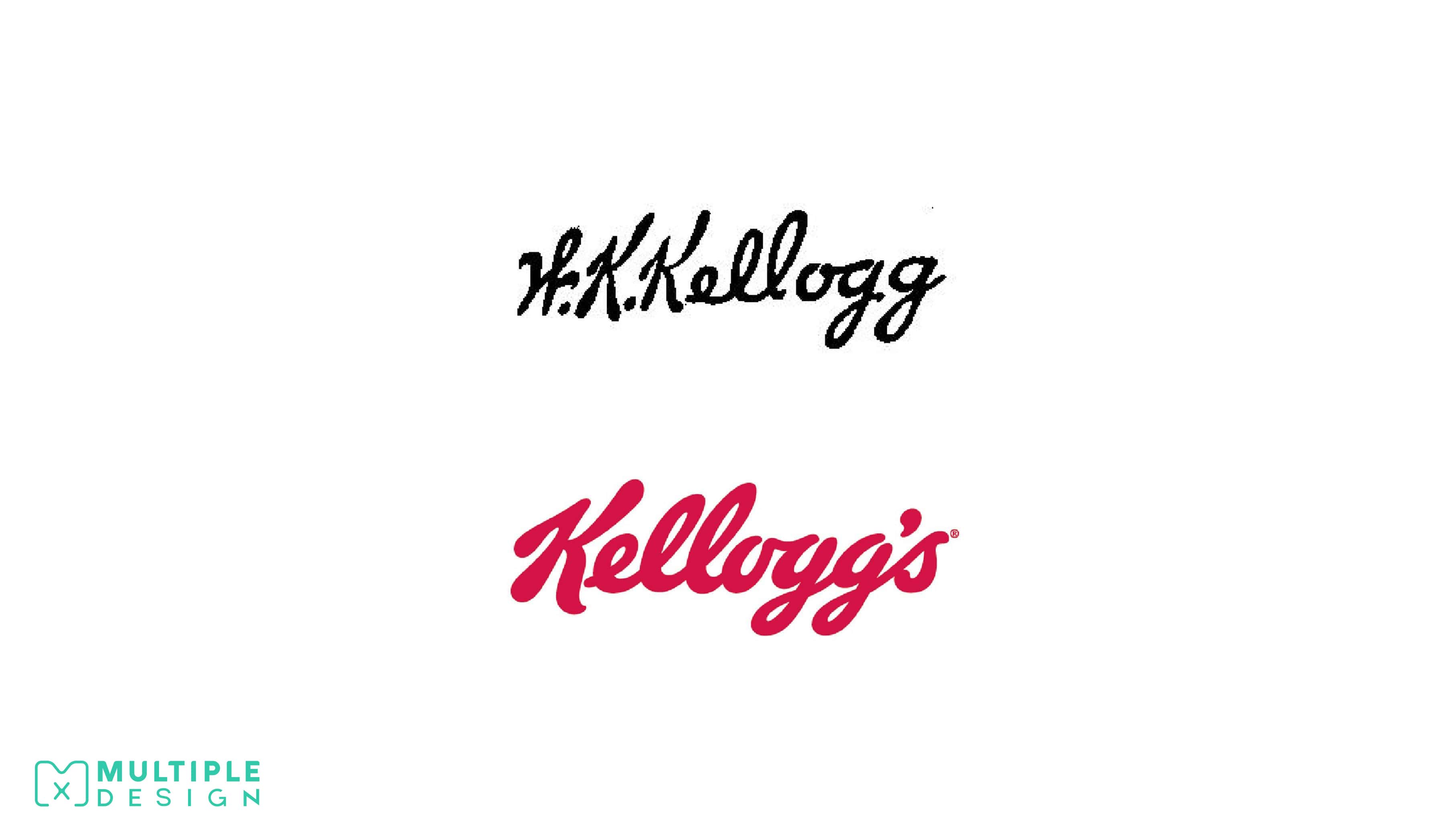
Kellogg's Logo is based William Kellogg's signature
William Keith Kellogg, signed each Corn Flakes package personally, to show that it was a genuine Kellogg product. Eventually the Kellogg company decided to use this signature as their company logo, retouching it slightly, and colouring it in red.
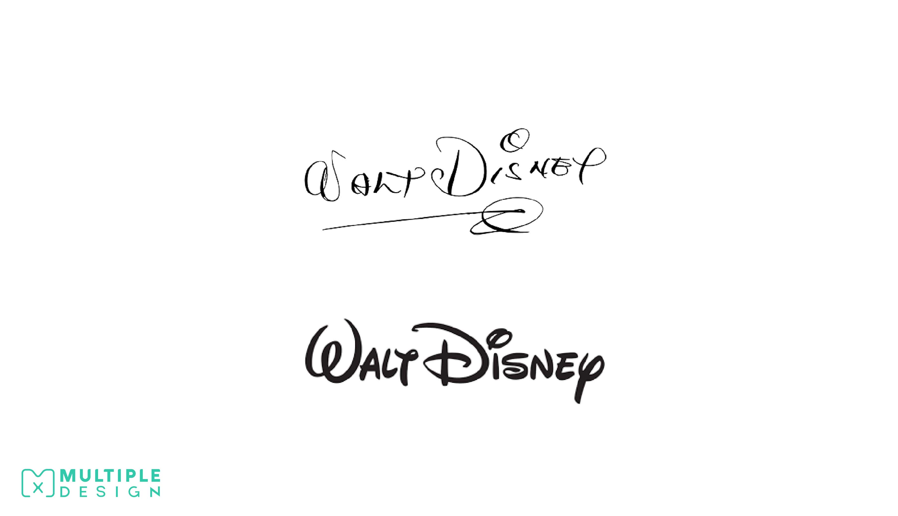
The famous Disney Logo is based on Walt Disney's writing style
Probably the most famous logo based on a signature belongs to the Walt Disney Company, who uses a stylised version of Walt Disney’s signature. He stopped signing his name this way eventually, and grew to dislike it. Today, all Mickey Mouse characters at every Disney Park must sign their name using the same Disney signature font. Same swirl over the i, same swirl underneath the name.
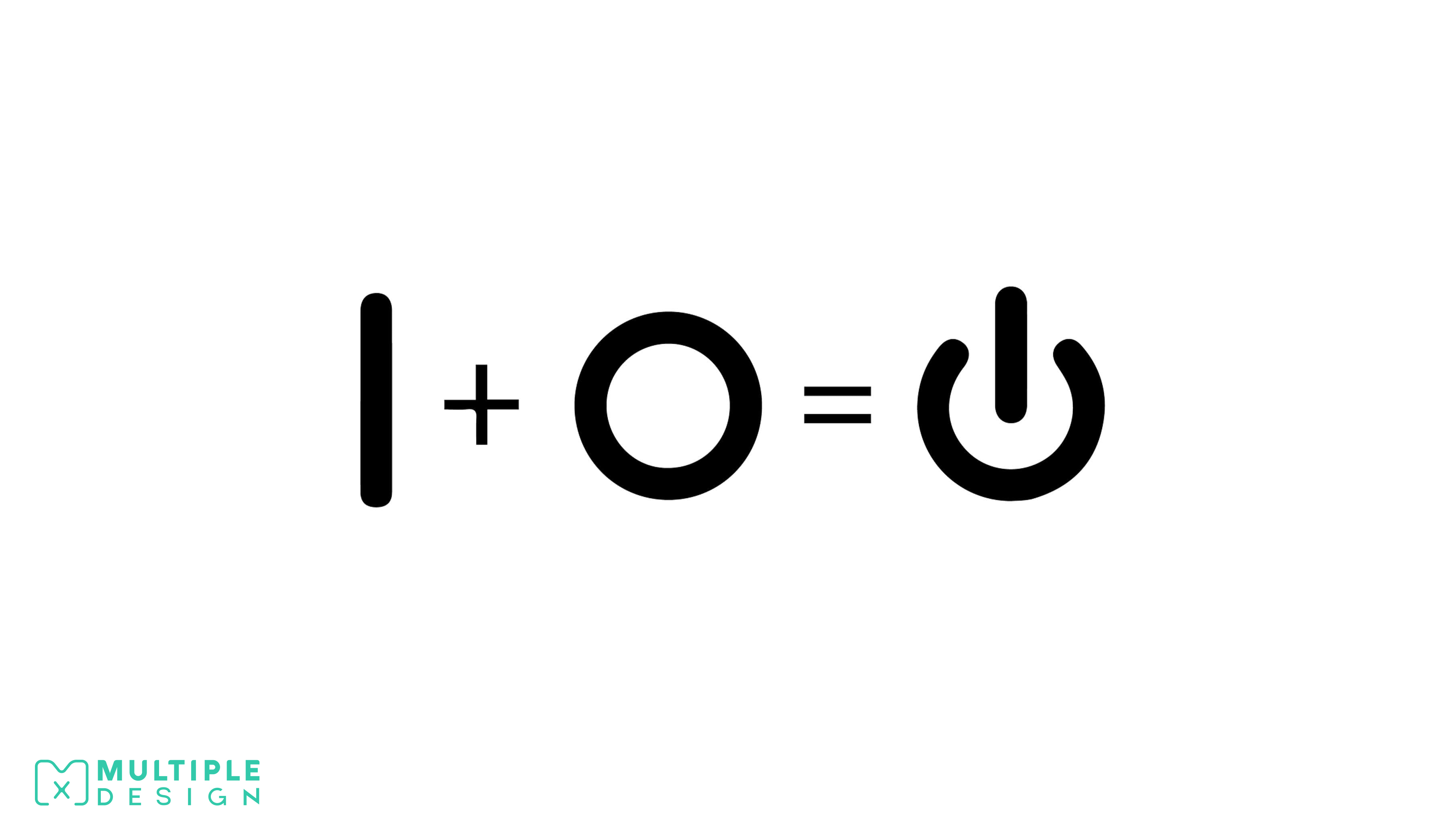
The “Power On/Off” symbol is a combination of a 1 and a 0
It is actually binary, where 1 is on and 0 is off. Originally there used to be two buttons, which either displayed a 1 or a 0, but as technology developed the symbols merged into one. The serifs on the numbers were removed, simplifying the symbol to bypass language barriers.
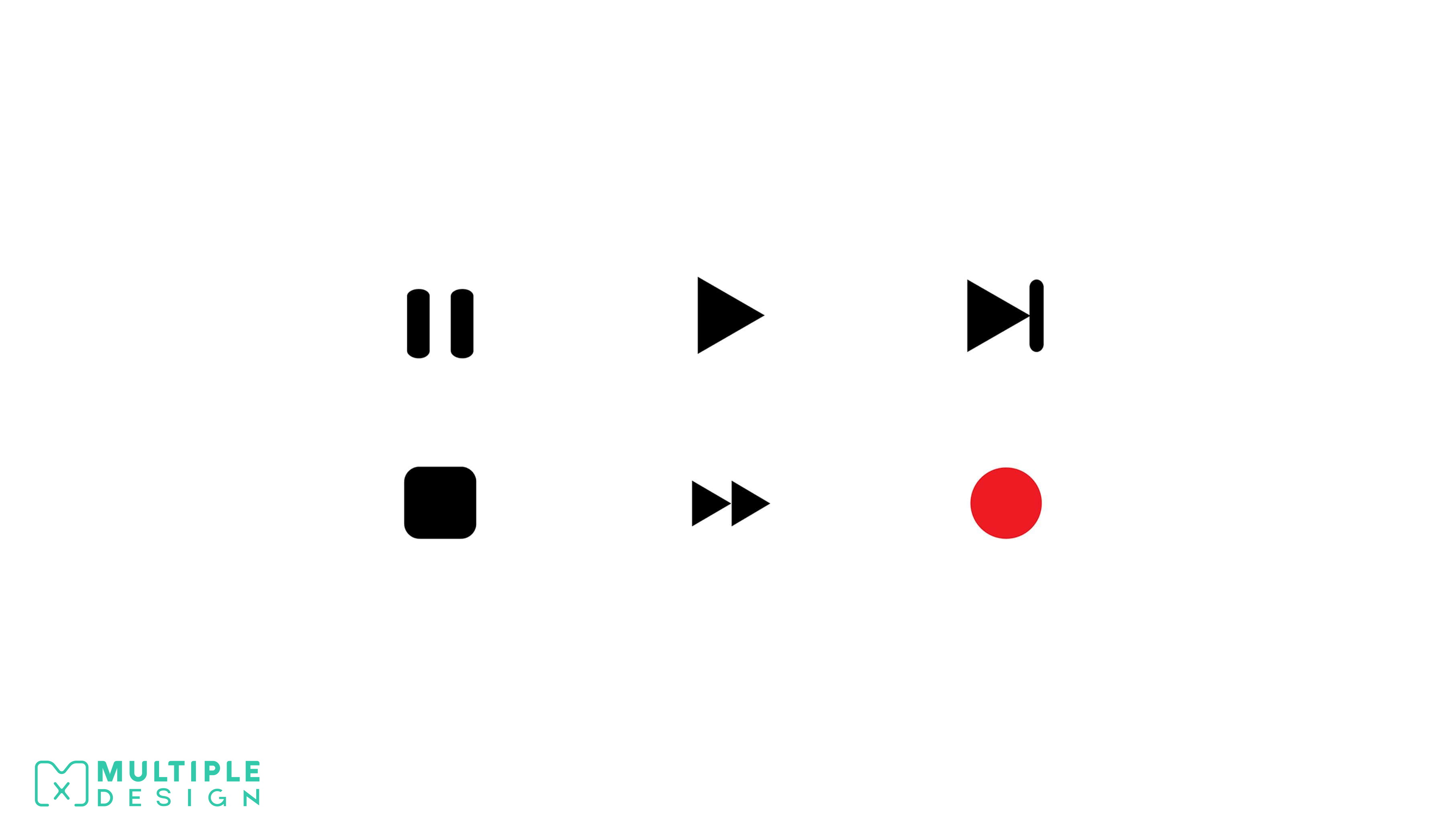
There is a reason why the symbols on a remote control look the way they do
The pause icon is symbolised by two vertical lines, which represent the sides of frames on a reel. Pause means you are stopped between two frames. Stop is symbolised by a square to represent that you are currently on one frame.
Play is symbolised by a right facing triangle, which represents that you are moving through the frames left to right. Fast forward is symbolised by two play triangles, which represents that you are moving through the frames at some multiple of 1x.
The scene skip icon represents moving forward to a frame and pausing. The record icon is symbolised by a red circle, which is a visual representation of the red "studio in use" light outside the door of recording studios.
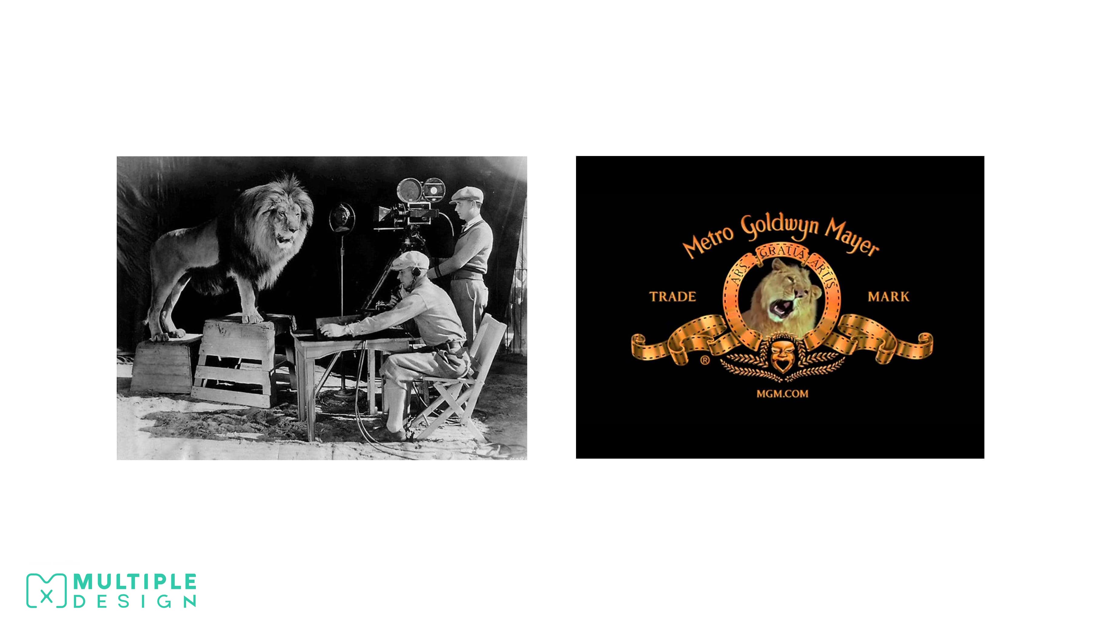
This how the MGM Logo was made
In 1916, Metro Goldwyn Mayer (MGM), crafted their “Leo The Lion” logo using seven trained lions. The original logo was designed by Howard Dietz, who decided to use a lion as homage to his favourite football team, The Colombian Lions. The first lion was called Slats, and couldn’t roar on cue, so he just sat there looking around. After the silent film era had finished, the roar was recorded using another lion called Jackie.
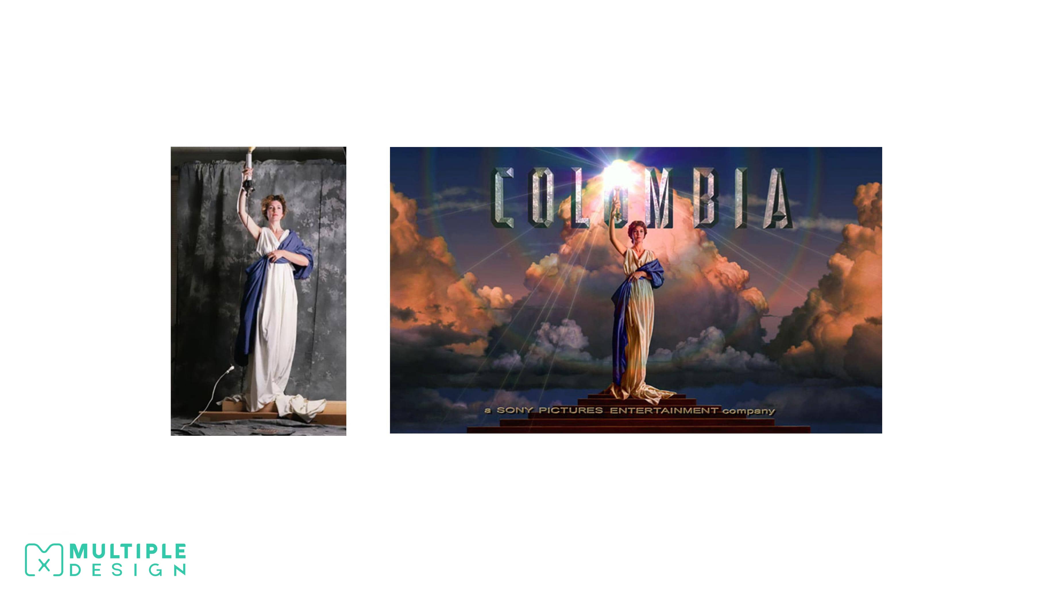
The Columbian Pictures Logo was based on a real woman
The famous logo of Columbian Pictures was made by painter Michael Daes. He used a friend of his, Jenny Joseph, wrapped in a bed sheet to resemble a roman and standing with a corded desk lamp. She was then painted over to enhance her figure, and clouds were airbrushed behind her.
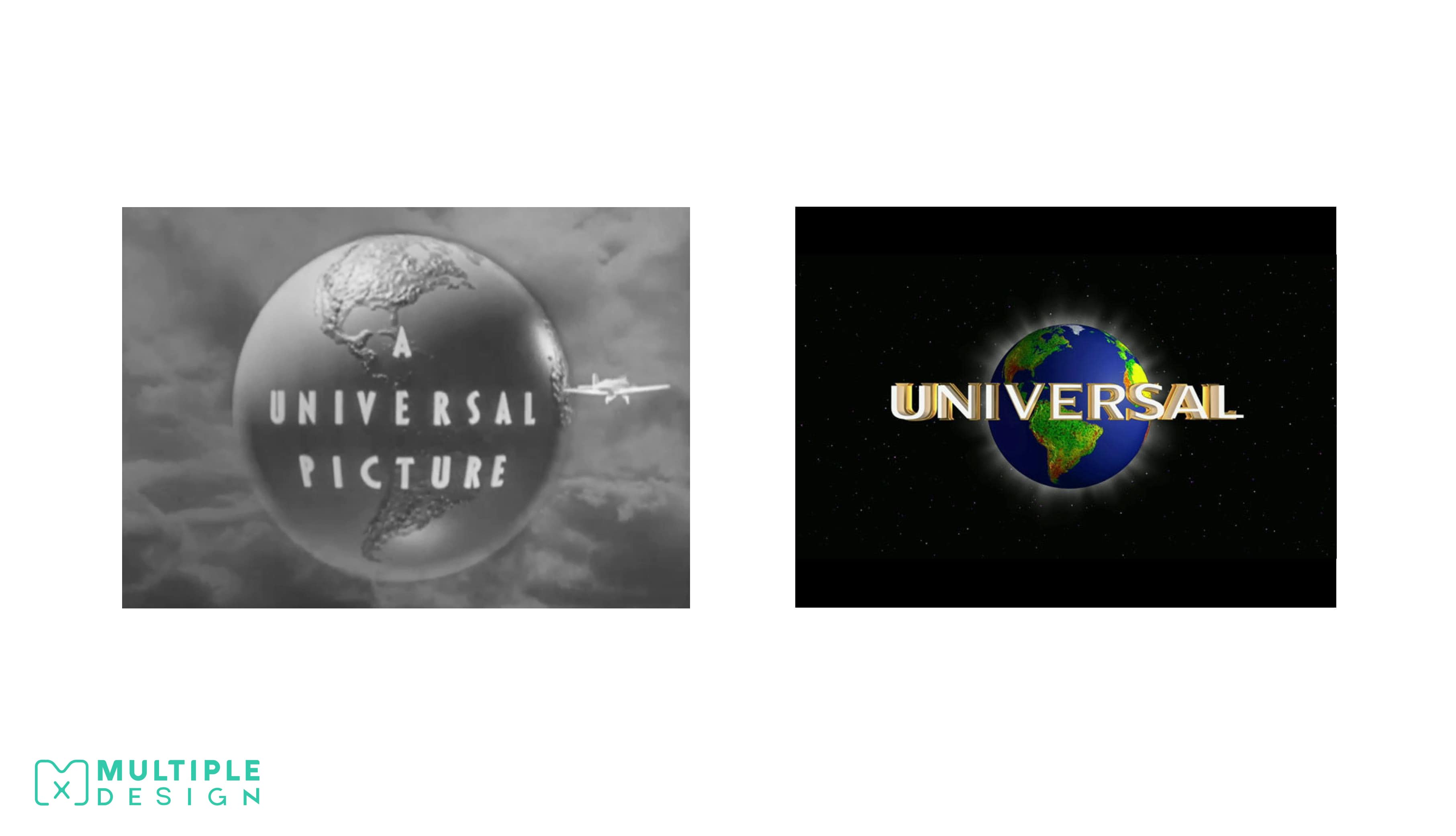
The Universal Pictures Logo was a real model
Universal Pictures created their logo by rotating a model globe on a space background. The studio originally wanted to use Saturn and it’s rings for the logo, but decided in the end to use Earth. There used to be a model plane flying around the logo, before it was removed to enhance the lettering.
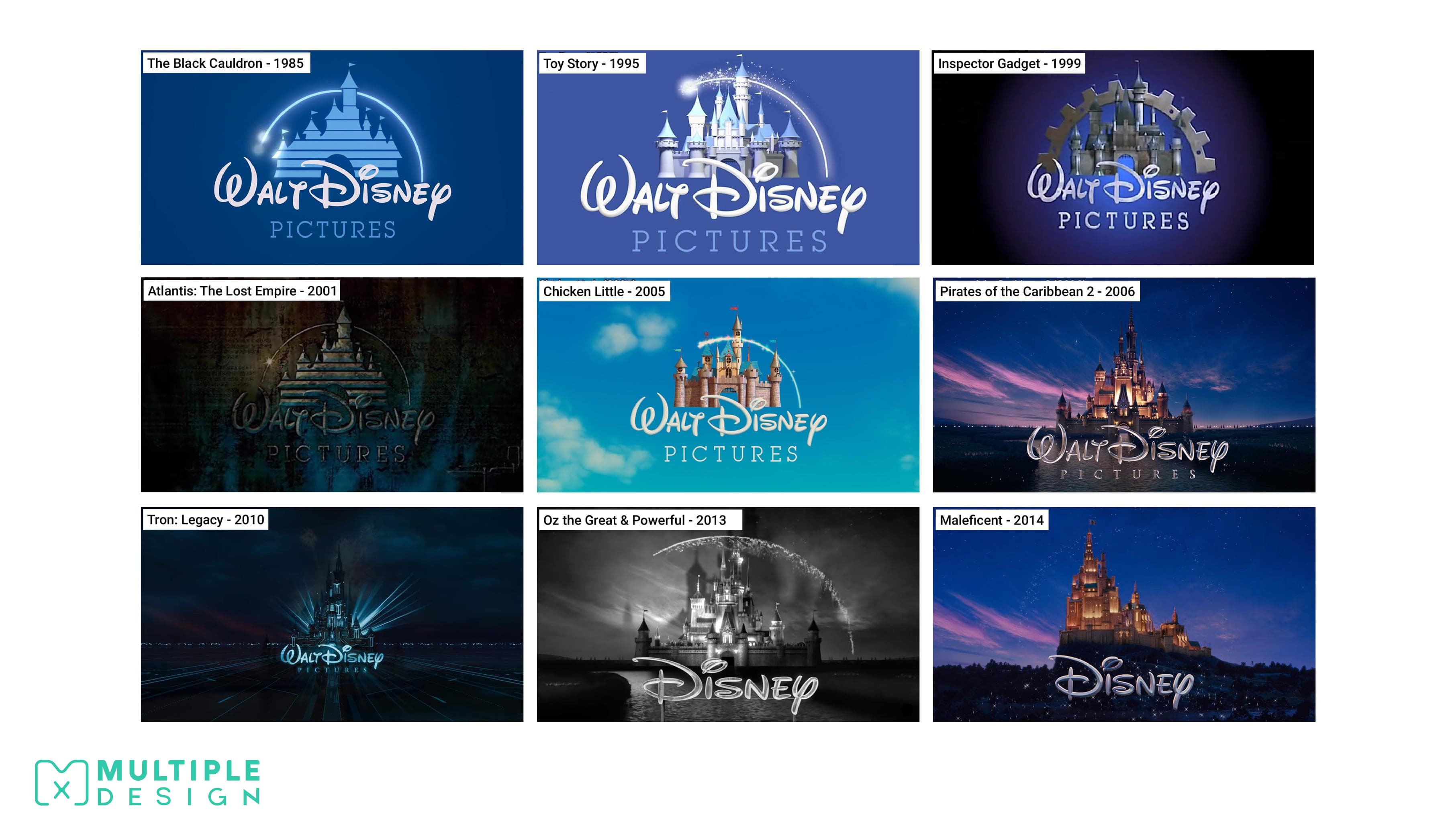
Disney alter their opening Logo to reflect the context of each film
The Disney logo has become one of the most iconic opening credit logos of all time. Their logo depicts Cinderella’s castle, and uses an instrumental version of “When You Wish Upon A Star” as their theme song. The first film to use this logo was The Black Cauldron in 1985. The logo was left unchanged for ten years, until 1995’s Toy Story turned the logo into a computer animated castle to match the style of the film.
After positive fan reaction, Disney decided to alter their logo to match the context of each film. In 2006, the opening of Pirates of the Caribbean: Dead Mans Chest, was the first time their fully 3D Cinderella’s castles was used. Disney then started to add variants of this logo, eventually dropping “Walt” from their name in 2011. Each of their Princess stories features their characters castle in place of Cinderella’s castle.
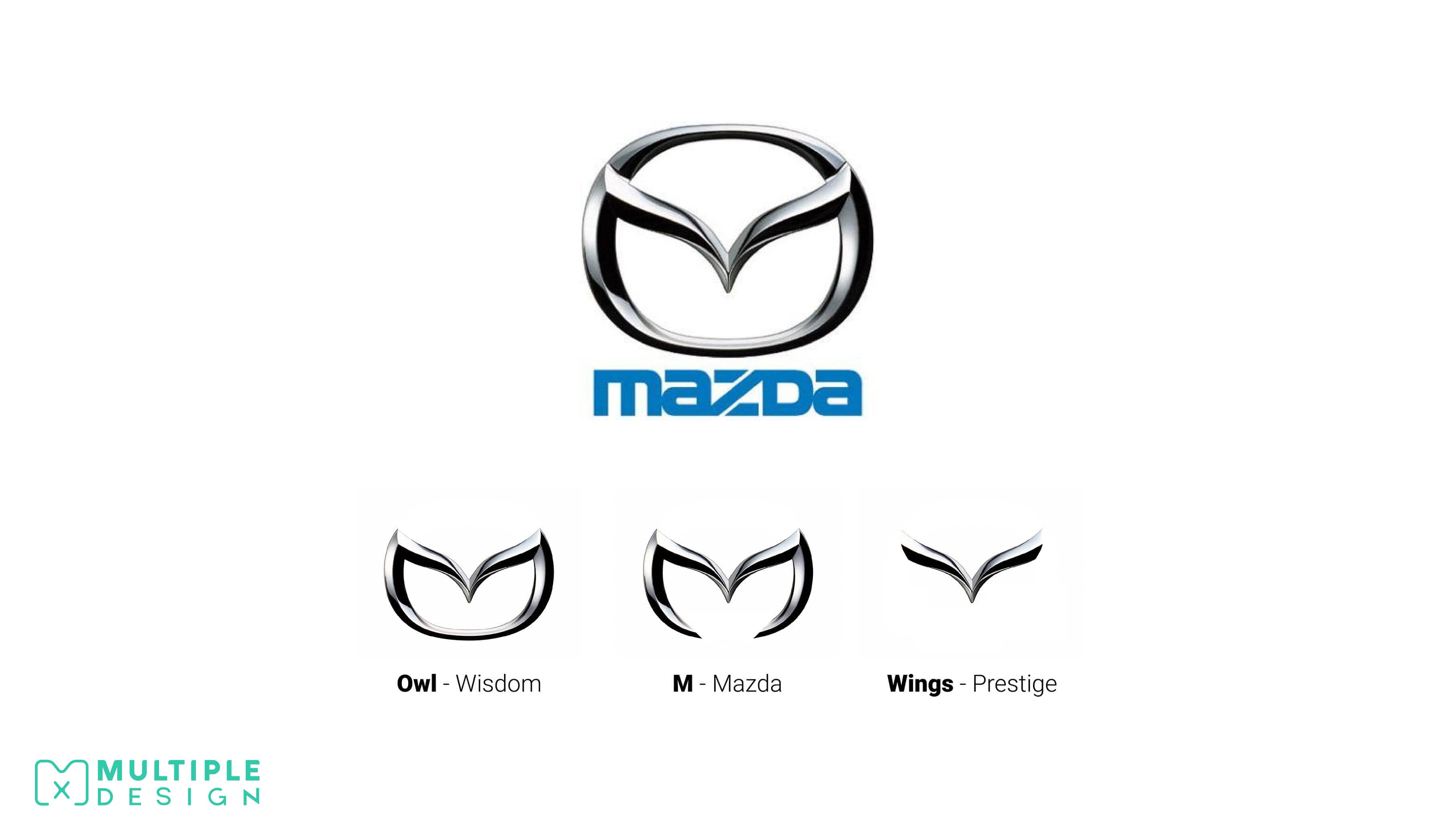
The Mazda Logo is not just a stylised M, but also includes a pair of wings and an owl
The Mazda logo is full of symbolism. The name Mazda itself comes from the god of wisdom, Ahura Mazda. This is shown in the logo as an owl face, as the animal is commonly used to depict wisdom. The pair of soaring wings in the middle of the logo represents Mazda’s flight towards the future, and prestige.
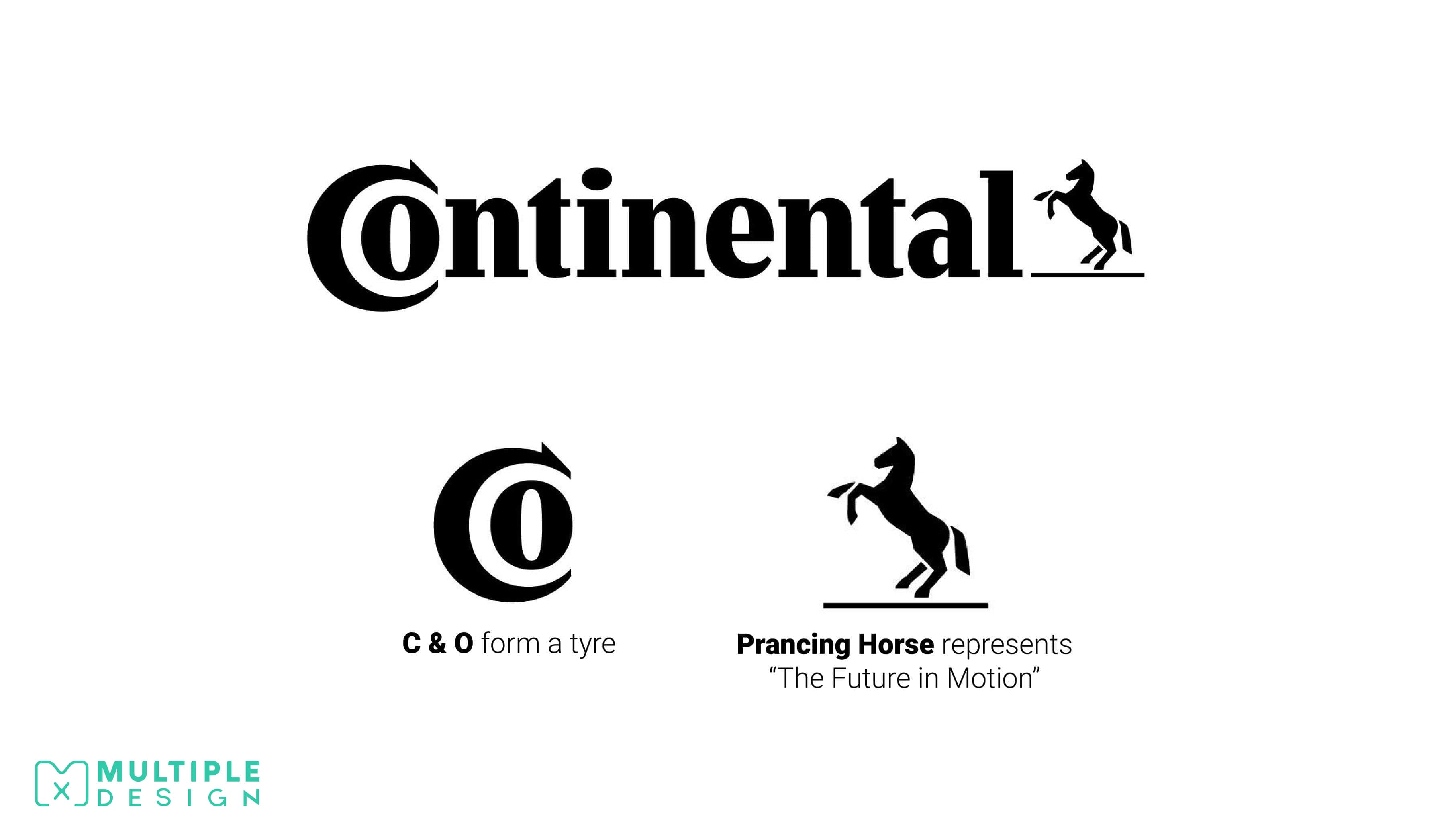
The Logo for Continental Tyres cleverly features a tyre shape created by the C and the O
Continental is a leading German automotive manufacturing company specialising in tyres and brake systems. The logo cleverly reinforces what they produce. The prancing horse is a visual representation of their corporate tagline "The Future in Motion".
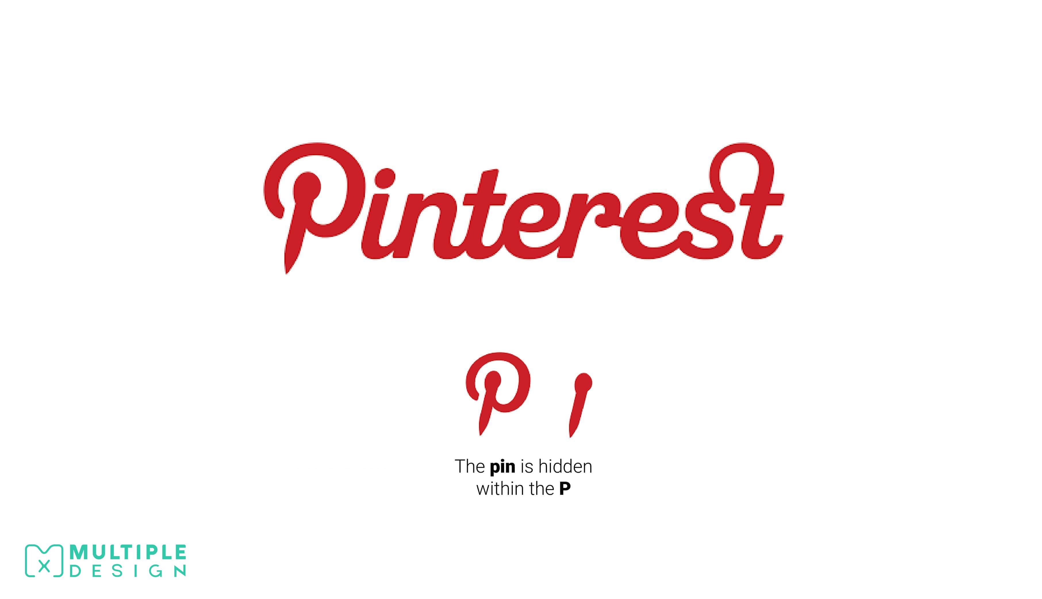
There is a pin hidden within the Pinterest Logo
Pinterest is a portmanteau of the words “pin” and “interest,” since it allows users to pin things they’re interested. The concept of the site is to mimic the action of pinning up ideas and images into a bulletin board.
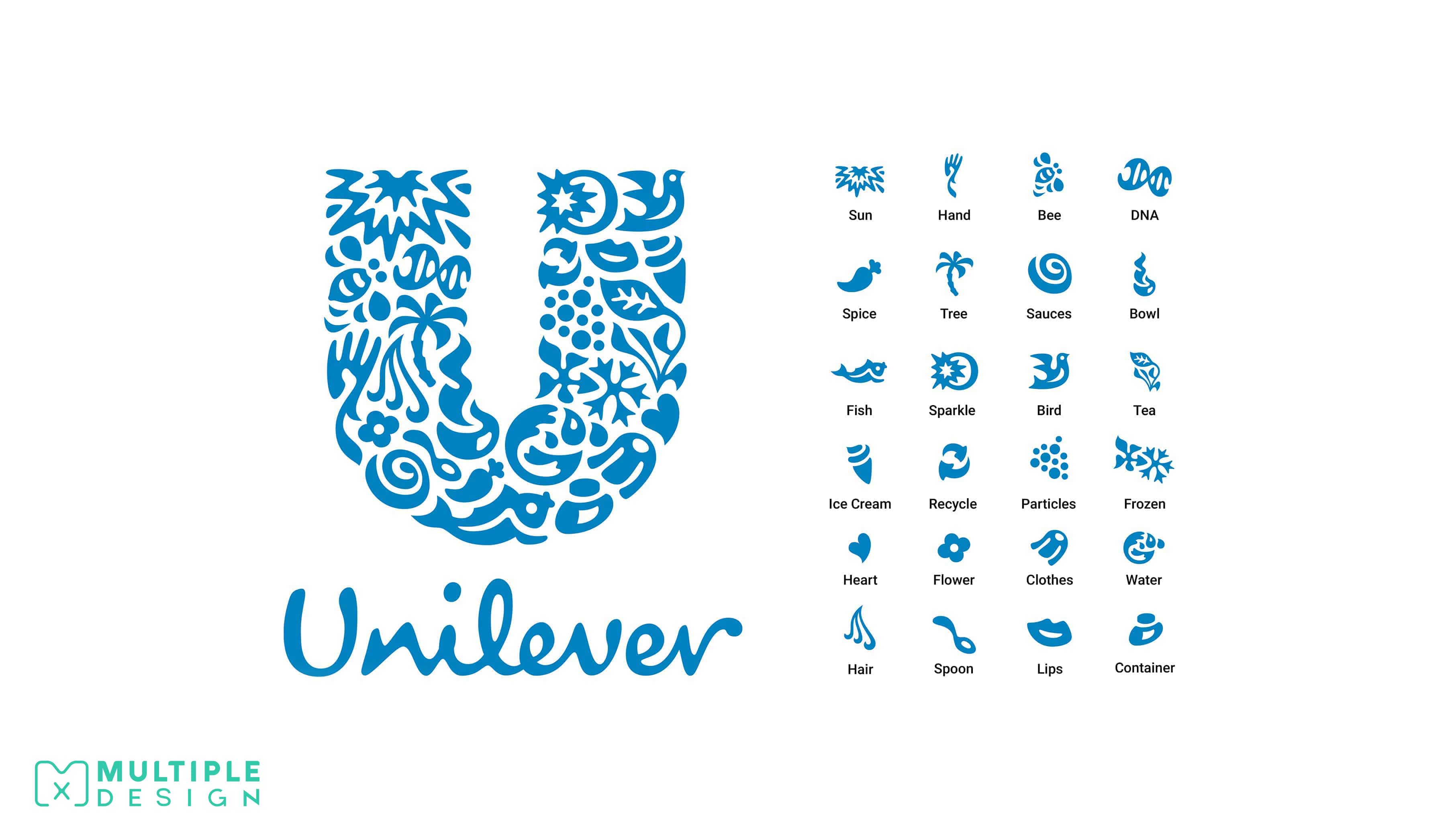
The Unilever Logo is composed of 24 different icons, each representing one of their products and services
Unilever is a British-Dutch consumer goods company with a portfolio of well-known brands within nutrition, hygiene, and personal care. Their clever logo is a visual expression of their products and services. Some of the icons within the logo include an ice cream, tea, hair, a heart, and the recycling symbol.
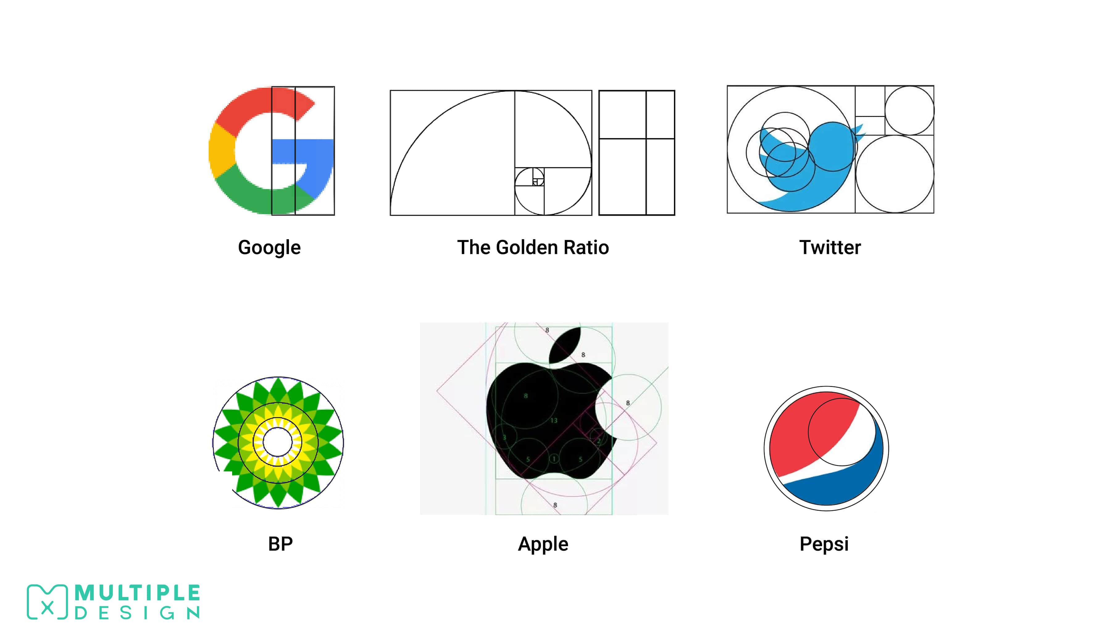
The Golden Ratio appears in many of the world’s most recognisable Logos
The Golden Ratio is a mathematical ratio that is based around perfect proportions that create aesthetically pleasing compositions. It is commonly found in nature, but has been applied to many areas of design for thousands of years. The Pyramids of Giza, the Eiffel Tower and Da Vinci’s painting of The Last Supper all abide by The Golden Ratio.
When applied to logo design, it can help be uses to create some harmonious designs. Google, Apple, Twitter, Pepsi, and BP all use The Golden Ratio.
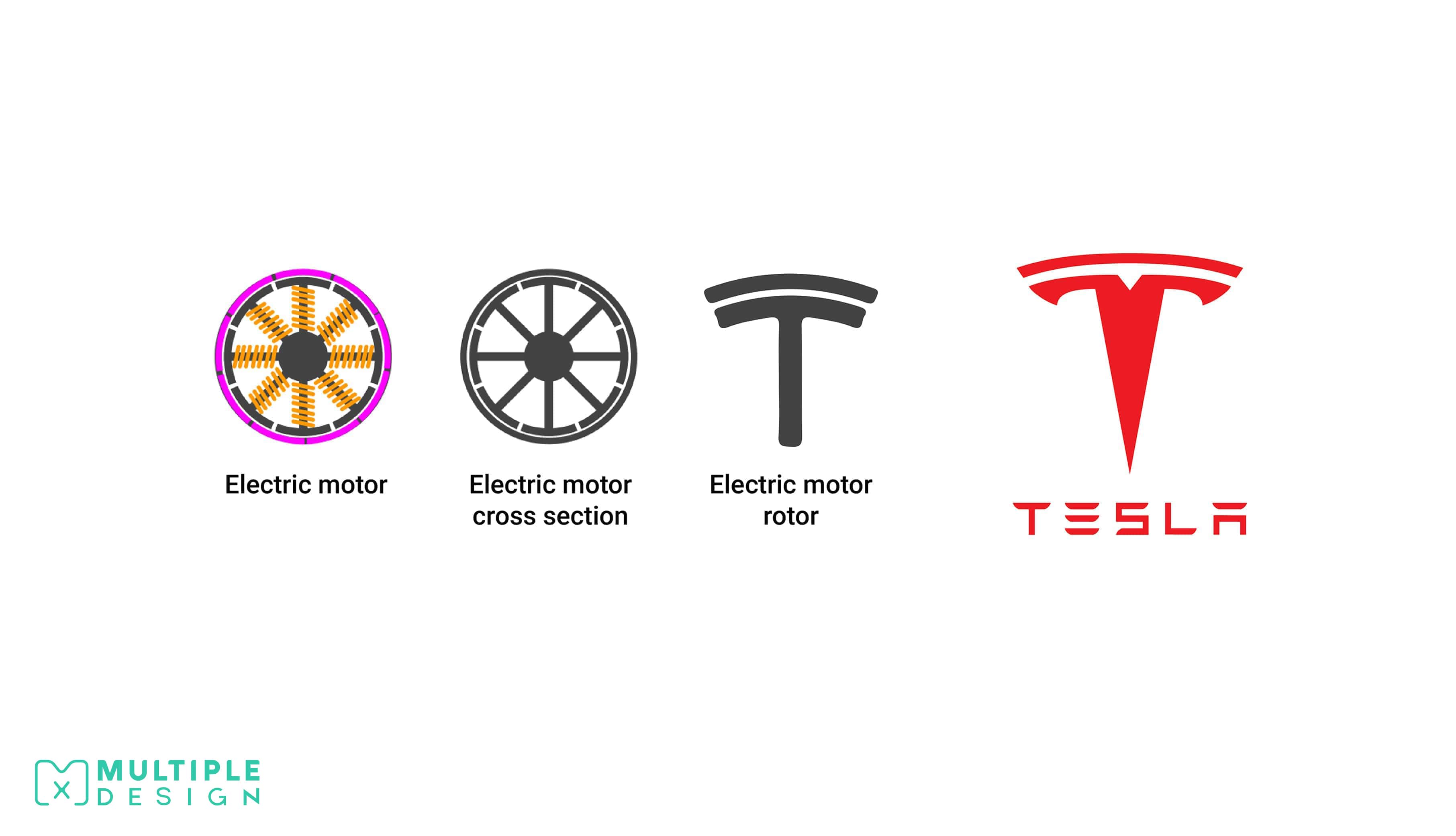
The Tesla T Logo is based on a cross section of an electric motor
Tesla Motors specialises in electric automotives, owned by billionaire Elon Musk. At first glance, the Tesla logo just looks like a fancy T, but is actually a stylised cross section of an electric motor. The motor itself was first designed by the company’s namesake, Nikola Tesla, the famous physicist and inventor.
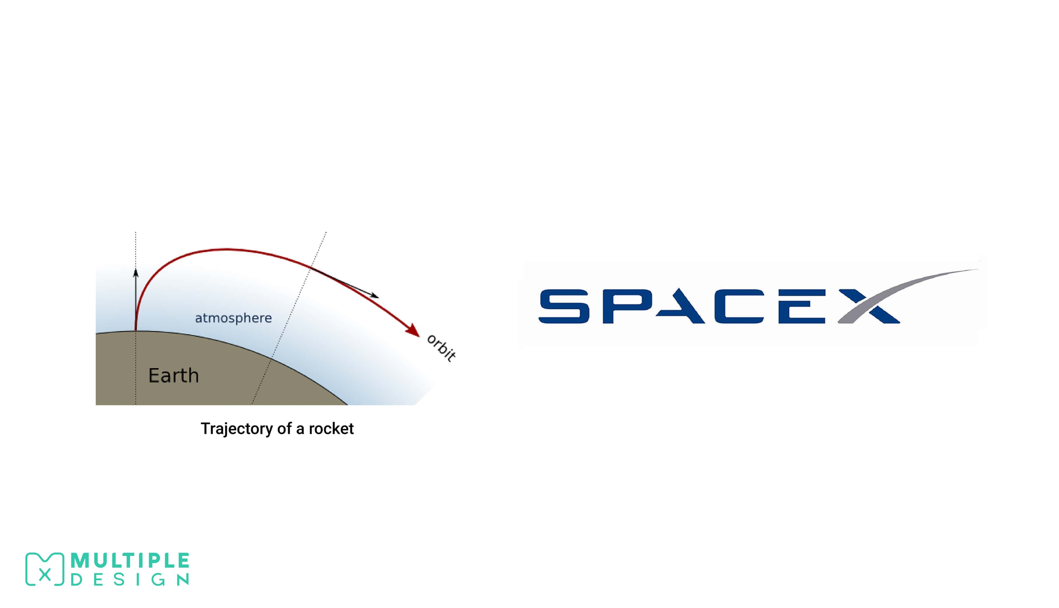
The X in the SpaceX Logo is based on the trajectory of a rocket
Elon Musk also owns SpaceX, whose own logo is more than what it appears. The X is actually a representation of a rocket trajectory. SpaceX manufactures and launches advanced rockets and spacecraft, with the ultimate goal of enabling people to live on other planets.
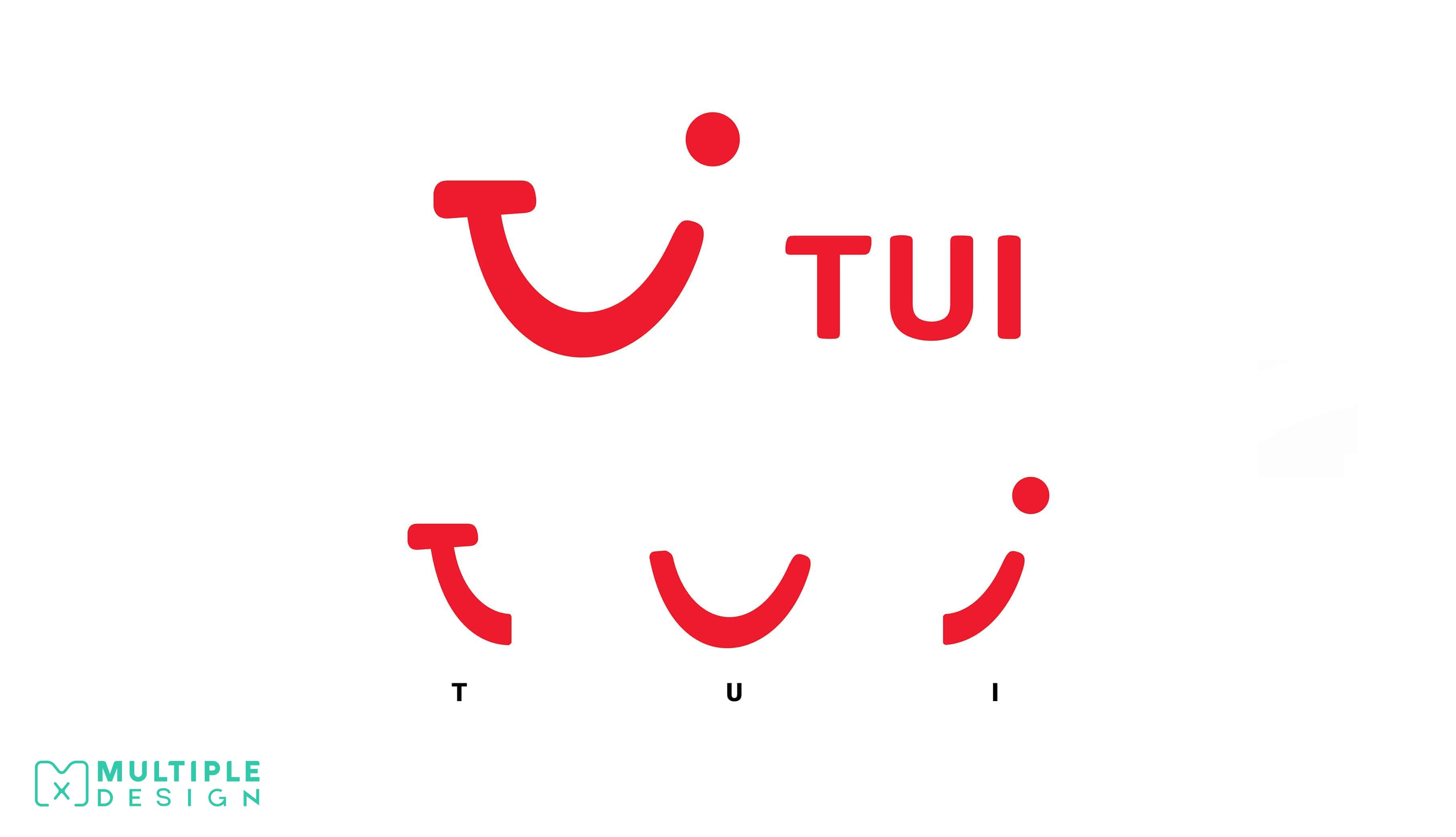
The TUI Logo depicts both the company name and a smiling face
Originally known as Thomson, TUI is a German, multinational travel and tourism company. TUI stands for Touristik Union International. Their logo cleverly combines the letters T, U & I, to create a winking, smiley face. The logo itself has now worked its way into the companies tagline: “We cross the 'T's, dot the 'I's and put 'U' in the middle”.
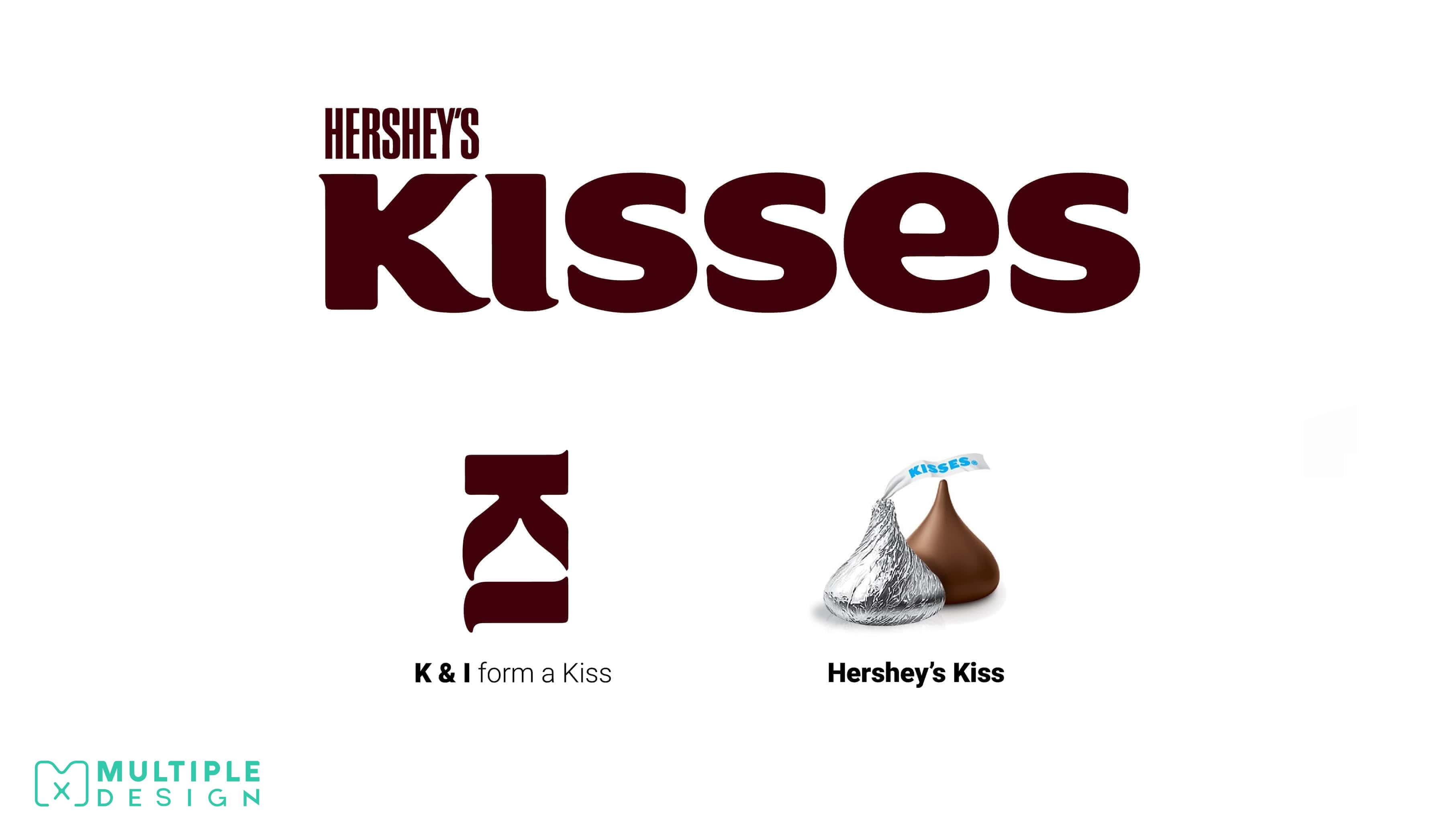
There is a hidden Hershey's Kiss inside the Hershey's Kisses Logo
Hershey’s is an American confectionary company and one of the largest chocolate manufacturers in the world. Kisses are bite-size pieces of chocolate, and come in a distinctive teardrop shape, wrapped in foil. The negative space between the "K" and the "I" create a sideways Hershey’s kiss.
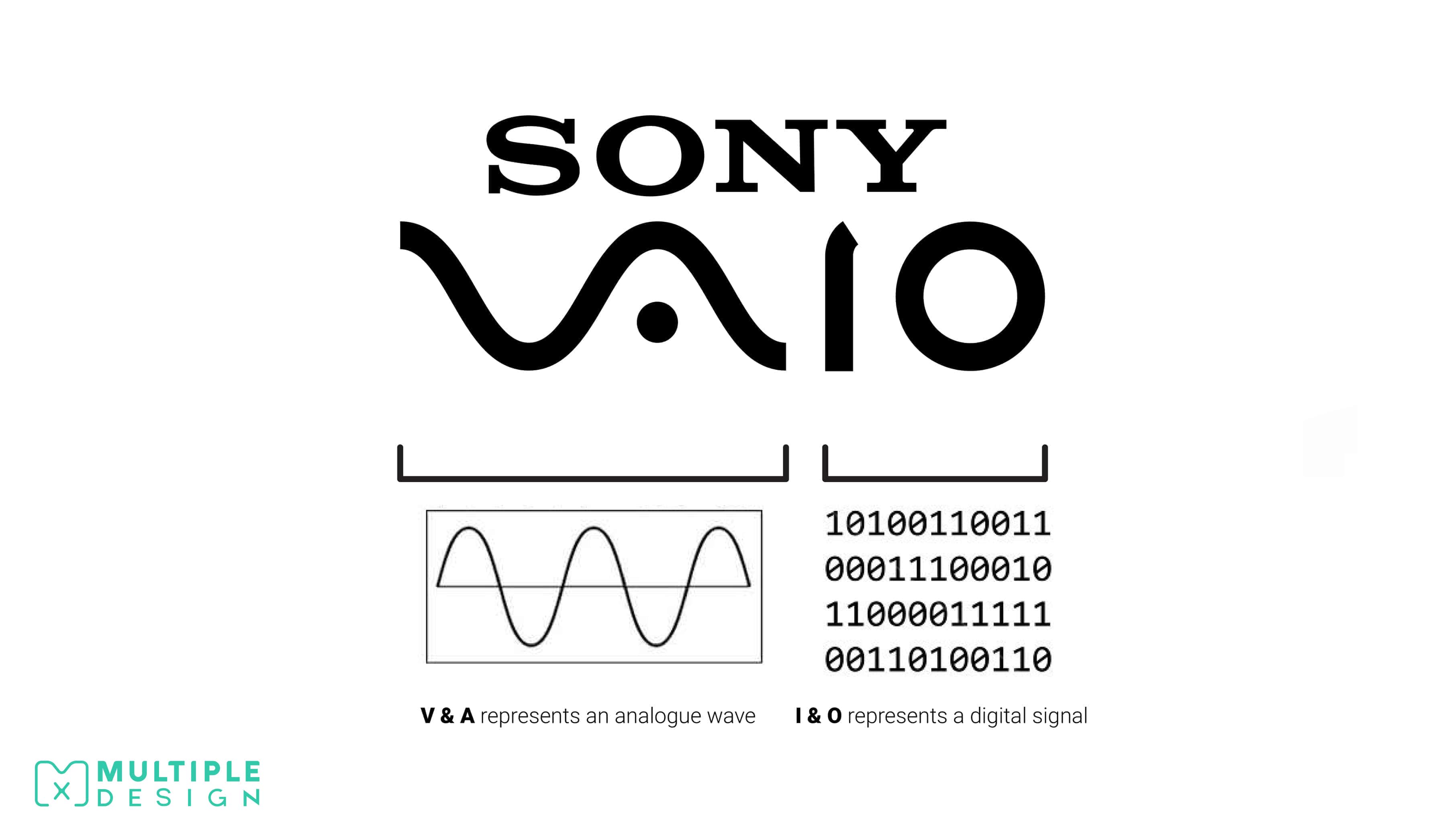
The Sony Vaio Logo depicts both an analogue and digital signal
Sony Vaio, which stands for Visual Audio Intelligent Organizer, is a Japanese manufacturer of personal computers and laptops. Not only does their logo spell Vaio, but it also cleverly visualises both an analogue and digital signal, using the V and A to represent an analogue wave, and the I and O to represent binary from a digital signal. The logo was designed to represent Sony’s evolution of technology from analogue to digital.
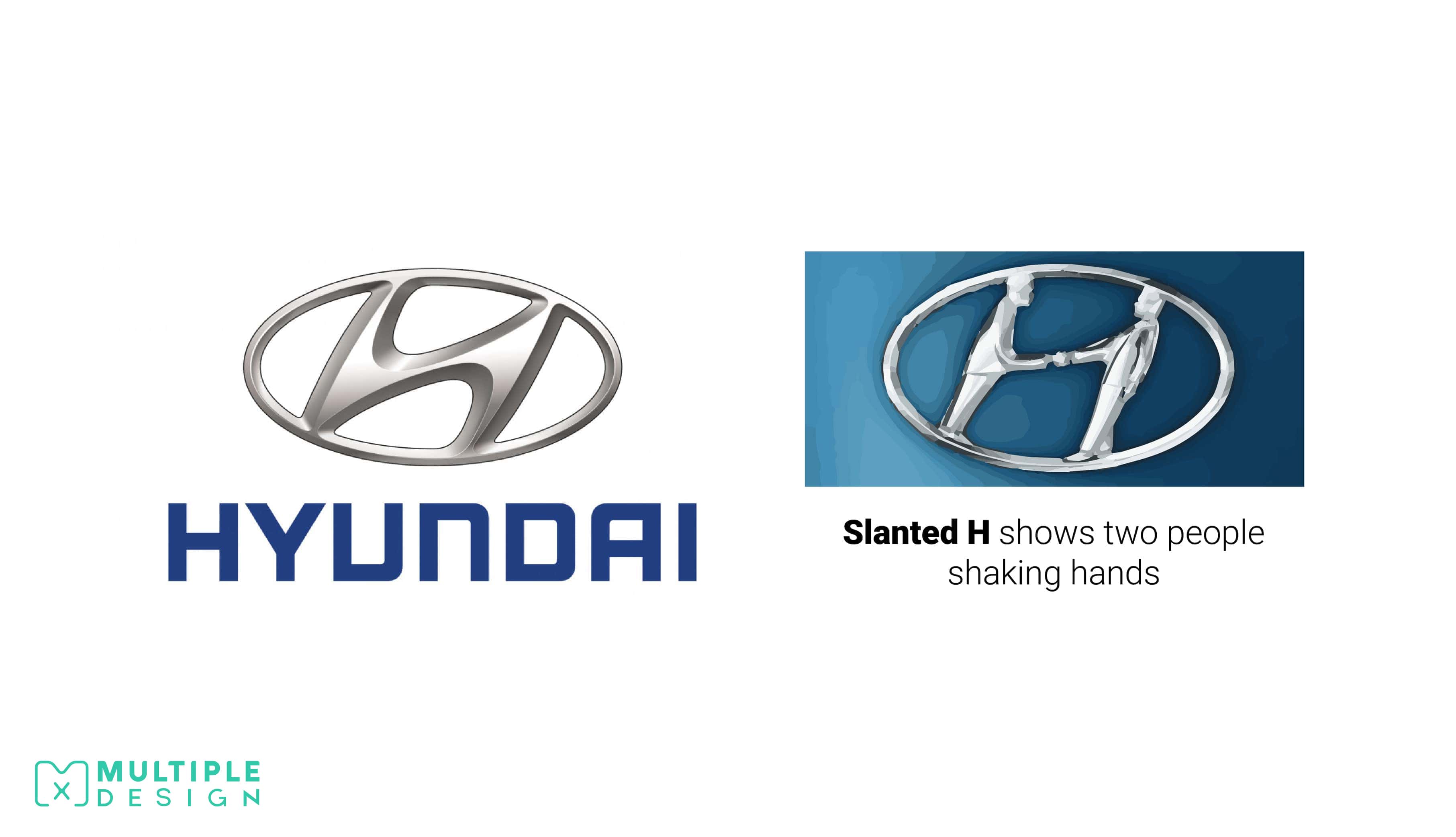
The Hyundai Logo is a not just a stylised H, but also represents two people shaking hands
Hyundai Motor Company is a South Korean automotive manufacturer. At first glance their logo looks like a slanted H, but it also represents two people shaking hands. One is the company, and the other is a satisfied customer, showcasing the company’s appreciation of their customers. The oval around the logo was placed there to represent Hyundai’s continuous expansion beyond Asia.
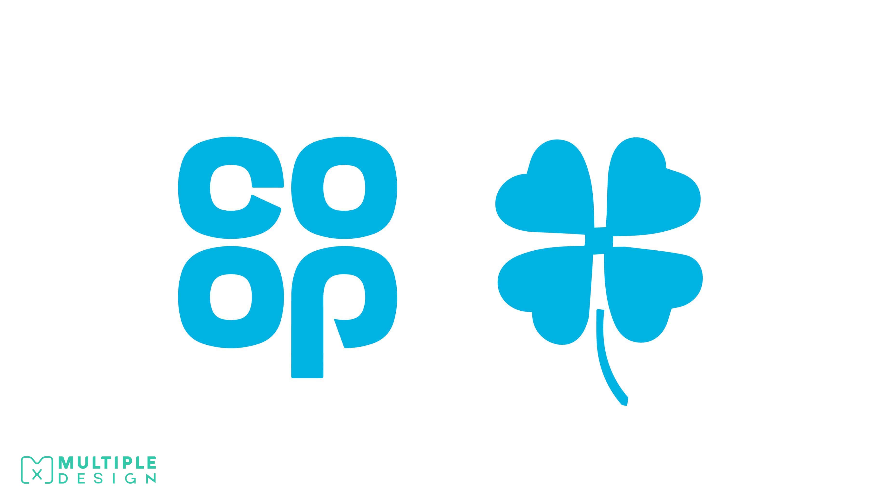
The letters in the Co-op Logo are arranged to resemble a clover leaf
The Co-operative is the UK’s fifth biggest food retailer operating across the country with almost 2,800 local, convenience and medium-sized stores. Their current logo is made up of four letters, that are arranged to look like a clover leaf, with the stem of the P corresponding with the stem of the leaf. The logo first came into use in 1968, but was slightly updated in 1993 with a more rounded design. In 2016, Co-Op returned to their original logo, as they wanted to embrace their heritage.
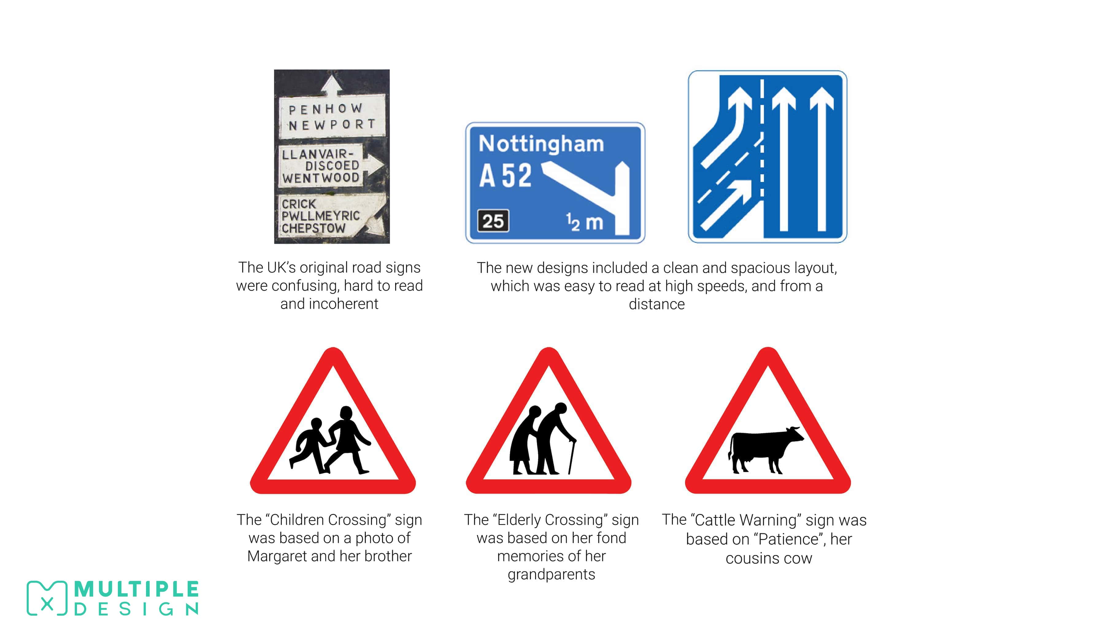
The UK’s road signs were designed by one person
In 1957, Margaret Calvert, was asked to design the signs for the UK’s first motorway. Her primary focus was to design a font that was easy to read at top speeds, yet also readable from a distance.
The success of this role led her to re-design the whole of the UK’s road signs, as they were often confusing, and used a jumble of colours, fonts and sizes depending on which region you were in. She had to convey a message primarily with images, while using as little words as possible.
Margaret based a lot of the designs on her childhood. The “Children Crossing” sign was based on a photo of Margaret and her little brother crossing the road. The “Elderly Crossing” sign was based on her grandparents, while the “Cattle Warning” sign was based on her cousin’s cow, Patience.
When her work was finally revealed to the British public, it was met with strong criticism as they found the designs too modern. However the designs were successful and helped improve safety on Britain’s roads. She eventually went on to design the logos and signage for both the NHS and British Rail.
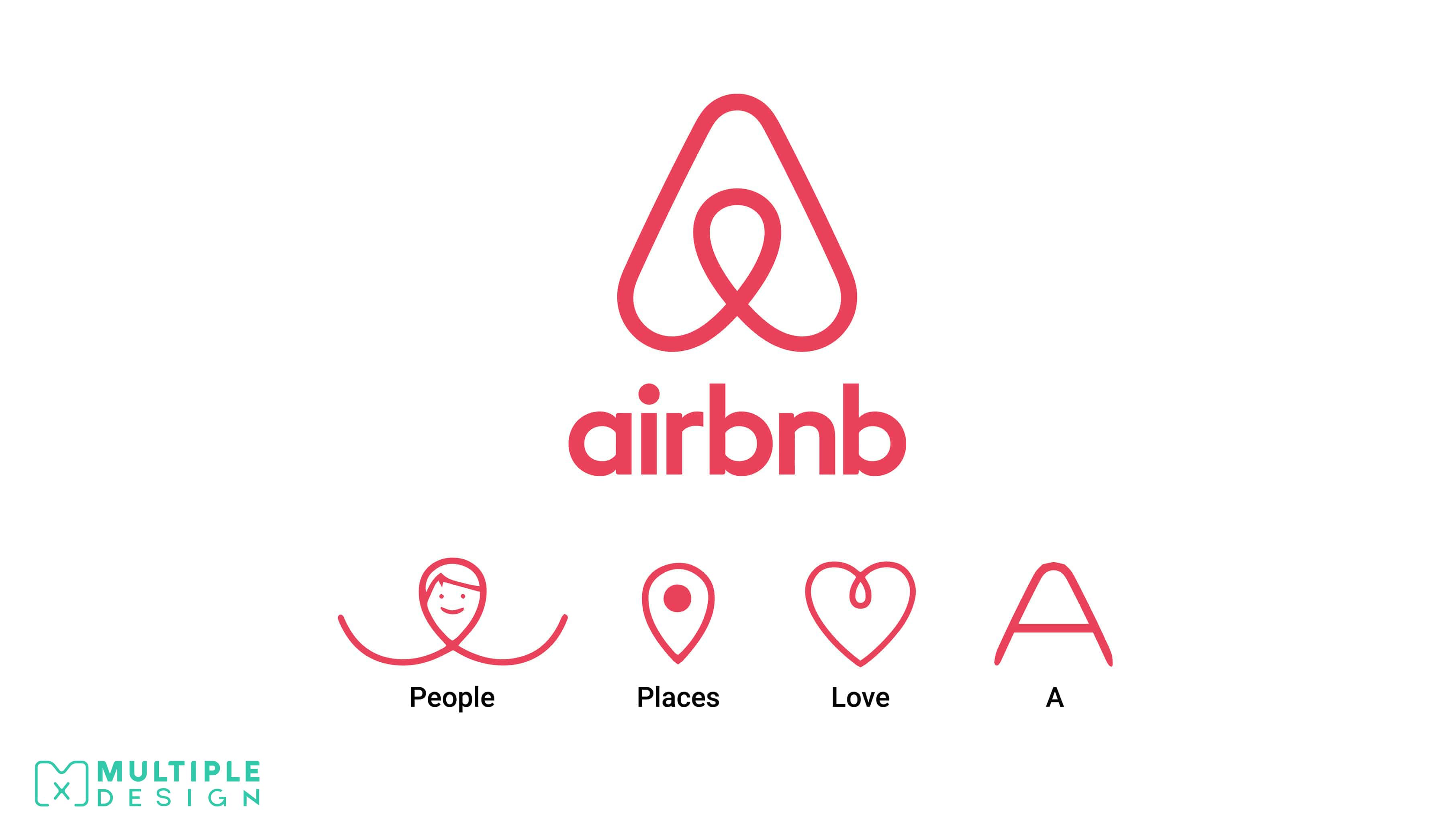
The Airbnb Logo is a combination of four symbols representing a person, a map marker, a heart, and the letter A
Airbnb is an American online marketplace for people looking to lease or rent holiday lodgings, apartments, or hotel rooms while encoring participants to leave reviews related to tourism and to make reservations at restaurants.
Their original logo was created by the company founders, Brian Chesky and Joe Gebbia while they were still graduates, and took them mere hours to put together. Airbnb wanted to showcase their core values in their new logo: People, Places, Love and Airbnb. Each one of these is combined to form the logo. The logo also has its own name: Bélo.
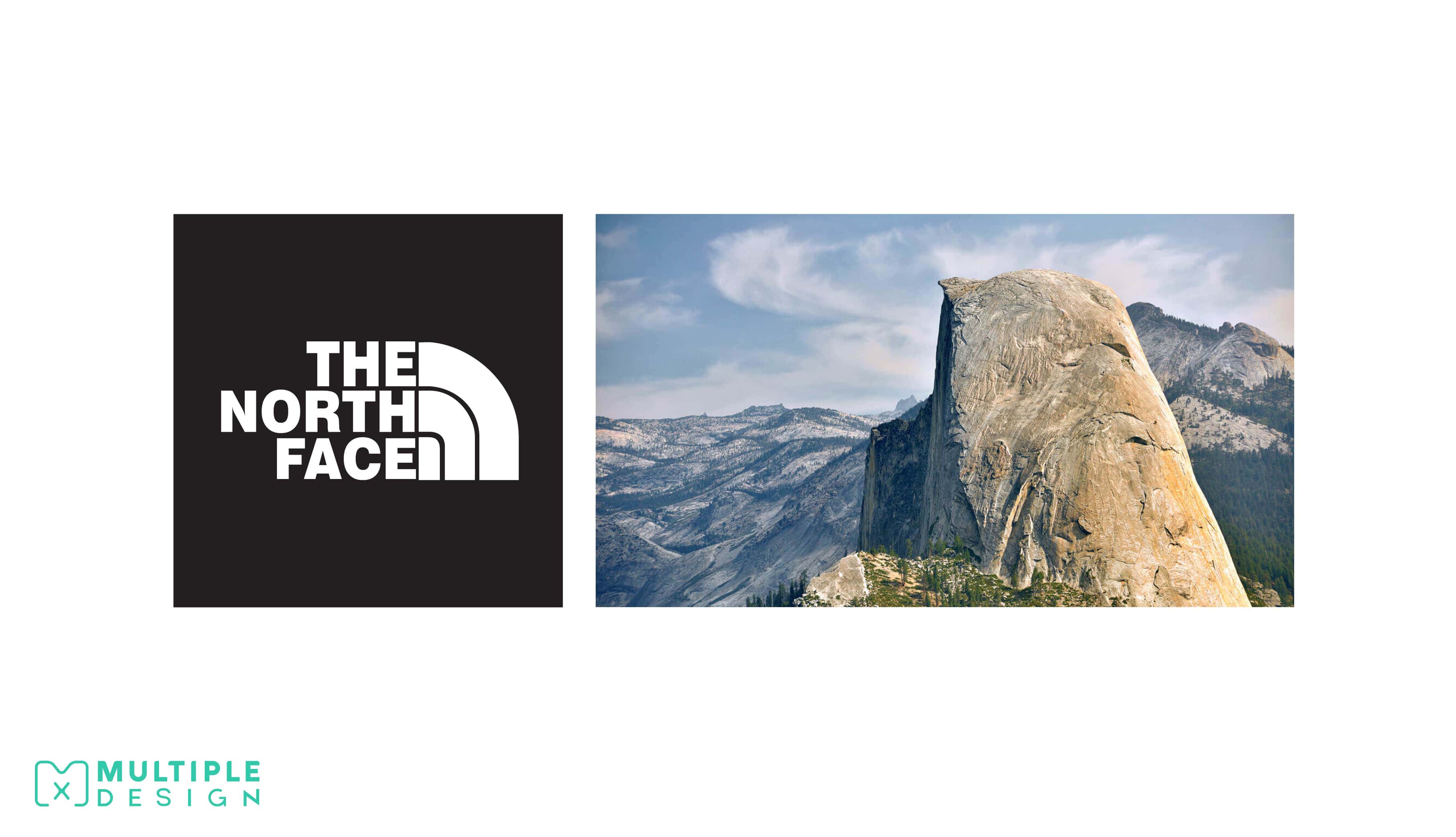
The North Face Logo depicts a famous mountain side
The North Face is an American outdoor product company specializing in clothing and equipment catered towards climbers, skiers and hikers.
Their logo depicts the Half Dome rock formation from Yosemite National Park in California. One side of the rock is rounded and smooth, while the other side is a jagged sheer face, giving it the appearance of a dome cut in half. The North Face chose to represent this as the Half Dome is held in high esteem amongst the climbing community. The companies name derives from the fact that the north face of a mountain is the coldest and most treacherous side to climb.
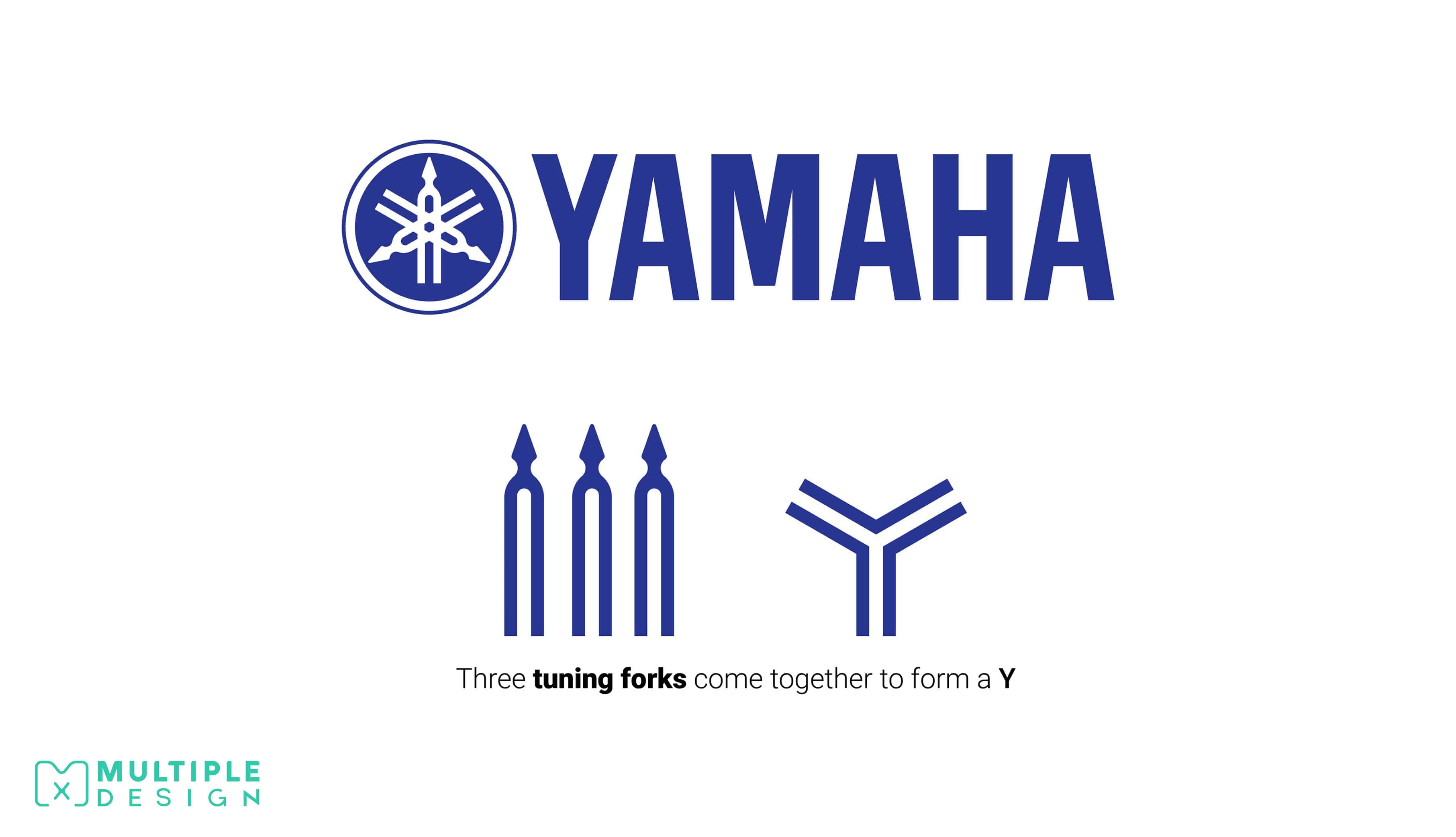
The Yamaha Logo is made up of three overlapping tuning forks that come together to form a Y
Many associate the Japanese corporation with electronics and motorcycles, but Yamaha actually started out creating high quality pianos. They decided to represent the trade in their logo, opting to depict three overlapping tuning forks, which also cleverly forms a Y in the center.
The company started to move into the motorcycle industry in 1954, and is now recognised as a leading force in the motorsport market. They still continue to create pianos, as well as drums, synthesizers, keyboards and amplifiers.
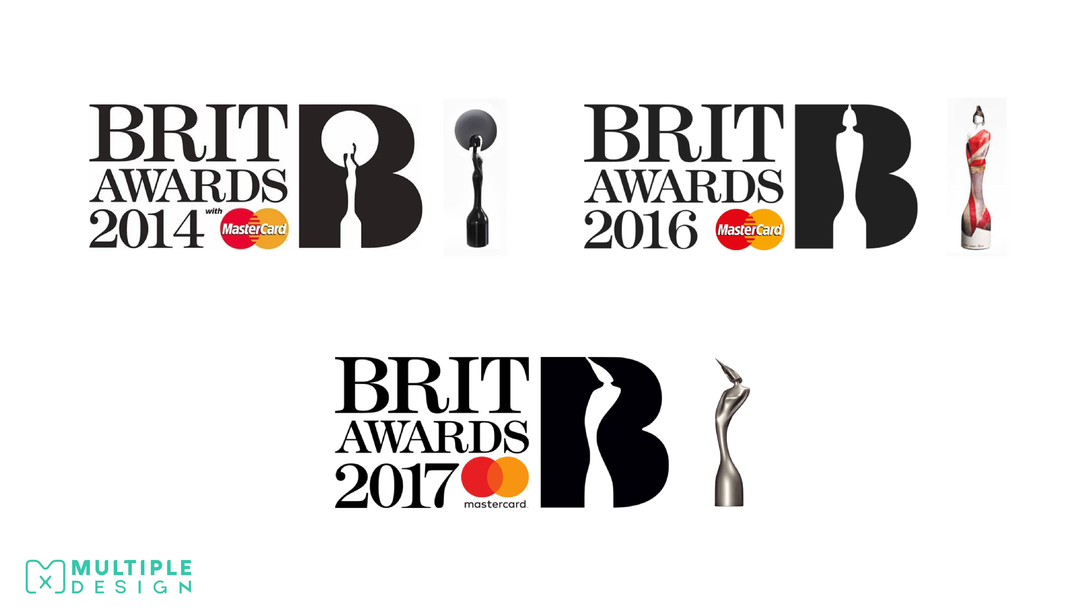
The BRIT Awards Logo changes every year to depict the new award
The BRIT Awards is a British pop music awards show held annually every February. The BRIT Award statuette given to the winners features Britannia, the female personification of Britain.
Every year the statuette is redesigned by some of Britain’s best known designers, stylists and artists. The logo itself depicts Britannia silhouetted within a B, and is updated to reflect the changes to the statuette.
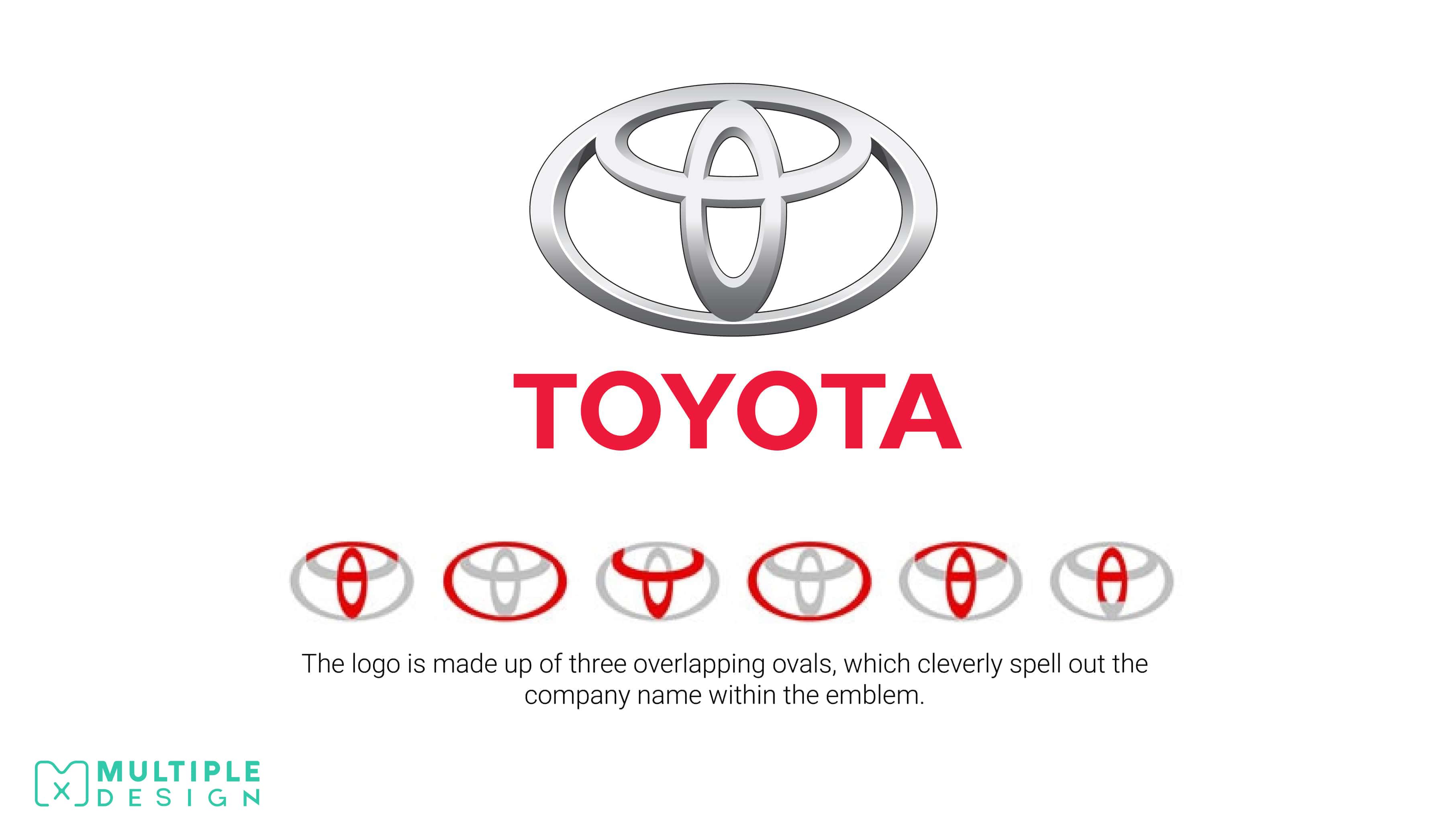
The ovals in the Toyota logo cleverly spells out the company name
Toyota is a Japanese automotive manufacturer, and currently the second-largest automobile manufacturer in the world.
Toyota originated from surname of its founder, Akio Toyoda, with early vehicles produced by the company originally sold with a "Toyoda" emblem. In 1936, the company ran a public competition to design a new logo, which lead to a change in the brand name to “Toyota”.
The new logo was made up of three overlapping ovals, which cleverly spelt out the company name within the emblem. The ovals are also said to symbolize the unification of the hearts of their customers and the heart of Toyota products.
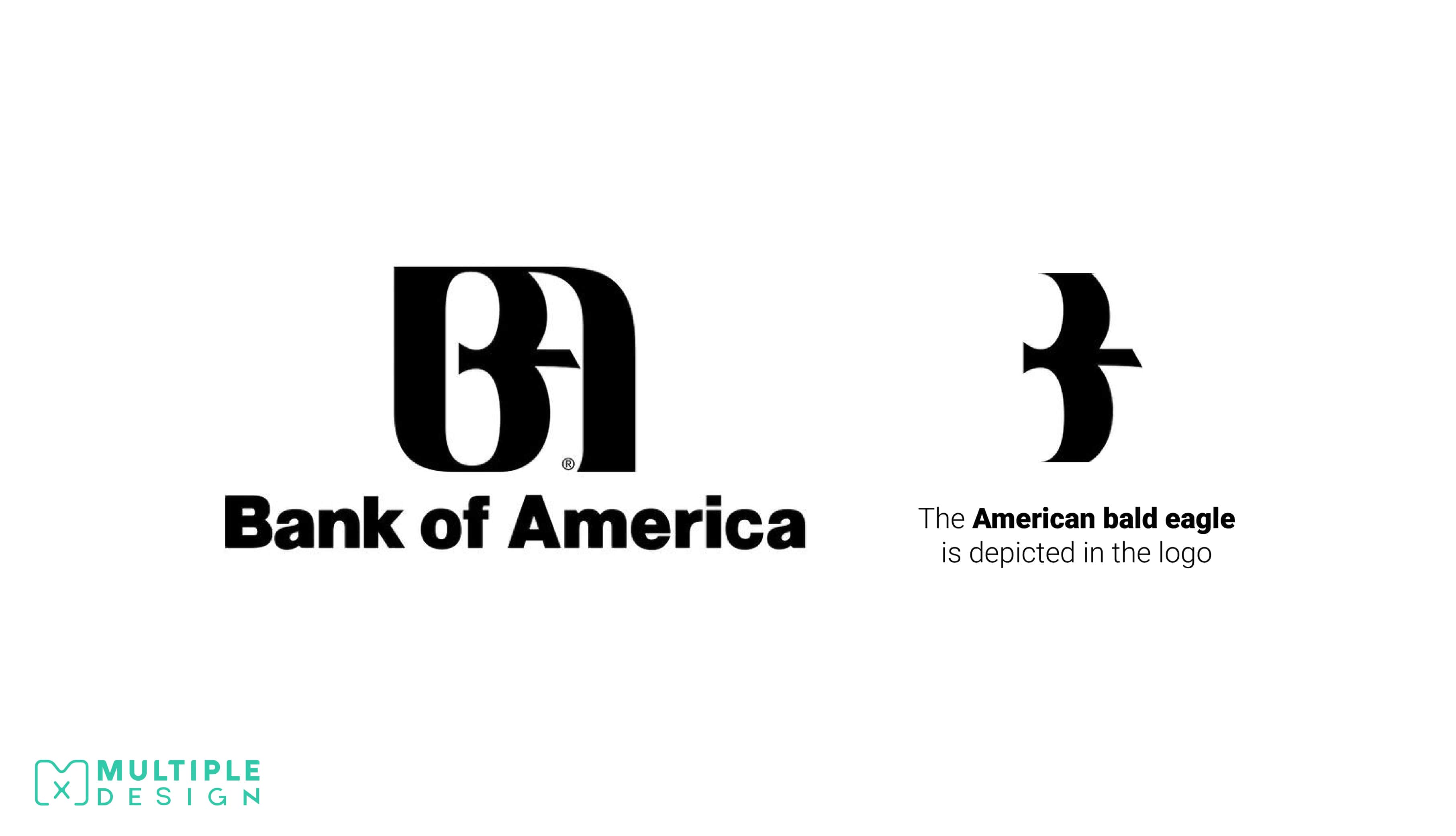
The Bank of America Logo contains a hidden eagle
The Bank of America is the second largest bank in the United States.
The logo depicts a bold B and A created with white space, and hidden between those shapes is a bald eagle. The bald eagle, sometimes called the American eagle, is the national bird and national animal of the United States, appearing on most official seals of the U.S. government.
There you have it, some ingenious hidden meanings behind some of the world’s most famous brand logos. I hope it makes you realise the incredible work that goes into shaping a brand. How many did you know? If you have any that you would like to share, please drop us a message below, and we may feature your logo fact within the coming weeks!
So next time you come across a logo, take a closer look, you never know what could be hiding right in front of you!
SEE ALSO: Why knowing the difference between a Brand and a Logo can help your business >>
- About the Author
Ryan Marter works as a graphic designer for Multiple Graphic Design. He has years of experience in helping out established and start-up business develop their brand. Get in touch with him on info@multiplegraphicdesign.com


Leave a Comment